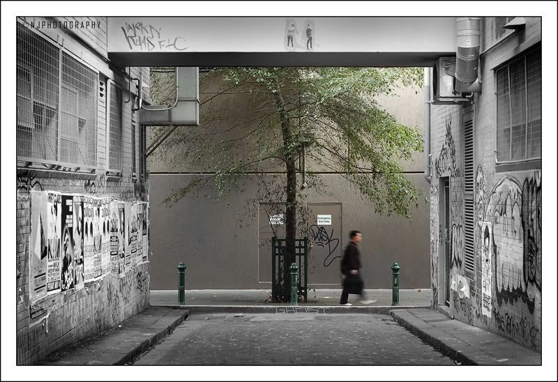
selective colour:
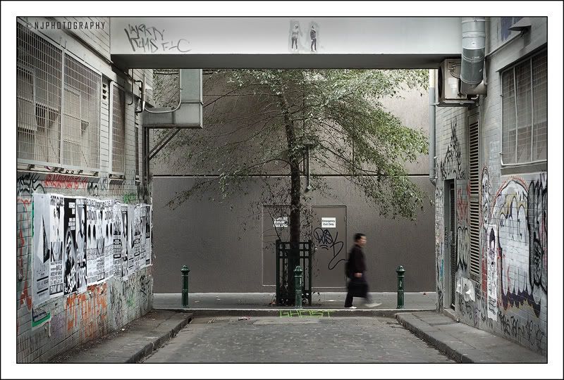
desaturated:
EDIT: added desturated version due to macka's input
A discussion forum - and more - for users of Digital Single Lens Reflex cameras.
walk on byModerators: Greg B, Nnnnsic, Geoff, Glen, gstark, Moderators
Forum rules
Please note that image critiquing is a matter of give and take: if you post images for critique, and you then expect to receive criticism, then it is also reasonable, fair and appropriate that, in return, you post your critique of the images of other members here as a matter of courtesy. So please do offer your critique of the images of others; your opinion is important, and will help everyone here enjoy their visit to far greater extent. Also please note that, unless you state something to the contrary, other members might attempt to repost your image with their own post processing applied. We see this as an acceptable form of critique, but should you prefer that others not modify your work, this is perfectly ok, and you should state this, either within your post, or within your signature. Images posted here should conform with the general forum guidelines. Image sizes should not exceed 950 pixels along the largest side (height or width) and typically no more than four images per post or thread. Please also ensure that you have a meaningful location included in your profile. Please refer to the FAQ for details of what "meaningful" is.
Previous topic • Next topic
17 posts
• Page 1 of 1
walk on by
i have been wanting to take this photo for a couple of weeks now, finally got the chance with no cars in the way. taken with the 50mm 1.8... 1/15sec @ f/5.6. what do you think?
selective colour:
desaturated:
EDIT: added desturated version due to macka's input Last edited by NJ on Sat May 05, 2007 6:27 pm, edited 2 times in total.
Nathan
D700 | MB-D10 | Nikkor 14-24 | Nikkor 24-70 | Sigma 70-200 | 20 2.8 28 2.8 35 2 50 1.8 | Sigma 105 | SB-800 http://www.flickr.com/nathanjphoto/
I really like this Nathan, it works well, very well. The selective colour I felt was subtle and very affective, the composition is well thought out and frames the shot very well. Also the choice of shutter speed to get the movement in the walker, all bring things together nicely. Well done.
thanks craig! yeah i actually took the time to think it through. I walk down this alley way after uni every day to go to the station. So i was constantly thinking about ways to make a photo out of it.
Nathan
D700 | MB-D10 | Nikkor 14-24 | Nikkor 24-70 | Sigma 70-200 | 20 2.8 28 2.8 35 2 50 1.8 | Sigma 105 | SB-800 http://www.flickr.com/nathanjphoto/
Well it's definitely shows, you're photography keeps improving, so keep thinking and shooting.
Pro’s
Great composition Excellent colour balance Well worth the wait Con’s None Chris
-------------------------------- I started my life with nothing and I’ve still got most of it left
Is this your new thing, Chris? I like it. Edit: should probably remember to comment on the image while I'm here (D'oh). Compositionally I really like it. Not sold on the selective colour, though - I don't know, I could be wring but I just don't think it needs it. I think I would go with a desaturated look instead if it were my shot. Cheers,
macka a.k.a. Kris
thanks very much everyone
macka, i took in your advice, and it looks great, i added it to the original. thanks Nathan
D700 | MB-D10 | Nikkor 14-24 | Nikkor 24-70 | Sigma 70-200 | 20 2.8 28 2.8 35 2 50 1.8 | Sigma 105 | SB-800 http://www.flickr.com/nathanjphoto/
I like both takes of the image. I do love a good example of contrast.
Steve.
|D700| D2H | F5 | 70-200VR | 85 1.4 | 50 1.4 | 28-70 | 10.5 | 12-24 | SB800 | Website-> http://www.stevekilburn.com Leeds United for promotion in 2014 - Hurrah!!!
Excellent shot - I think the selective desaturation works: it becomes a frame for the central image. The original isn't bad either, but my eyes weren't really sure where to focus. How long were you lying in wait to take it?
Pentax istDS+K10D. Pentax 50mm f1.4, Sigma 10-20mm, Tamron 90mm f2.8 macro, Kit Lenses. http://www.redbubble.com/people/berndt2
Nathan
I've said it before, but I'll say it again - boy you're getting good. I prefer the desat (#2) to the selective colour. Peter
Disclaimer: I know nothing about anything. *** smugmug galleries: http://www.stubbsy.smugmug.com ***
thanks guys
Nathan
D700 | MB-D10 | Nikkor 14-24 | Nikkor 24-70 | Sigma 70-200 | 20 2.8 28 2.8 35 2 50 1.8 | Sigma 105 | SB-800 http://www.flickr.com/nathanjphoto/
I actually like the original shot because I find it forces me to view all of the scene, whilst the desat version focus me to the man too quickly. There is so much to see in this image, love the posters ang graffiti on the walls, which is what makes the whole scene so visually interesting. Good stuff.
Canon
Previous topic • Next topic
17 posts
• Page 1 of 1
|


