DSLRUsers.com
A discussion forum - and more - for users of Digital Single Lens Reflex cameras.
Too distracting?Moderators: Greg B, Nnnnsic, Geoff, Glen, gstark, Moderators
Forum rules
Please note that image critiquing is a matter of give and take: if you post images for critique, and you then expect to receive criticism, then it is also reasonable, fair and appropriate that, in return, you post your critique of the images of other members here as a matter of courtesy. So please do offer your critique of the images of others; your opinion is important, and will help everyone here enjoy their visit to far greater extent. Also please note that, unless you state something to the contrary, other members might attempt to repost your image with their own post processing applied. We see this as an acceptable form of critique, but should you prefer that others not modify your work, this is perfectly ok, and you should state this, either within your post, or within your signature. Images posted here should conform with the general forum guidelines. Image sizes should not exceed 950 pixels along the largest side (height or width) and typically no more than four images per post or thread. Please also ensure that you have a meaningful location included in your profile. Please refer to the FAQ for details of what "meaningful" is.
Previous topic • Next topic
9 posts
• Page 1 of 1
Too distracting?
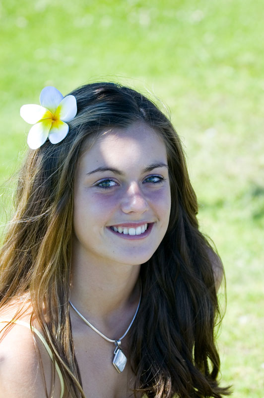
I shot this one a few months back and on revisiting it I wondered if the spot of sunlight on her forehead was a little too distracting and took something away from the shot. Comments welcomed:
Geoff
Special Moments Photography Nikon D700, 50mm 1.4, 85mm 1.4, 70-200 2.8VR, SB800 & some simple studio stuff.
yes...... and the background is also a distraction by being a bit bright and off colour.......... sorry...... edit: also to much space at the top which takes away from the face.......
Cheers ....bp....
Difference between a good street photographer and a great street photographer.... Removing objects that do not belong... happy for the comments, but .....Please DO NOT edit my image..... http://bigpix.smugmug.com Forever changing
Geoff
I agree with the previous post.....maybe crop more of the bright background out...but the sunshine spot looks great in my opinion. I think it adds a freshness to the face. Regards
Matt. K
Pretty girl but I agree that the sunshine is distracting plus it looks as if she has a black eye (left)
Edit: Geoff - this is one shot where your reflectors would have come in very handy Chris
-------------------------------- I started my life with nothing and I’ve still got most of it left
Lovely portait shot, Geoff and the girl has a glowing, radiating smile. Nice colours and sharpness, too. Unfortunately, I also think sun on face is a bit distracting and was the first thing I saw when I viewed image. A couple of reflectors would soften sun area and diffuse light beautifully.
Nice work Cheers Michael
seems a natural enough look on the woman. some portraits look contrived but she looks natural enough.
I would crop more off the top of the frame. would like her eyes to ba a little brighter, maybe a catch light. you notice the bright spot on the forehead, I would prefer it not there but it isnt the thing that stops the portrait popping out at me. Steve check out my image gallery @
http://photography.avkomp.com/gallery3
Previous topic • Next topic
9 posts
• Page 1 of 1
|


- Mods Database • The team • Delete all board cookies • Reset blocks • All times are UTC + 10 hours [ DST ]

