Sorry for the kid content, it's all I shoot anymore.
My monitor isn't calibrated, so would like to know especially if the images appear too dark or lighte etc.
Cheers
Deb
A discussion forum - and more - for users of Digital Single Lens Reflex cameras.
Playing with FiltersModerators: Greg B, Nnnnsic, Geoff, Glen, gstark, Moderators
Forum rules
Please note that image critiquing is a matter of give and take: if you post images for critique, and you then expect to receive criticism, then it is also reasonable, fair and appropriate that, in return, you post your critique of the images of other members here as a matter of courtesy. So please do offer your critique of the images of others; your opinion is important, and will help everyone here enjoy their visit to far greater extent. Also please note that, unless you state something to the contrary, other members might attempt to repost your image with their own post processing applied. We see this as an acceptable form of critique, but should you prefer that others not modify your work, this is perfectly ok, and you should state this, either within your post, or within your signature. Images posted here should conform with the general forum guidelines. Image sizes should not exceed 950 pixels along the largest side (height or width) and typically no more than four images per post or thread. Please also ensure that you have a meaningful location included in your profile. Please refer to the FAQ for details of what "meaningful" is.
Previous topic • Next topic
4 posts
• Page 1 of 1
Playing with Filters
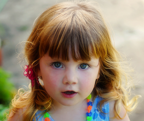
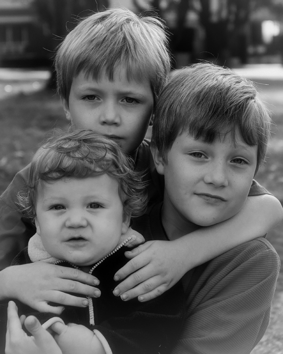
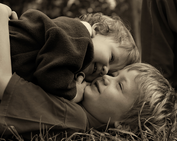
Been playing with filters in Photoshop on the weekend and would appreciate some feedback on the treatment of these images.
Sorry for the kid content, it's all I shoot anymore.
My monitor isn't calibrated, so would like to know especially if the images appear too dark or lighte etc. Cheers Deb "Sometimes when you are sad Poko, it's good to hug the monkey."
I really like #3
For #1 you may try a softer diffuse there with warmer tones. For #2 I would prefer a brighter contrast there. Or boost up the contrast even more for effect's sake.
Thanks Yip.
Number 3 I intend to print and hang. The first one of my daughter looks better with a larger version, but I will play with the softness as you suggested. As for the second one, well I really am unhappy with that one and thought I would just throw it in and see what could be suggested. Somehow I think I need to go back to the start and do over again. Ít's so hard getting 3 kids looking at you at the same time Thanks for taking the time to help out. "Sometimes when you are sad Poko, it's good to hug the monkey."
Deb, love the expression and rosy cheeks on 1, think it is fantastic. Like 2 but maybe a touch of fill flash, or as Yi-p says more contrast. 3 seems dark but it highlights the faces, might try to expose it 1/3 stop lighter?
Previous topic • Next topic
4 posts
• Page 1 of 1
|


