Page 1 of 1
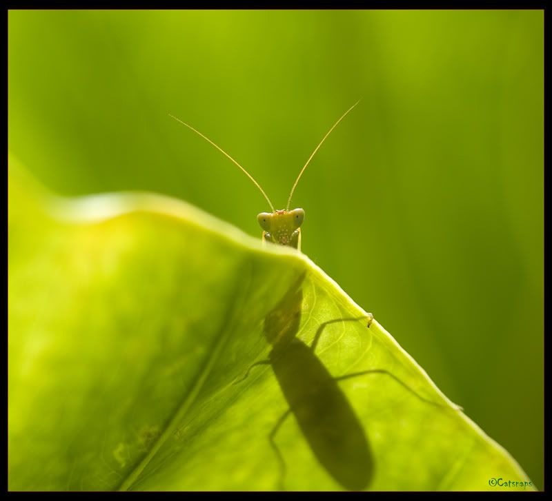
I-Mantis

Posted:
Thu Dec 15, 2005 6:32 pmby cc@t
Shot with 35 - 105 Macro handheld.


Posted:
Thu Dec 15, 2005 6:36 pmby big pix
Nice pix......... you had me going as I thought you had a pix of Simon........

Posted:
Thu Dec 15, 2005 6:37 pmby sirhc55
Excellent - the shadow adds to this pic


Posted:
Thu Dec 15, 2005 7:27 pmby Manta
big pix wrote:Nice pix......... you had me going as I thought you had a pix of Simon........
That's how I look when I shed my human disguise Bernie.....
I think this is really interesting CC@t - as Chris said, the inclusion of the shadow is what makes this different to most macro insect shots.

Posted:
Thu Dec 15, 2005 7:38 pmby Oneputt
I aghree with Chris and Simon. Without the shadow it is just another macro shot, but as you have presented, it is both different and appealing. Nice work.


Posted:
Thu Dec 15, 2005 7:42 pmby Sheetshooter
Macro with a touch of wit and whimsy - what a treat. Thank you.

Posted:
Thu Dec 15, 2005 7:50 pmby christiand
Hi cc@at,
this is a fine image - well done.
The mantis looks so cheeky

Cheers,
CD

Posted:
Thu Dec 15, 2005 7:52 pmby kipper
Love the backlighting on this one which has brought through the silhouette of the bugs body through the translucent leaf (not really a shadow as such more just the body blocking light

).
This reminds me of the wonderfully vivid colors,
modelling, lighting and animation found in A Bugs Life by Pixar. Keep up the good work.

Posted:
Thu Dec 15, 2005 8:02 pmby ABG
cc@t that bought a big silly grin to my face. I love it.

Posted:
Thu Dec 15, 2005 8:50 pmby mudder
This is excellent, the combination of the shadow and him (or her?) peering over the edge gives the bug real character...

Posted:
Thu Dec 15, 2005 9:22 pmby avkomp
this is a great macro, the shadow definitely adds an interest to this image.
The only thing that weakens this is the OOF leaf.
Well done
Steve

Posted:
Thu Dec 15, 2005 9:26 pmby kipper
I don't think it really weakens it Steve, and it'd be impossible to render it tack sharp due to the small DOF that you get with macro.

Posted:
Thu Dec 15, 2005 9:40 pmby Manta
CC@T - I hope you don't mind...
I found the overall light green cast gave the original a washed out look. I tinkered a bit with the levels to try and flesh out the tonal range. To me, this gives your shot more punch but I'll get rid of it if you wish.


Posted:
Thu Dec 15, 2005 10:06 pmby kipper
Sorry Simon, but I prefered the original as I thought it had more of a cartoon rendering to it.

Posted:
Thu Dec 15, 2005 10:19 pmby cc@t
Hey Manta - no I dont mind at all, we all see things differently and though I like the depth you have brought to the pic, Kipper was spot on with the feel I was trying to get. But thanks anyway.

Posted:
Thu Dec 15, 2005 10:32 pmby Manta
cc@t wrote:Hey Manta - no I dont mind at all, we all see things differently and though I like the depth you have brought to the pic, Kipper was spot on with the feel I was trying to get. But thanks anyway.
Yep - couldn't agree more - and you've achieved that look very well too. I actually started work on the pic immediately after my first post and then got caught up doing other things before coming back and posting my adjusted version, not reading the other messages first. Had I done so, I wouldn't have bothered posting as it's obvious now what you were trying to portray.


I guess I've been hanging around BlacknStormy for too long and have a tendency to try and bring out the realistic rather than the interpretive side of these sorts of images.


