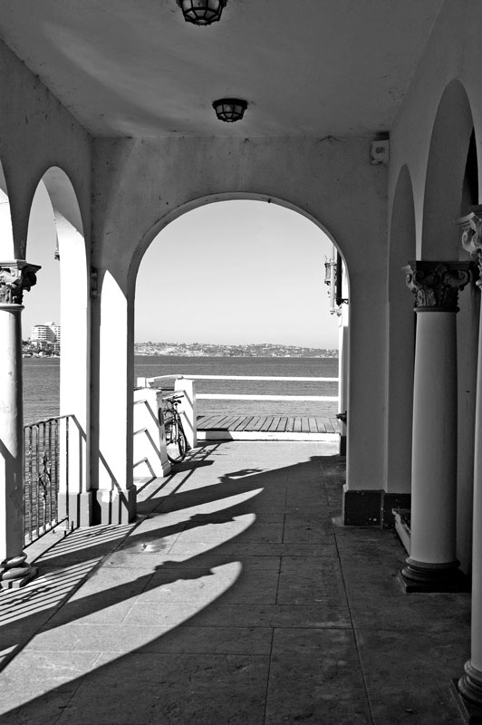
I thought the conversion from colour to B&W suited the image:
A discussion forum - and more - for users of Digital Single Lens Reflex cameras.
Manly - Lines, Curves, Water and ShadowsModerators: Greg B, Nnnnsic, Geoff, Glen, gstark, Moderators
Forum rules
Please note that image critiquing is a matter of give and take: if you post images for critique, and you then expect to receive criticism, then it is also reasonable, fair and appropriate that, in return, you post your critique of the images of other members here as a matter of courtesy. So please do offer your critique of the images of others; your opinion is important, and will help everyone here enjoy their visit to far greater extent. Also please note that, unless you state something to the contrary, other members might attempt to repost your image with their own post processing applied. We see this as an acceptable form of critique, but should you prefer that others not modify your work, this is perfectly ok, and you should state this, either within your post, or within your signature. Images posted here should conform with the general forum guidelines. Image sizes should not exceed 950 pixels along the largest side (height or width) and typically no more than four images per post or thread. Please also ensure that you have a meaningful location included in your profile. Please refer to the FAQ for details of what "meaningful" is.
Previous topic • Next topic
7 posts
• Page 1 of 1
Manly - Lines, Curves, Water and Shadows
This is one I revisited also. Not sure if it's a something shot or a NOTHING shot...I'd appreciate honest (harsh if necessary) critique:
I thought the conversion from colour to B&W suited the image: Geoff
Special Moments Photography Nikon D700, 50mm 1.4, 85mm 1.4, 70-200 2.8VR, SB800 & some simple studio stuff.
for me I would add a lot more contrast....... nice image but lacking in pp.......I would drop out a lot of mid tones to see how it would look.......
Cheers ....bp....
Difference between a good street photographer and a great street photographer.... Removing objects that do not belong... happy for the comments, but .....Please DO NOT edit my image..... http://bigpix.smugmug.com Forever changing
I agree with BP, ramp up the contrast and maybe make the railing the level point in the image. Or go back and ask the owners to clean the ceiling, it looks dirty now, with higher contrast may look like age
I think the guys are right about increasing the contrast (levels and curves?) but I'd also consider cloning out the modern buildings viewed through the archway on the left (maybe copy some of the hillside viewed through the arch at the end?) and what looks like a movement sensor in the top right corner...
Aka Andrew
Geoff I was here on Monday, I spent a good deal of time looking at this building thinking how could I shoot it to make it work.
I gave up! So here are my thought on someone who actually got a shot off It is very difficult to get a good frame. I was thinkning about using the colums with the artwork on them as a focal point. I like the idea of using the arch to frame the water, but I feel that there needs to be more contrast in the shadows and the highlights. Maybe get rid of the ceiling. Mal
I've got a camera, it's black. I've got some lens, they are black as well.
horizion police here..........is it straight ???
Cheers ....bp....
Difference between a good street photographer and a great street photographer.... Removing objects that do not belong... happy for the comments, but .....Please DO NOT edit my image..... http://bigpix.smugmug.com Forever changing
Thanx for your comments guys...might have a tinker over the next few days...
Geoff
Special Moments Photography Nikon D700, 50mm 1.4, 85mm 1.4, 70-200 2.8VR, SB800 & some simple studio stuff.
Previous topic • Next topic
7 posts
• Page 1 of 1
|


