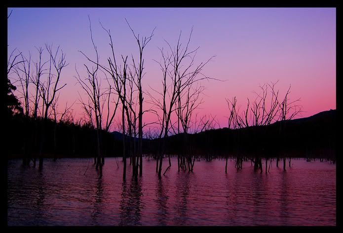
i over saturated this one because the original looked quite boring compared to it.
didnt bump the saturation up at all for this one though

i just like the cloud pattern in this one

and a dragonfly...

A discussion forum - and more - for users of Digital Single Lens Reflex cameras.
lake eildonModerators: Greg B, Nnnnsic, Geoff, Glen, gstark, Moderators
Forum rules
Please note that image critiquing is a matter of give and take: if you post images for critique, and you then expect to receive criticism, then it is also reasonable, fair and appropriate that, in return, you post your critique of the images of other members here as a matter of courtesy. So please do offer your critique of the images of others; your opinion is important, and will help everyone here enjoy their visit to far greater extent. Also please note that, unless you state something to the contrary, other members might attempt to repost your image with their own post processing applied. We see this as an acceptable form of critique, but should you prefer that others not modify your work, this is perfectly ok, and you should state this, either within your post, or within your signature. Images posted here should conform with the general forum guidelines. Image sizes should not exceed 950 pixels along the largest side (height or width) and typically no more than four images per post or thread. Please also ensure that you have a meaningful location included in your profile. Please refer to the FAQ for details of what "meaningful" is.
Previous topic • Next topic
11 posts
• Page 1 of 1
lake eildon
hi guys, havent posted in ages coz i havent been around home for a while. here are a fer shots that i got from another trip to lake eildon with a friend of mine. i hope you like them. c &c always welcome.
i over saturated this one because the original looked quite boring compared to it.
didnt bump the saturation up at all for this one though
i just like the cloud pattern in this one
and a dragonfly... Last edited by NJ on Mon Jan 23, 2006 3:53 pm, edited 2 times in total.
Nathan
D700 | MB-D10 | Nikkor 14-24 | Nikkor 24-70 | Sigma 70-200 | 20 2.8 28 2.8 35 2 50 1.8 | Sigma 105 | SB-800 http://www.flickr.com/nathanjphoto/
cummon guys, please, my first post for the new year and no one has any comments for them
Nathan
D700 | MB-D10 | Nikkor 14-24 | Nikkor 24-70 | Sigma 70-200 | 20 2.8 28 2.8 35 2 50 1.8 | Sigma 105 | SB-800 http://www.flickr.com/nathanjphoto/
Hi Nathan,
I like first two photos. First one is the best, IMHO. Second one is quite good but I beleive that gradual ND has to be used to bring bit more details in water reflections Mikhail
Hasselblad 501CM, XPAN, Wista DX 4x5, Pentax 67, Nikon D70, FED-2
NJ, number one has nice colours to it. I like it the best of this series. For your cloud shot I would crop and remove teh water as it doesn't really add to the shot. IMHO that is..
Mal
I've got a camera, it's black. I've got some lens, they are black as well.
NJ
#1 - like it a lot, very nice work, love the colour #2 - also good, very strong, rich #3 - not as excited as you about the clouds, bit underwhelmed with this one (Maybe a CPL filter might have given more punch) #4 - love the background, the dragonfly looks a tad oversharpened to me which I think detracts from the image. If you haven't sharpened it, I don't know what's going on!! Greg - - - - D200 etc
Talent hits a target no one else can hit; Genius hits a target no one else can see. - Arthur Schopenhauer
thanks for the comments guys, much appreciated.
Greg, i did use a cpl on #3 but im guessing (because i cant remember) that i had set to cancle out the reflection in the water. And with #4 it was definately over sharpened and i think i have fixed it now. Nathan
D700 | MB-D10 | Nikkor 14-24 | Nikkor 24-70 | Sigma 70-200 | 20 2.8 28 2.8 35 2 50 1.8 | Sigma 105 | SB-800 http://www.flickr.com/nathanjphoto/
I think all 4 are great. Only slight annoyance with #1 is the far left trees jutting into the composition. I would crop them out. Other than that, great.
Matt
Previous topic • Next topic
11 posts
• Page 1 of 1
|


