Page 1 of 1
lake eildon

Posted:
Mon Jan 23, 2006 12:20 pmby NJ
hi guys, havent posted in ages coz i havent been around home for a while. here are a fer shots that i got from another trip to lake eildon with a friend of mine. i hope you like them. c &c always welcome.
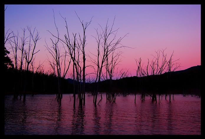
i over saturated this one because the original looked quite boring compared to it.
didnt bump the saturation up at all for this one though

i just like the cloud pattern in this one

and a dragonfly...

Posted:
Mon Jan 23, 2006 1:19 pmby NJ
cummon guys, please, my first post for the new year and no one has any comments for them

Posted:
Mon Jan 23, 2006 1:24 pmby Hlop
Hi Nathan,
I like first two photos. First one is the best, IMHO. Second one is quite good but I beleive that gradual ND has to be used to bring bit more details in water reflections
Posted:
Mon Jan 23, 2006 2:10 pmby Mal
NJ, number one has nice colours to it. I like it the best of this series. For your cloud shot I would crop and remove teh water as it doesn't really add to the shot. IMHO that is..

Posted:
Mon Jan 23, 2006 2:38 pmby Marvin
I like the oversaturation in the first one. The trees look very stark. I actually don't mind that one with a bit chopped off the bottom.
Posted:
Mon Jan 23, 2006 2:44 pmby Greg B
NJ
#1 - like it a lot, very nice work, love the colour
#2 - also good, very strong, rich
#3 - not as excited as you about the clouds, bit underwhelmed with this one (Maybe a CPL filter might have given more punch)
#4 - love the background, the dragonfly looks a tad oversharpened to me which I think detracts from the image. If you haven't sharpened it, I don't know what's going on!!
Posted:
Mon Jan 23, 2006 3:37 pmby NJ
thanks for the comments guys, much appreciated.
Greg, i did use a cpl on #3 but im guessing (because i cant remember) that i had set to cancle out the reflection in the water.
And with #4 it was definately over sharpened and i think i have fixed it now.
Posted:
Mon Jan 23, 2006 4:04 pmby PALL
beautiful,loved the first two for colors contrast and composition,,, the third one got non semitric terian,no so good,,.the macro shot is very good.
Posted:
Mon Jan 23, 2006 7:37 pmby Big V
Number 1 is a winner...
Posted:
Mon Jan 23, 2006 7:39 pmby Alex
First two are stunning, Nathan. Well done. Love the colours.
Alex
Posted:
Mon Jan 23, 2006 8:26 pmby rokkstar
I think all 4 are great. Only slight annoyance with #1 is the far left trees jutting into the composition. I would crop them out. Other than that, great.