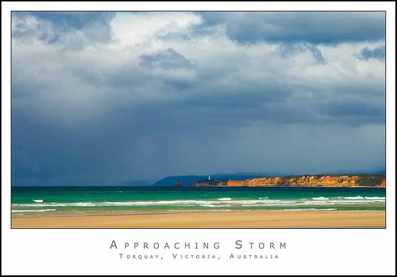
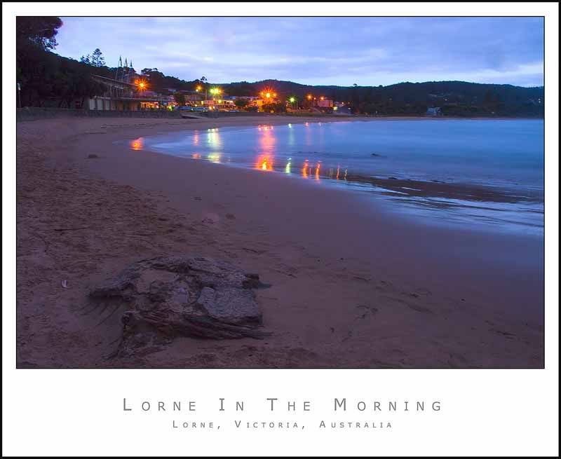
Alpha_7 wrote:Paul shots #1 and #2 stand out to me in these series. I really like them both.
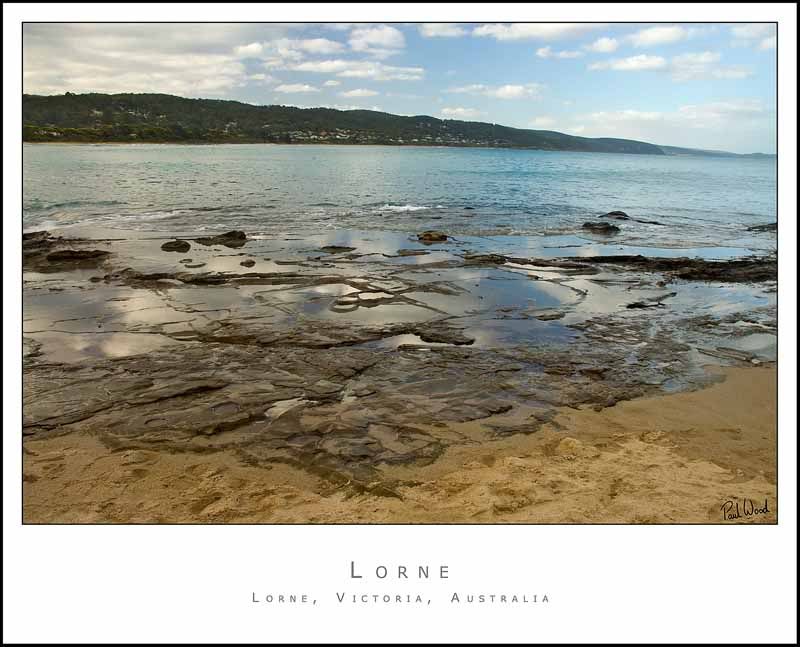
#3 Seems a little flat to me, and the horizon seems to be doing some weird (what lens did you use ?) Definitely appears bent to me here.
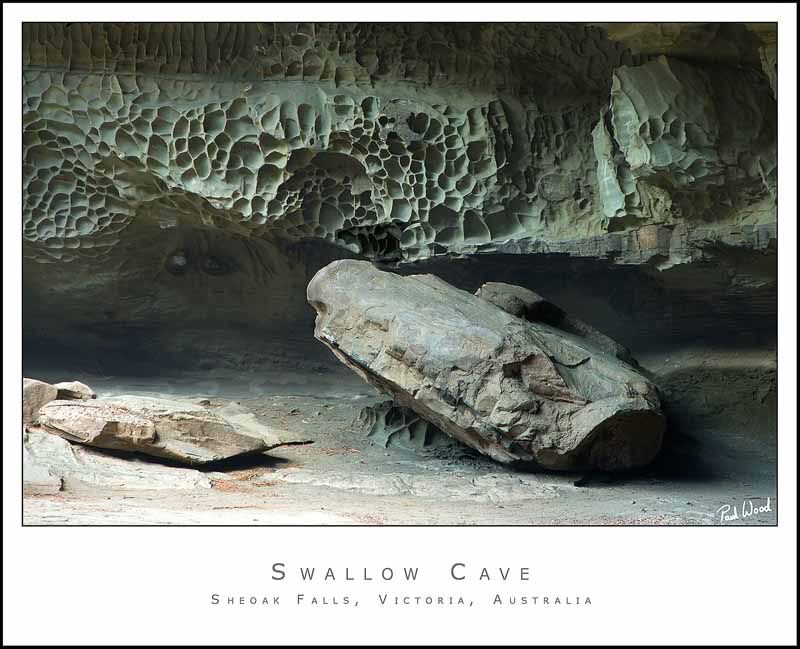
#4 This one is a little bland in colour, I tried a quick B&W conversion and liked the results, but that's just me
#5 Seems a little soft, I'm guessing it could of been a bit windy maybe ? That or the tripod had unstable ground to stand on ? It also seems to be suffering badly from the jpeg compression and also from sensor heat noise (top left corner is purple-ish).
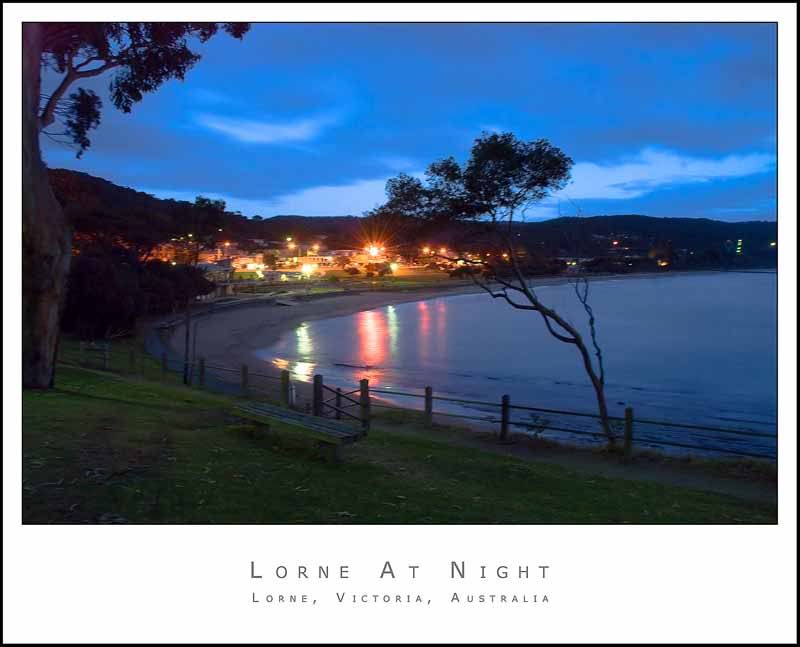
#6 This one's better then the last but for me the lights are overpowering in this shot. Some purple top left is again evident
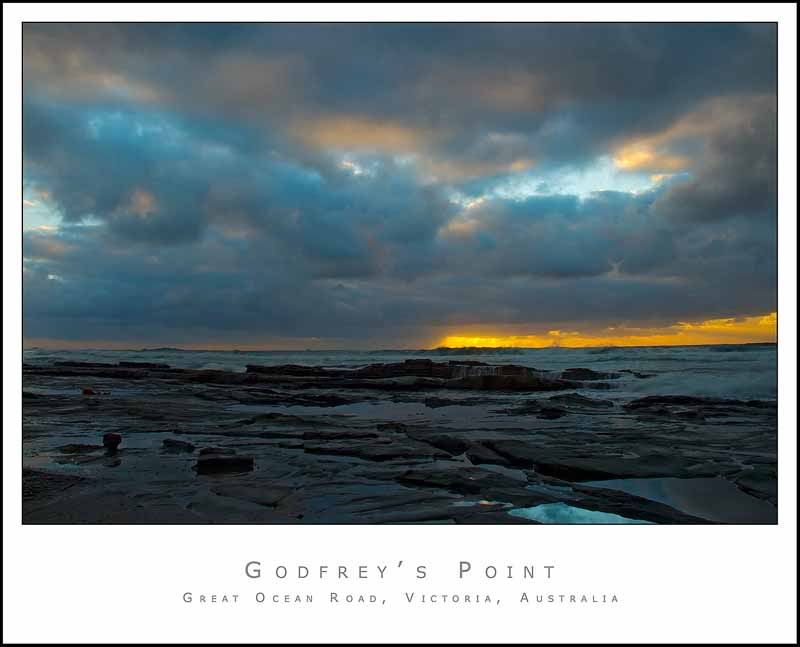
#7 This is a good shot, but my eyes disbelieve this to be the true colours, they can easily get it wrong but when I look at it, it seems a little un-natural, in particular the blue-ish tint on the rocks
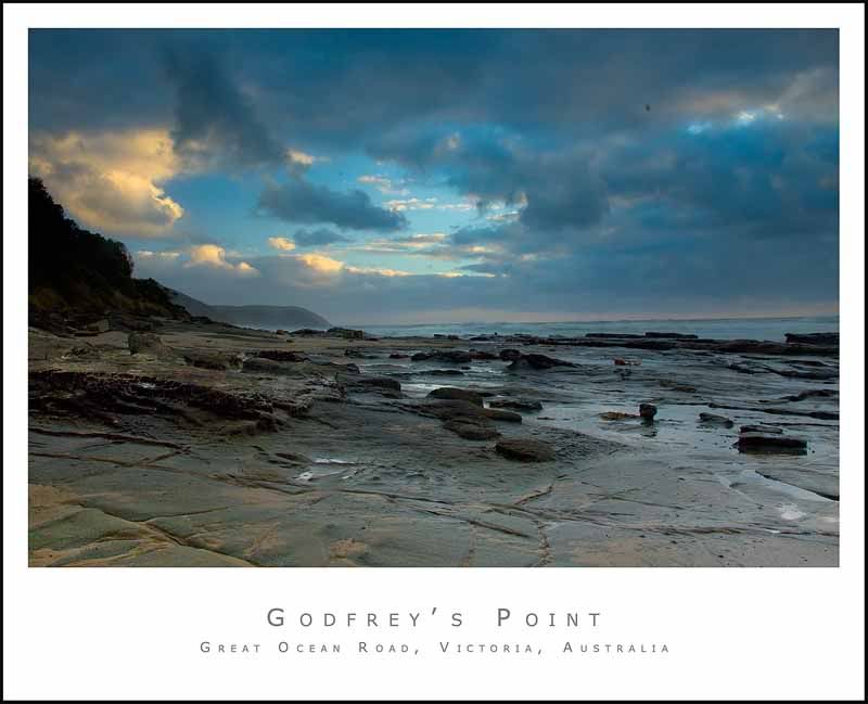
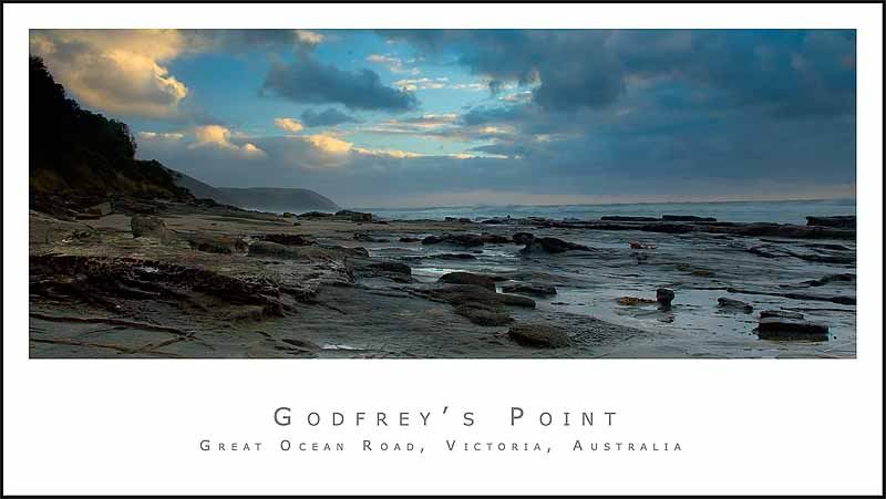
#8 This shot I think might be improved by a pano crop.. definitely worth a try IMO.
#3 - The light was getting a bit bright by this stage which probably explains why it's flat. All of these were taken with the kit lens.
#4 - Bland is how the scene was in real life. I wasn't sure about this shot but was trying a sort of monochrome scene without actually desaturating anything.
#5 - Definately very soft. I wasn't going to post this one because of it but I just liked the way it looked. Proabably couldn't print this any bigger than 6x4
I've never heard of the purple thing before. My colourblind eyes can't see any on my screen... but blue and purple together are problem areas for me.
#7. These are indeed the true colours... I've just increased the saturation a bit. I can't see any blue in the rocks... only in the water around the rocks. Again that could be either my eyes or screen.
#8 - What do you suggest I crop off....sky or foreground? I'm very new to cropping my photos.... have always shyed away from it in the past but have recently discovered how much of a dramatic impact it can have.
Thanks for the comments. They all help with my learning.

Paul