Page 1 of 1
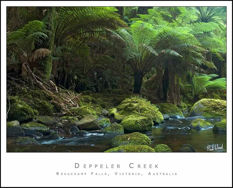
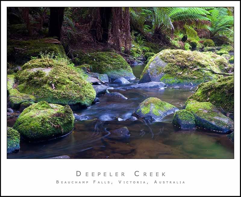
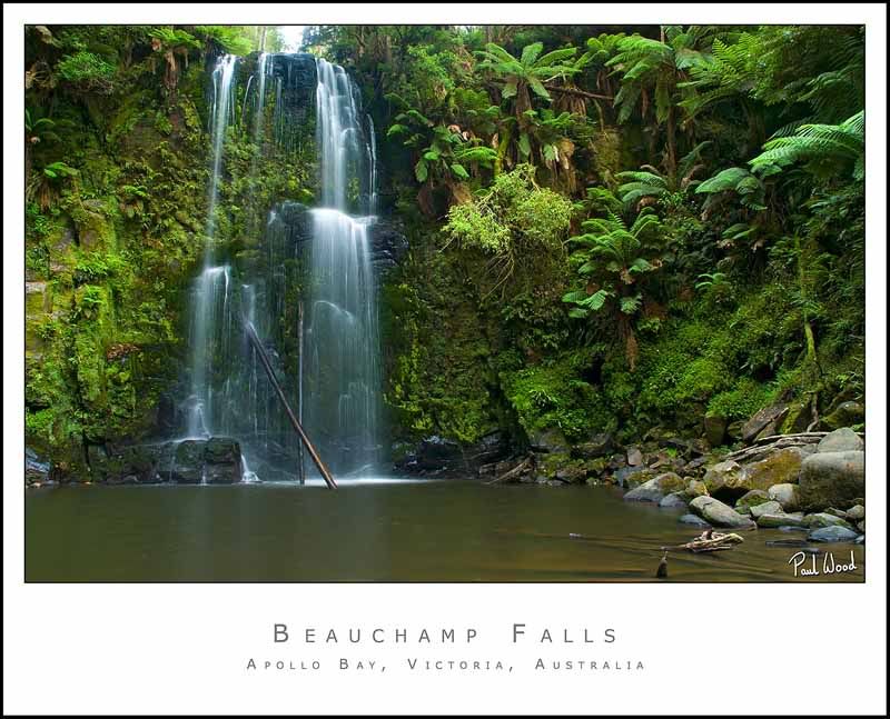
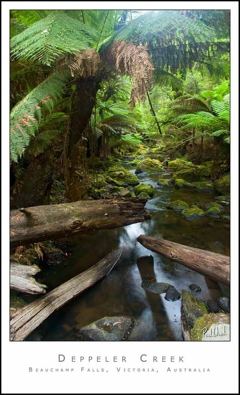
Waterfalls from The Great Ocean Road (9 pics)

Posted:
Mon Feb 13, 2006 10:13 amby NikonUser
Posted:
Mon Feb 13, 2006 10:17 amby Alpha_7
Some lovely stuff here Paul, you really have a knack with the waterfall wilderness calendar style shots. I feel not all of these reach your typically high standards, but most of them do. Seems to be the time of day / direction of the light could of been better if a few shots, and I assume this was mainly you didn't have time to wait for it to be right, it's hard when you trying to fit so much into each day. But overall a nice series!
Posted:
Mon Feb 13, 2006 10:24 amby NikonUser
Thanks Alpha_7...
You are right with the time of day/direction of light thingy. I didn't have any control over that at all as, like you said, we had a limited timeframe to fit everything in.
The weather was quite good to me as the days we went to the waterfalls there were nice big cloud patches in the sky and I didn't have to wait very long for the sun to dissapear most of the time.
Which ones specifically don't you like the light on?
I'm thinking #1, #2 and #8?
Paul
Posted:
Mon Feb 13, 2006 10:31 amby Alpha_7
Paul - The lighting that distracted for me was mainly in #4 #5 and #6.
#4 was actually my favourite shot, but the light on the top of the shot in the foliage kind of ruined it
Something is funky with #3 possibly the WB, it looks a little too warm to me?
#8 I didn't originally think it was a light thing but maybe it is.. the rocks and and water around them look a bit weird.. they look to steely if you know what I mean ?
Posted:
Mon Feb 13, 2006 10:35 amby NikonUser
I see what you mean
In #'s 4,5 and 6 I think the problem is the light being filtered through the leaves being so bright. It seems to make the shot around the bright bits hazy.... I've always had this problem with waterfalls.
Could it be a form of flare or other lens abberation?
I guess I could try and tone it down in Photoshop.
Paul
Posted:
Mon Feb 13, 2006 11:01 amby NikonUser
Just had a quick play in Photoshop to try and reduce that brightness...
1) Duplicated the layer
2) Ran Shadow/Highlights
3) Masked out the areas that didn't need adjustment (most of the image)
What do you think?
Posted:
Mon Feb 13, 2006 12:28 pmby Alpha_7
A significant improvement there Paul, it's not nearly as distracting or washed out as it was.
Posted:
Mon Feb 13, 2006 12:44 pmby avkomp
some nice shots here
the improvements you made work well.
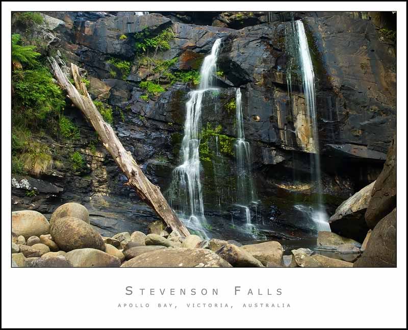
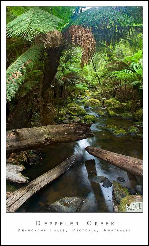
not too fond of the big log in the second shot,
this is my least favourite of the series.
Steve