|
Got a thin skin? Then look elsewhere. Post a link to an image that you've made, and invite others to offer their critiques. Honesty is encouraged, but please be positive in your constructive criticism. Flaming and just plain nastiness will not be tolerated. Please note that this is not an area for you to showcase your images, nor is this a place for you to show-off where you have been. This is an area for you to post images so that you may share with us a technique that you have mastered, or are trying to master. Typically, no more than about four images should be posted in any one post or thread, and the maximum size of any side of any image should not exceed 950 px.
Moderators: Greg B, Nnnnsic, Geoff, Glen, gstark, Moderators
Forum rules
Please note that image critiquing is a matter of give and take: if you post images for critique, and you then expect to receive criticism, then it is also reasonable, fair and appropriate that, in return, you post your critique of the images of other members here as a matter of courtesy. So please do offer your critique of the images of others; your opinion is important, and will help everyone here enjoy their visit to far greater extent.
Also please note that, unless you state something to the contrary, other members might attempt to repost your image with their own post processing applied. We see this as an acceptable form of critique, but should you prefer that others not modify your work, this is perfectly ok, and you should state this, either within your post, or within your signature.
Images posted here should conform with the general forum guidelines. Image sizes should not exceed 950 pixels along the largest side (height or width) and typically no more than four images per post or thread.
Please also ensure that you have a meaningful location included in your profile. Please refer to the FAQ for details of what "meaningful" is.
 by NikonUser on Wed Feb 22, 2006 9:14 pm by NikonUser on Wed Feb 22, 2006 9:14 pm
Evening All, 
I've been refining the border that I will be using on my photo site...
I'd like to keep the site looking nice and uniform so would prefer to choose one border style for the whole site.
I've made these two and am undecided as to which one I prefer... actually I do have a preference but I'm wondering what other people's opinions are?
The site's background is a medium grey colour. The look I'm after is professional and neat.
Any help and advice on which colour is better would be greatly appreciated. Also any other tips on the borders.
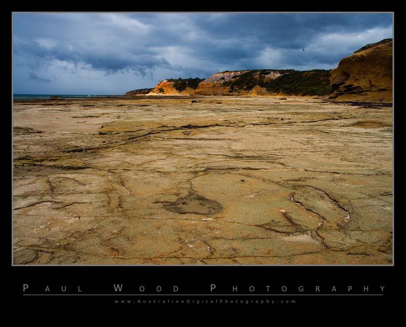
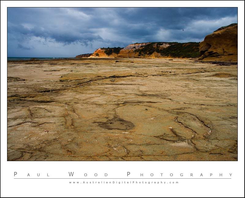
Paul
-

NikonUser
- Senior Member
-
- Posts: 1064
- Joined: Tue Jul 12, 2005 6:18 pm
- Location: Canberra - **D2X**
-
by Willy wombat on Wed Feb 22, 2006 10:04 pm
I lean to the black but hard to say without seeing in on the grey.
-

Willy wombat
- Senior Member
-
- Posts: 2284
- Joined: Mon Jun 20, 2005 10:47 pm
- Location: Bentleigh, VIC Australia
by stubbsy on Wed Feb 22, 2006 10:19 pm
Paul, my experience is that most images get overpowered by the border in a dark frame so I generally prefer white.
-

stubbsy
- Moderator
-
- Posts: 10748
- Joined: Wed Dec 08, 2004 7:44 pm
- Location: Newcastle NSW - D700
-
by BBJ on Wed Feb 22, 2006 11:15 pm
I like both  Paul did you realise that you have a dust bunny 1/3 of the way in from the right hand side, might want to clone it out.
Cheers
John D3,D2x,D70,18-70 kit lens,Sigma 70-200mm F2.8EX HSM,Nikon AF-I 300m F2.8, TC20E 2X 80-400VR,SB800,Vosonic X Drive,VP6210 40 http://www.oz-images.com
-

BBJ
- Senior Member
-
- Posts: 3651
- Joined: Mon Nov 15, 2004 8:49 pm
- Location: Mt Gambier South Australia-D70-D2X
-
by shutterbug on Wed Feb 22, 2006 11:24 pm
White for me 
-

shutterbug
- Senior Member
-
- Posts: 1853
- Joined: Fri Jan 07, 2005 11:32 am
- Location: A Pub in Sydney / Bankstown
by NikonUser on Thu Feb 23, 2006 1:35 pm
Thanks for the votes...
I was leaning towards black as I think it brings out the colours on the picture more. I do however agree that it takes some of the emphasis away from the picture.
It's a fairly close vote (if you include mine as well). I think I'll try browsing a few more 'pro' photography sites and see what sort of frames they are all using as well.
Paul
-
NikonUser
- Senior Member
-
- Posts: 1064
- Joined: Tue Jul 12, 2005 6:18 pm
- Location: Canberra - **D2X**
-
by wendellt on Thu Feb 23, 2006 1:42 pm
white seems to suit that particular picture better but overall black is my preference without the grey border
on my website all the backgrounds are black
-

wendellt
- Outstanding Member of the year (Don't try this at home.)
-
- Posts: 4078
- Joined: Sun Feb 20, 2005 10:04 am
- Location: Dilettante Outside the City Walls, Sydney
-
by Aussie Dave on Thu Feb 23, 2006 1:44 pm
Hi Paul
what colour is the page background going to be ? This will also have a determining factor in what the frame (and photo) looks like.
If it's a dark colour, the black background will get lost and lose it's impact over the photo.....so black may be an advantage (depending on how you look at it). The same could be said for the white.
How much of a contrast do you want the frames to have with the background page colour ?
Something else to consider.....
Nice frames though. I really like both yours & Stubbsy's frames. They have a signature kind of look to them.....which is good. Dave
Nikon D7000 | 18-105 VR Lens | Nikon 50 1.8G | Sigma 70-300 APO II Super Macro | Tokina 11-16 AT-X | Nikon SB-800 | Lowepro Mini Trekker AWII
Photography = Compromise
-

Aussie Dave
- Senior Member
-
- Posts: 1427
- Joined: Sun Nov 21, 2004 1:40 pm
- Location: West. Suburbs, Melbourne [Nikon D7000]
by NikonUser on Thu Feb 23, 2006 1:47 pm
Dave,
The background is a medium grey colour (#7b7b7b)
If you click on my website link you will see the colour used on the main page (you don't have to go into the gallery as it's the same colour)
As to how much contrast I want.... Well I dunno.... I just want something that looks good
Paul
-
NikonUser
- Senior Member
-
- Posts: 1064
- Joined: Tue Jul 12, 2005 6:18 pm
- Location: Canberra - **D2X**
-
by Aussie Dave on Thu Feb 23, 2006 1:58 pm
Looking at your galleries, the white borders look great, and really stand out from the grey. I'd be inclined to stick to the white.
Perhaps you can put the comparison images on your site and have a look ?
Also, very nice website. Clean, clear and easy to navigate. Great work !
Dave
Nikon D7000 | 18-105 VR Lens | Nikon 50 1.8G | Sigma 70-300 APO II Super Macro | Tokina 11-16 AT-X | Nikon SB-800 | Lowepro Mini Trekker AWII
Photography = Compromise
-
Aussie Dave
- Senior Member
-
- Posts: 1427
- Joined: Sun Nov 21, 2004 1:40 pm
- Location: West. Suburbs, Melbourne [Nikon D7000]
by NikonUser on Thu Feb 23, 2006 2:10 pm
Aussie Dave wrote:Looking at your galleries, the white borders look great, and really stand out from the grey. I'd be inclined to stick to the white.
Perhaps you can put the comparison images on your site and have a look ?
Also, very nice website. Clean, clear and easy to navigate. Great work !
A very good idea indeed
Here is a link to a test gallery.
http://www.australiandigitalphotography ... itemId=108
Thanks for the comments about the site. Now all I have to do is add some actual content!
Paul
-
NikonUser
- Senior Member
-
- Posts: 1064
- Joined: Tue Jul 12, 2005 6:18 pm
- Location: Canberra - **D2X**
-
by sydneywebcam on Thu Feb 23, 2006 2:24 pm
Hi Paul,
Having looked at your website (very nice by the way) my preference would be for a white frame rather than the black. The white goes much better with your grey background. The black frame certainly looks great around the image on a white background, but with the grey the white gives a better contrast.
_________________
Cheers,
Paul.
-
sydneywebcam
- Member
-
- Posts: 77
- Joined: Wed Oct 05, 2005 12:55 am
- Location: Pennant Hills, Sydney
-
by wile_E on Thu Feb 23, 2006 2:35 pm
White for me as well, given your grey background website colour. The only other thing I would suggest is to make the writing stand out a bit more by using a slightly darker grey colour.
-

wile_E
- Member
-
- Posts: 198
- Joined: Tue Nov 23, 2004 12:34 pm
- Location: Maroubra, Sydney
by NikonUser on Thu Feb 23, 2006 4:33 pm
Thanks everyone,
After putting the pics up on the site and the discussion I've decided to go with white.
I do like the black but think a) white looks better on my site's background colour and b) the black does tend to overpower the pic a little bit.
Paul
-
NikonUser
- Senior Member
-
- Posts: 1064
- Joined: Tue Jul 12, 2005 6:18 pm
- Location: Canberra - **D2X**
-
by avkomp on Thu Feb 23, 2006 5:57 pm
I am late to this thread,
I personally put black frames around images I post in forums as I prefer it.
Looking at your website however, the white is a clear winner over the black, considering the grey background.
Steve
-

avkomp
- Senior Member
-
- Posts: 2485
- Joined: Sun May 29, 2005 8:47 pm
- Location: Bendoura NSW - Nikon D5
-
by gunn parker on Fri Feb 24, 2006 12:23 am
Black for me, after looking at your great gallery, I still go for the black border.
Andrew
Fuji Finepix s9500>>>D70s 18-70 lens
-
gunn parker
- Member
-
- Posts: 134
- Joined: Mon Jan 09, 2006 4:53 pm
- Location: Willetton, Perth, Western Australia
-
Return to Image Reviews and Critiques
|
