Page 1 of 1
Help Me Choose A Border

Posted:
Wed Feb 22, 2006 9:14 pmby NikonUser
Evening All,

I've been refining the border that I will be using on my photo site...
I'd like to keep the site looking nice and uniform so would prefer to choose one border style for the whole site.
I've made these two and am undecided as to which one I prefer... actually I do have a preference but I'm wondering what other people's opinions are?
The site's background is a medium grey colour. The look I'm after is professional and neat.
Any help and advice on which colour is better would be greatly appreciated. Also any other tips on the borders.
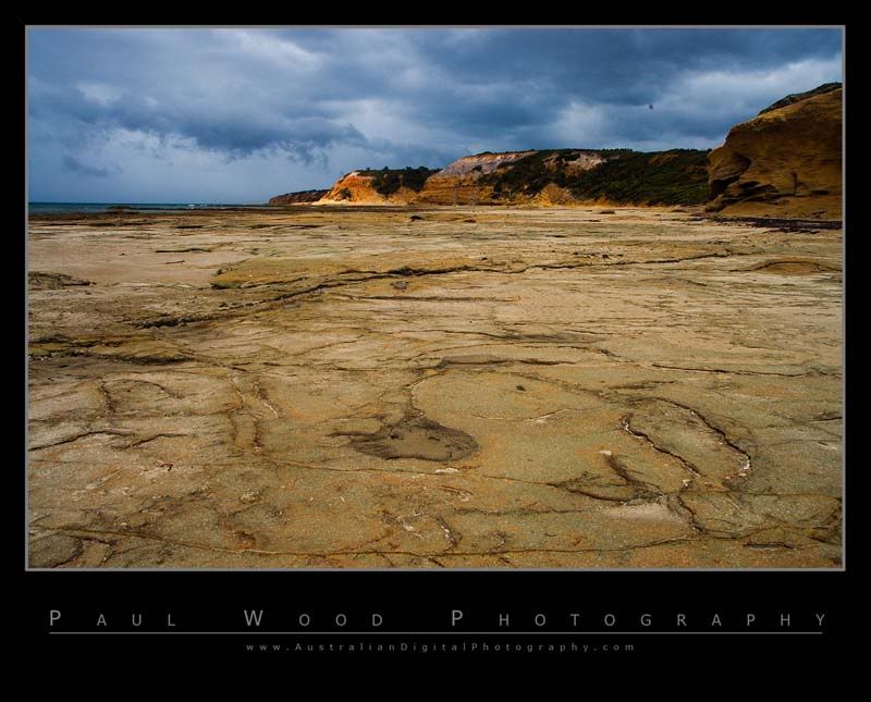
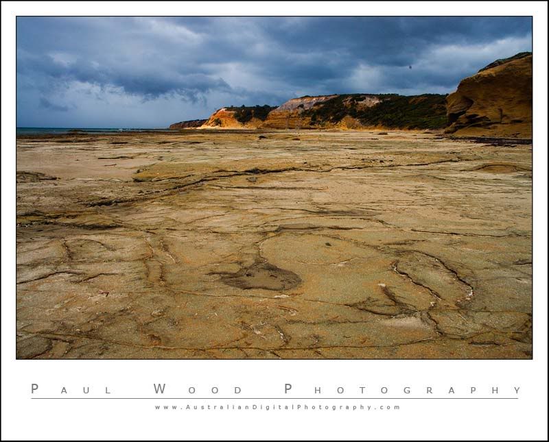
Paul
Posted:
Wed Feb 22, 2006 10:04 pmby Willy wombat
I lean to the black but hard to say without seeing in on the grey.
Posted:
Wed Feb 22, 2006 10:19 pmby stubbsy
Paul, my experience is that most images get overpowered by the border in a dark frame so I generally prefer white.
Posted:
Wed Feb 22, 2006 11:15 pmby BBJ
I like both

Paul did you realise that you have a dust bunny 1/3 of the way in from the right hand side, might want to clone it out.
Cheers
John
Posted:
Wed Feb 22, 2006 11:24 pmby shutterbug
White for me

Posted:
Thu Feb 23, 2006 1:35 pmby NikonUser
Thanks for the votes...
I was leaning towards black as I think it brings out the colours on the picture more. I do however agree that it takes some of the emphasis away from the picture.
It's a fairly close vote (if you include mine as well). I think I'll try browsing a few more 'pro' photography sites and see what sort of frames they are all using as well.
Paul
Posted:
Thu Feb 23, 2006 1:42 pmby wendellt
white seems to suit that particular picture better but overall black is my preference without the grey border
on my website all the backgrounds are black
Posted:
Thu Feb 23, 2006 1:44 pmby Aussie Dave
Hi Paul
what colour is the page background going to be ? This will also have a determining factor in what the frame (and photo) looks like.
If it's a dark colour, the black background will get lost and lose it's impact over the photo.....so black may be an advantage (depending on how you look at it). The same could be said for the white.
How much of a contrast do you want the frames to have with the background page colour ?
Something else to consider.....
Nice frames though. I really like both yours & Stubbsy's frames. They have a signature kind of look to them.....which is good.
Posted:
Thu Feb 23, 2006 1:47 pmby NikonUser
Dave,
The background is a medium grey colour (#7b7b7b)
If you click on my website link you will see the colour used on the main page (you don't have to go into the gallery as it's the same colour)
As to how much contrast I want.... Well I dunno.... I just want something that looks good
Paul
Posted:
Thu Feb 23, 2006 1:58 pmby Aussie Dave
Looking at your galleries, the white borders look great, and really stand out from the grey. I'd be inclined to stick to the white.
Perhaps you can put the comparison images on your site and have a look ?
Also, very nice website. Clean, clear and easy to navigate. Great work !
Posted:
Thu Feb 23, 2006 2:10 pmby NikonUser
Aussie Dave wrote:Looking at your galleries, the white borders look great, and really stand out from the grey. I'd be inclined to stick to the white.
Perhaps you can put the comparison images on your site and have a look ?
Also, very nice website. Clean, clear and easy to navigate. Great work !
A very good idea indeed
Here is a link to a test gallery.
http://www.australiandigitalphotography ... itemId=108
Thanks for the comments about the site. Now all I have to do is add some actual content!
Paul
Posted:
Thu Feb 23, 2006 2:24 pmby sydneywebcam
Hi Paul,
Having looked at your website (very nice by the way) my preference would be for a white frame rather than the black. The white goes much better with your grey background. The black frame certainly looks great around the image on a white background, but with the grey the white gives a better contrast.
_________________
Cheers,
Paul.
Posted:
Thu Feb 23, 2006 2:35 pmby wile_E
White for me as well, given your grey background website colour. The only other thing I would suggest is to make the writing stand out a bit more by using a slightly darker grey colour.
Posted:
Thu Feb 23, 2006 4:33 pmby NikonUser
Thanks everyone,
After putting the pics up on the site and the discussion I've decided to go with white.
I do like the black but think a) white looks better on my site's background colour and b) the black does tend to overpower the pic a little bit.
Paul
Posted:
Thu Feb 23, 2006 5:57 pmby avkomp
I am late to this thread,
I personally put black frames around images I post in forums as I prefer it.
Looking at your website however, the white is a clear winner over the black, considering the grey background.
Steve
Posted:
Fri Feb 24, 2006 12:23 amby gunn parker
Black for me, after looking at your great gallery, I still go for the black border.
Andrew