Page 1 of 1
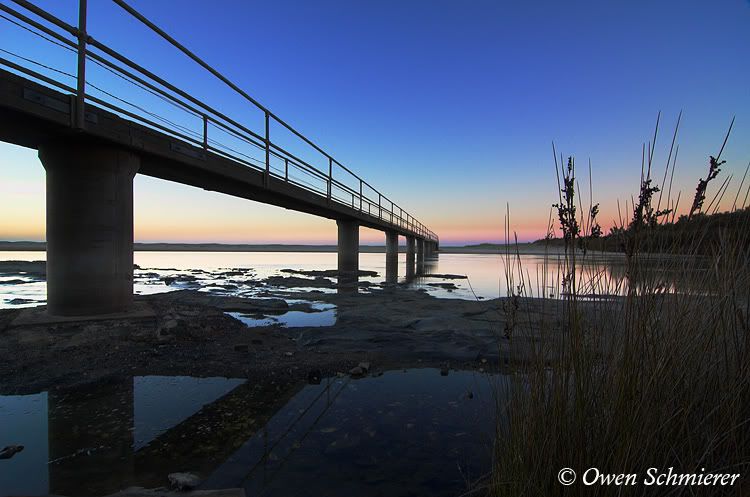
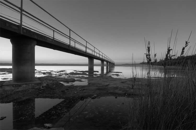
Before Sunrise

Posted:
Mon Mar 06, 2006 6:42 pmby owen
Hi Guys. Unsure which version I like better, the colour or the black and white.
I'd like to hear your opinion.
Cheers,
Owen.
Posted:
Mon Mar 06, 2006 6:53 pmby sheepie
Hey Owen

I know what you mean, they are both great pics in their own right
I think I'm tending towards the B&W one, which is unusual for me. It just seems to have a bit more depth about it.
Posted:
Mon Mar 06, 2006 7:04 pmby owen
Hi Sheepie. Thanks for your comment, I am inclining towards the b&w version as well. discovered it purely by accident - I was playing around in lab
mode and this was the lightness channel.
I passed this one up when I was processing my shots from a few weeks ago, I guess it doesn't hurt to go back through them once in a while.
Cheerio.
Owen.
Posted:
Mon Mar 06, 2006 7:19 pmby avkomp
I may be in the minority but I prefer the colour one.
Steve
Posted:
Mon Mar 06, 2006 7:35 pmby big pix
colour for me ....... but a bit earlier so there is more colour in the sky.......
Posted:
Mon Mar 06, 2006 7:38 pmby christiand
Hi,
I like both photos.
I think these two photos each give a different message:
No: 1 vibrant, energetic, nice colours, the day is rising, things to happen ...
No: 2 suttle, nice tonal shades, softer story, more relaxed.
My 20 cents,
CD
Posted:
Mon Mar 06, 2006 7:41 pmby bloop
I like the coloured one, not enough contrast in the B/W for my liking.
Posted:
Mon Mar 06, 2006 7:48 pmby vort
Colored vers. for sure! The tones of the sky are simply magnificent. What camera was used? Settings?
Posted:
Mon Mar 06, 2006 8:10 pmby marcotrov
Beautiful shot Owen. IMO the colour suits this image better Owen as those pastel tones really enhance the image. Whereas black and white would be better suited to a more contrasty image.
cheers
marco
Posted:
Mon Mar 06, 2006 8:39 pmby owen
Thanks guys.
This was taken with the D70 featuring the tokina 12-24 at 12mm. The sky colours were enhanced when I did a levels adjustment, but saturation stayed as is.
I appreciate the comments regarding preference to colour or black and white... I still like black and white - I did try increasing the overall contrast but there were too many dark areas in it.
Again thanks for the comments.
Posted:
Mon Mar 06, 2006 9:20 pmby Nikon boy
Owen, both are great, but i have to go for the colour pic ,,,lovely
Posted:
Mon Mar 06, 2006 10:07 pmby Big V
The colour version has got so much more going on it just grabs you..nice..
Posted:
Mon Mar 06, 2006 10:27 pmby Manta
Tough call Owen. I can't pick between them. The test I use is "Would I want them hanging in my living room and would I enjoy looking at it every day?". Answer is "Yes" on both counts for both these shots. Excellent images, each a winner in its own way.
Posted:
Mon Mar 06, 2006 11:11 pmby Geoff
Both are beautiful Owen, and you have been putting out some great work lately but my preference is the colour one
Well done my friend. Keep up the excellent 'work'

Posted:
Tue Mar 07, 2006 8:14 amby johnd
Owen, a beautiful shot. I like the coloured version best. A suggestion, if I could be so bold: have you tried cropping off the bottom third of the (coloured) image. I did so by just scrolling the page down and IMHO it adds even more punch to the shot.
Cheers
John
Posted:
Tue Mar 07, 2006 8:34 amby PiroStitch
It's a tough choice, but if you held me at gunpoint, I'd have to choose the colour version. The colours in it are just a bit different and gives it a bit of oomph. The b&w, while it creates a nice atmosphere, the grass to the right get a bit lost.
Posted:
Tue Mar 07, 2006 8:36 amby Pa
g/day owen i prefer the colour image and as john says, crop of the bottom of it .
pa
Posted:
Tue Mar 07, 2006 8:46 amby dreams
Nice pic, i prefer the coloured one too. i cant judge if its sunrise with the B&w, if ur first intetion is to shoot sunrise, thats imho
Posted:
Tue Mar 07, 2006 1:20 pmby darb
lovce the colours, nice, up early i see !
i would have loved to see a shot also without the foreground reeds ... or even standing other side of bridge with bridge and sunrise colours on right of composition and a wide expanse to the left ... but may not have worked (cant see obviously)
Posted:
Tue Mar 07, 2006 7:08 pmby mudder
Definately the color one for me out of these, but maybe if the contrast in the B&W one was increased a smidge I might be swayed...
The color one seems to scream nice soft, late light and the color and tone makes the shot for me...
I assume it's just me but the color one looks sharper for some reason???

Posted:
Tue Mar 07, 2006 7:13 pmby owen
Thanks for all the comments. It appears the black and white is falling out of favour
However I still prefer it... just one of those things I guess.
The black and white was copied after sharpening so I am not sure about the sharpness.
darb:
This was taken from the other side of the bridge, but at 18mm rather than 12mm.
Cheers,
Owen.