How can i crop and Photoshop this to make it perfect for printing?

A discussion forum - and more - for users of Digital Single Lens Reflex cameras.
This photo for printing...Moderators: Greg B, Nnnnsic, Geoff, Glen, gstark, Moderators
Forum rules
Please note that image critiquing is a matter of give and take: if you post images for critique, and you then expect to receive criticism, then it is also reasonable, fair and appropriate that, in return, you post your critique of the images of other members here as a matter of courtesy. So please do offer your critique of the images of others; your opinion is important, and will help everyone here enjoy their visit to far greater extent. Also please note that, unless you state something to the contrary, other members might attempt to repost your image with their own post processing applied. We see this as an acceptable form of critique, but should you prefer that others not modify your work, this is perfectly ok, and you should state this, either within your post, or within your signature. Images posted here should conform with the general forum guidelines. Image sizes should not exceed 950 pixels along the largest side (height or width) and typically no more than four images per post or thread. Please also ensure that you have a meaningful location included in your profile. Please refer to the FAQ for details of what "meaningful" is.
Previous topic • Next topic
23 posts
• Page 1 of 1
This photo for printing...
I really love this shot, but the background is blown!
How can i crop and Photoshop this to make it perfect for printing? 5D | 16-35L | 35L | 85L | 135L | 70-200F2.8IS | 580EX
My Blog - http://www.allkris.com My Flickr - http://www.flickr.com/photos/dastrix My Website - http://www.kriskeen.com.au
You're right - a GREAT image. I'm not a PS expert but I don't think the blown background hugely distracts from the image. I'm sure others will have a better idea on how best to 'deal' with this.
Geoff
Special Moments Photography Nikon D700, 50mm 1.4, 85mm 1.4, 70-200 2.8VR, SB800 & some simple studio stuff.
A lovely portrait, great natural subjects with a happy natural smile, great image...
For PP, I'm just rambling now... I'd be tempted to select the background and blur a bit to take detail away (especially the street sign in the background) but I wouldn't apply the blur to the leaves entering the frame in the top right corner as they're the same distance from the camera as your subject so they might look "faked" if they were blurred, plus they frame your subject nicely.. While the background's still selected you could lower the white point using the end point of a curve to make the white more "gray" maybe? Possibly darken the overall background a smidge to make it hit the viewer less... Hmmm, maybe a vignette too, to force the viewer's eye to stay on your subject? Just tossing some stuff around Aka Andrew
Good advice Andrew!
Geoff
Special Moments Photography Nikon D700, 50mm 1.4, 85mm 1.4, 70-200 2.8VR, SB800 & some simple studio stuff.
This is a LOVELY shot and is well and truly worthy of framing (well, for the people involved, anyway!! otherwise that's just creepy....
I do not know how to do it myself, but would you consider getting rid of that background altogether? Either reshoot a "nicer" outdoor background somewhere else, or dummy up a plain one in PS? (ie that looks like a backdrop, maybe) Would these options look too fake?? Well shot, anyway.... cheers. Rae
. All the gear and no idea. PPOK / Others' pics in my threads OK
Good idea, if you use a background that's a mottled green and other pale color, you could make the join between the subjects little details like the hair blend in well with a replaced background... Aka Andrew
I was going to suggest replacing the background too.
Getting around the guys hair could be tricky but with a bit of time it would work. (I just did it very quickly in PSCS2 and the hair was the only bit that didn't turn out well) 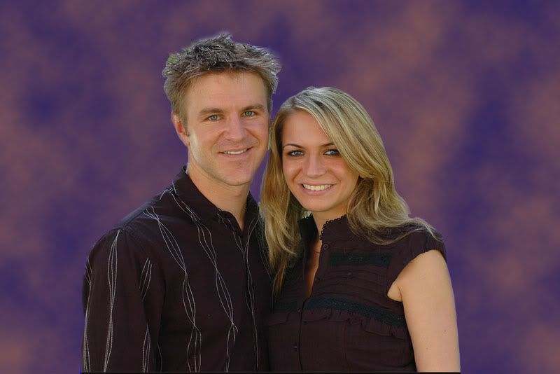
You'd obviously choose a better background Paul http://www.australiandigitalphotography.com
Living in poverty due to my addiction to NIKON... Is there a clinic that can help me?
You could go a couple of ways here...
You could either using the color replace, zoom in and replace the color in the daggy bits around the edges with the same color as the background. Or you could use a different background, one with a mottled type of appearance with a couple (or more!) colors in it, so the daggy edge bits will blend in more... Just something blurry and bugger all detail to take attention away from your subject... The hair's usually the tricky bit, dunno but this might help, worth a try... When working with selections, you could go into the channels palette and select one of the color channels just for making your selections. Some color channels give greater contrast than others, depending on the scene, use them to make your selection, then just go back into RGB when making the change... Worth a try... Aka Andrew
That's what I did http://www.australiandigitalphotography.com
Living in poverty due to my addiction to NIKON... Is there a clinic that can help me?
That is an excellent background...but a bit bright. Try this....using the polygonal lassoo click a rough line about 1 cm outside the people. Close the loop then go to SELECT/FEATHER and set a feather of around 150. Go back to SELECT/INVERT and invert the selection. Go to levels and darken the background, but don't overdo it.
Regards
Matt. K
Nice work!
The background is not too bad, but maybe I would consider selecting it and simply making it darker. I think you can quite easily go overboard with PPing the background, when all that is required is a simple darkening.. IMO
Kris,
Two points. 1: I would have preferred to see this shot in portrait orientation. Guess why it's called "portrait"? But had you done that, your question probably wouldn't have been asked. 2: That said, I don't see a problem with background. Yes, it's blown, but so what? The people are the subject, and they're perfectly exposed. The blown background only helps to focus attention on the people, and in that respect it's only down the scale a little from, say, a high key image. Don't sweat it. 3: If you really feel a need to do something, crop it into a portrait orientation; I suspect that it'll look better. g.
Gary Stark Nikon, Canon, Bronica .... stuff The people who want English to be the official language of the United States are uncomfortable with their leaders being fluent in it - US Pres. Bartlet
This was a quickie on the orig, tricky with low res stuff, but all I did was:
select the background but not the leaves in the TR cnr using a curve darken and reduce the white level down Slightly blur the background A smidge of levels just on the subjects a vignette Oh, and I cheated and whitened her teeth (too much)... You could do a lot more if you spend time on the high res version... This is a bit rough of course but you get the idea... This is just one quick way using the original background... Maybe a crop??? Kris, pls let me know and I'll take the image down... Orig: 
Quickie modified:  Aka Andrew
hello Andrew, i think the darken is a little to ex7reme. try feathering your selection a bit further
Last edited by redline on Tue Mar 21, 2006 10:55 pm, edited 1 time in total.
Life's pretty straight without drifting
http://www.puredrift.com
Yeah, I couldn't help it when I zoomed in a bit...
You're right, t'was a quickie and I didn't bother to blur the mask before posting... Aka Andrew
woah alot of replies. I think i'll do the crop, some sharpening and call it quits
Ill definately remove that sign from the picture! Thanks guys! I'm really happy with the shot i just wish all of them would come out like this! 5D | 16-35L | 35L | 85L | 135L | 70-200F2.8IS | 580EX
My Blog - http://www.allkris.com My Flickr - http://www.flickr.com/photos/dastrix My Website - http://www.kriskeen.com.au
how about this?

Just a quickie...didn't spend too much time on it, otherwise would have tried to go for selective colouring. Hassy, Leica, Nikon, iPhone
Come follow the rabbit hole...
very quick and dirty go at this (which is why it looks like a fake background), but i'm a little short on time tonight.... if you spend some time on it you could eliminate the highlights and clone out the sign etc

cheers http://www.markcrossphotography.com - A camera, glass, and some light.
Was it a RAW or JPG? If it was a RAW, you could do several developments, one for the background which should reduce a good portion of the blowout and then do another for the peoples and merge them.
Nice portrait by the way! Smile; it makes people wonder what you have been up to.
Previous topic • Next topic
23 posts
• Page 1 of 1
|


