Page 1 of 1

Please help me get this image right

PostPosted: Thu Mar 30, 2006 7:48 pm
by owen
Hi Guys.

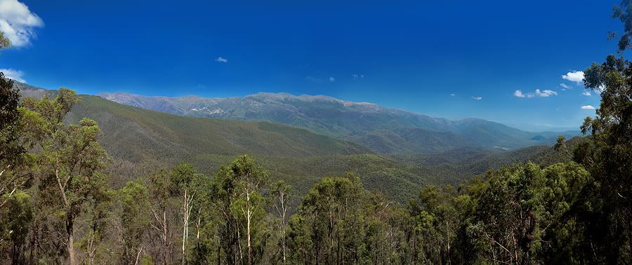
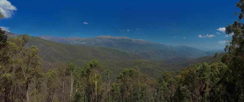
Going through my old photos seeing as my camera is at the doctor. I have this 4 image panorama that I stupidly used the polariser on, plus I didn't go to the effort of putting the camera on tripod, setting everything to manual etc. It was just click click click click. So I've been struggling to get the colours matched for each image and to sort the sky out, but it's still a bit blotchy.

Can anyone give me any ideas how to smooth the sky out. Things I've tried include:
low opacity blue colour to go over it
low opacity clone tool
blue gradient over the sky

Any other ideas would be greatly appreciated.

Image

Thanks,
Owen.

PostPosted: Thu Mar 30, 2006 8:18 pm
by NikonUser
How about a new layer (blue)

with a gradiant mask attached? Also mask out the clouds so they can be seen too.

I haven't done much stuff like that but it could work :)

PostPosted: Thu Mar 30, 2006 8:23 pm
by owen
Thanks mate, I have been playing around with it and I think I've got the version I want now. :) Thanks for responding.

PostPosted: Thu Mar 30, 2006 8:28 pm
by mudder
G'day mate,

Gee, I don't think I can even see any exposure matching issues with this one, unless it's more obvious at a larger (printing?) size... Although when I zoom in the sky looks "blotchy" though, have you already used the spot healing tools or anything?

Not sure if it's just because I'm zooming in on a low res image or not, but how did you merge them (wondering whether you've used an auto tool like panofactory or something), and do you still have the originals?

PostPosted: Thu Mar 30, 2006 8:31 pm
by big pix
I had a 2 minute play using lab colour..........

Image

PostPosted: Thu Mar 30, 2006 8:43 pm
by owen
Thanks big pix, to me that looks a little artificial though, but thanks for having a go for me :)

Mudder, the blotchyness was due to me cloning and trying to merge a darker sky with a brighter more saturated sky, cloning and generally messing around. It was all done in photoshop and looked much worse in the larger image. I managed to do a few light strokes of blue between the splotchiness and it looks much better (to me) now :)

Image

PostPosted: Thu Mar 30, 2006 8:51 pm
by mudder
At web posting size it looks fine, after looking for them there's a couple of areas where the "brightness" seems to have a bit of a "vertical band" in a couple of spots in the hills in the background but that's only after looking for them...

Sometimes the healing brush can do wonders for evening out an area, sometimes it leaves a "blotchiness(?)" behind when I've used it, maybe too high an opacity for the brush for the job at hand maybe...

Looks fine unless you're going to print it large-ish :)