Page 1 of 1
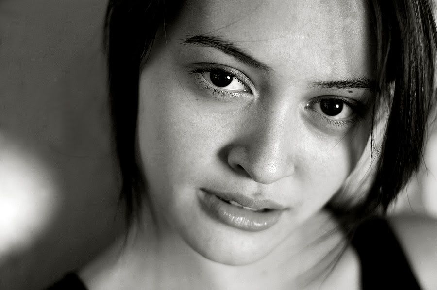
A picture from today - My first proper organised 'model' sho

Posted:
Mon May 01, 2006 8:31 pmby vort
 http://www.flickr.com/photos/nicknav/138135291/
My Model didn't really want any photos of her posted however she said it was ok to do this one.
What do you all think?
Shot with my D70 + 50/1.8 .. Gold reflector, converted to BnW.
Cheers

Posted:
Mon May 01, 2006 8:33 pmby babyvtr
a nice shot apart from the white spot on the lower left hand side which i find distracting... very nice
Posted:
Mon May 01, 2006 8:37 pmby Alpha_7
Nice use of depth of field.

Posted:
Mon May 01, 2006 8:39 pmby Zeeke
I'll Agree with Jennifer on this... Great image.. but the white spot is annoyingly distracting.. .. nice depth of field too
Tim
Posted:
Mon May 01, 2006 8:41 pmby big pix
to use depth of field I beleive you stop the lens down...... to use a lens wide open there is no depth of field........ or lack of.....
Posted:
Mon May 01, 2006 8:41 pmby Alex
Very nice. The white spot doesn't bother me as much as the black 'dirt' on the wall on the right hand side. Eyes are very sharp!
Alex
Posted:
Mon May 01, 2006 8:46 pmby MattC
Even with the white spot (clone tool?) those big brown (?) eyes just draw me in. Use of DOF really accentuates that.
Well done.
Cheers
Posted:
Mon May 01, 2006 8:51 pmby big pix
MattC wrote: Use of DOF really accentuates that.
Well done.
Cheers
it is called shallow depth of field....... or shooting wide open........
Posted:
Mon May 01, 2006 8:54 pmby beetleboy
big pix - i think you're nitpicking a little there!
"Use of depth of field" is bloody close enough! Using a shallow depth of field is a "use of depth of field"! Even if you use a lens wide open, you still have a depth of field: it's just shallow! If you had "NO" depth of field the whole image would be out of focus!
Not snapping at you, just thought the comment might discourage some people.
Liam =]
Posted:
Mon May 01, 2006 8:58 pmby Alpha_7
beetleboy wrote:big pix - i think you're nitpicking a little there!
"Use of depth of field" is bloody close enough! Using a shallow depth of field is a "use of depth of field"! Even if you use a lens wide open, you still have a depth of field: it's just shallow! If you had "NO" depth of field the whole image would be out of focus!
Not snapping at you, just thought the comment might discourage some people.
Liam =]
I'm guilty of the same comment aswell.
Posted:
Mon May 01, 2006 8:59 pmby daniel_r
Vort, well done.
When I first opened the thread I thought "Phwaar, excellent image!"
The composition is well thought out, and the shadows not too harsh.
For my tastes in PP (this could be just me though), I feel that you've lost a little too much tonality on the right hand side during processing. It's a bit too bright (just a tad).
As others have commented, a bit of cloning could clean up the dark corner (top left), the black splotches in the background, and the spots on the edge of the highlight as well. I think if you removed these, you're on the path to a real winner here.
This is a bit of quick demo (very quick 'n' scrappy cloning) of what I had in mind, with bit of a bump to help bring back some of the tones. I'm also working on my non-profiled LCD, so take it as a rough guide only.
If you (or your subject) want the image taken down, just say so and it's gone!
edit:
BTW, I'm no portraiture expert - I could be just talking utter shite here!
Posted:
Mon May 01, 2006 9:00 pmby vort
Alex wrote:Very nice. The white spot doesn't bother me as much as the black 'dirt' on the wall on the right hand side. Eyes are very sharp!
Alex
Thanks.
The shot was taken against a rusting yellow door down the end of my road in the industrial-ish area. The 'dirt' you mention is actually the rust. I think it really adds to the the shot. You can't really distinguish it there, though.
Thanks for the comments everyone.
I agree that the white spot is a bit annoying but I think I like it there anyway
Posted:
Mon May 01, 2006 9:01 pmby Sheila Smart
I am not sure the choice of the 50 mm was the right one. On my monitor, the lovely face appears to be a tad distorted as if it were taken with a wide angle lens.
Sheila
Posted:
Mon May 01, 2006 9:03 pmby big pix
to use a term "nice use of depth of field" means the lens is stopped down, to use a shallow depth of field means the lens is used wide open, if the members are serious about photography, which I think a lot are, and are willing to learn, then the correct way to express what is happening in an image is also as important as the way it is presented
Posted:
Mon May 01, 2006 9:06 pmby beetleboy
But the photographer has chosen to use the lens wide open (or with a fairly open aperture) therefore "using" depth of field as a tool..
How can stopping down a lens be "using" DOF but opening it up isn't?
Sorry big pix, gonna have to uphold my disagreement here!!
Liam =]
Posted:
Mon May 01, 2006 9:08 pmby babyvtr
depth of field is depth of field whether it be shallow or deep. depth varies
Posted:
Mon May 01, 2006 9:08 pmby vort
beetleboy wrote:But the photographer has chosen to use the lens wide open (or with a fairly open aperture) therefore "using" depth of field as a tool..
How can stopping down a lens be "using" DOF but opening it up isn't?
Sorry big pix, gonna have to uphold my disagreement here!!
Liam =]
I think big pix may have just mixed the meaning of Wide open and stopped down up
@Daniel_R
I like your edit! However in yours the white spot sticks out alot more. I want to leave the black spots there also for reasons explained in my previous post
I quite like the toning you've done with your edit though. It does look very good!
Posted:
Mon May 01, 2006 9:09 pmby big pix
[quote="big pix"]l to use a shallow depth of field means the lens is used wide open,
I think this explains it all.........
Posted:
Mon May 01, 2006 9:11 pmby rooboy
Gorgeous shot, great use of shallow DOF, it's almost too sharp (you can see every single pore on her nose).
I would say that it's a fantastic use of shallow DOF, drawing attention to the eyes. The white spot is mildly annoying, but not enough so to ruin the photo. Great stuff.
Posted:
Mon May 01, 2006 9:11 pmby Matt. K
vort
That is a beautiful image. It has a lovely 'French' style and would not be out of place in any glossy magazine.
Posted:
Mon May 01, 2006 9:13 pmby big pix
vort wrote:[
I think big pix may have just mixed the meaning of Wide open and stopped down up
I do not think so ........ you should google "depth of field" and learn a little about photography, and after you have spent a number of years learning, you can then tell me I am wrong.........
Posted:
Mon May 01, 2006 9:16 pmby sirhc55
Vort - this is indeed a lovely portrait
Posted:
Mon May 01, 2006 9:21 pmby vort
big pix wrote:vort wrote:[
I think big pix may have just mixed the meaning of Wide open and stopped down up
I do not think so ........ you should google "depth of field" and learn a little about photography, and after you have spent a number of years learning, you can then tell me I am wrong.........
Um?
I don't claim to be an expert of photography however your arguments really are jumbled.
I know what depth of field is.
I didn't post an image for my intelligence to be insulted, so please, unless you have some constructive criticism on my image don't post anymore. Cheers.
Posted:
Mon May 01, 2006 9:24 pmby MattC
beetleboy wrote:big pix - i think you're nitpicking a little there!
"Use of depth of field" is bloody close enough! Using a shallow depth of field is a "use of depth of field"! Even if you use a lens wide open, you still have a depth of field: it's just shallow! If you had "NO" depth of field the whole image would be out of focus!
Not snapping at you, just thought the comment might discourage some people.
Liam =]
Liam, I was wondering what the heck he was on about! Thanks for clearing that up.
BP, has that one been posted in the pedant corner? If it has then I missed it.
Cheers
Edit: Vort, I thought that we were still on page 1 when I posted this one so I did not see your latest post... Cheers
Posted:
Mon May 01, 2006 9:24 pmby macka
I don't have much constructive to add - really nice shot. I think the DOF works really well, it's perfectly sharp exactly where it needs to be. Your
model shouldn't be worried about having her picture posted.
Edit: Colour one you posted on OCAU is really nice as well.
Posted:
Mon May 01, 2006 9:30 pmby Marty
Hey Vort,
I think that's a great portarit, very similar to the way I like to shoot.
I won't mention dof (what the hell is that
).....
If you or the
model are going to use this shot for a portfolio or commercial work, then a little pp will make this great portrait into a stunning portarit (for my taste anyway).
Marty
Posted:
Mon May 01, 2006 9:31 pmby beetleboy
Sorry about that vort..
Got a bit carried away and I forgot to mention that I agree with the others; the use of shallow depth of field here is excellent. Such a shallow DOF makes it hard to nail the exact point you want sharp and you've done it exceptionally well.
Unlike the others tho I'm not too bothered by the background elements..the white patch in the bottom left may benefit a little from a bit of burning but in all honesty it doesn't bother me. I'm so drawn to those eyes that the rest is not so important to me.
Good work.
Liam =]
Posted:
Mon May 01, 2006 9:41 pmby big pix
vort wrote:big pix wrote:vort wrote:[
I think big pix may have just mixed the meaning of Wide open and stopped down up
I do not think so ........ you should google "depth of field" and learn a little about photography, and after you have spent a number of years learning, you can then tell me I am wrong.........
Um?
I don't claim to be an expert of photography however your arguments really are jumbled.
I know what depth of field is.
I didn't post an image for my intelligence to be insulted, so please, unless you have some constructive criticism on my image don't post anymore. Cheers.
...... pardon.... if you read my first post you will find that I was correcting the use of the term "depth of field"...... and explaining the difference of depth of field and shallow depth of field, it seems that you have missed the point of what was posted along with a few others, and you do not have the orthority to tell me what I can and cannot post....... if I was to insult your intelligence ..... well we will not go there....... in regard to your image I like the lighting and the shadow creates some interest but I find the face distorted from the use of a short lens........
Posted:
Mon May 01, 2006 9:48 pmby vort
http://nicknav.ath.cx:81/shoot/_DSC3813.jpg
Color version
http://nicknav.ath.cx:81/shoot/_DSC3767.jpg
One other pic from the shoot. I'm not terribly happy with how this one turned out, the hair in the face bugs me alot. But hey, it was really windy
They are both hosted on my home connection so go gentle!
Posted:
Mon May 01, 2006 9:58 pmby beetleboy
That second one (with the hair) is one of those times I bet you've looked at the image and gone - oh, so close! Cos that's what I feel about it, the hair thing is cool, just not quite there! A great effort nonetheless; although I also feel you could do with tweaking the yellow hue a little - I often find cooling it a tad helps make the skin tone feel a bit more natural.
Can't say I'm bothered by the use of the 50mm lens (and no this isn't just a "disagree with big pix" comment!!) - I quite like the feel of it. It feels like we're stepping into her personal space without being threatening. I'm not seeing the distortion either..and I wouldn't really expect to with a 75mm equivalent FOV? I could be wrong (would be a first tho! Just jokes!).
Liam =]
Posted:
Mon May 01, 2006 9:59 pmby marcotrov
Terrific portrait together with the offerings from others re- the wall behind I'd add it is incredibly sharp where it counts - her eyes are razor sharp but i'd probably be tempted to soften her nose just a tad or certainly smooth the skin tone of the nose to avoid the focus on the small but cleqarly visible, and distracting blemishes. She is very photogenic. It's a beautiful portrait.
cheers
marco
Posted:
Mon May 01, 2006 10:00 pmby marcotrov
Terrific portrait together with the offerings from others re- the wall behind I'd add it is incredibly sharp where it counts - her eyes are razor sharp but i'd probably be tempted to soften her nose just a tad. She is very photogenic. It's a beautiful portrait.
cheers
marco
Posted:
Mon May 01, 2006 10:02 pmby vort
beetleboy wrote:That second one (with the hair) is one of those times I bet you've looked at the image and gone - oh, so close! Cos that's what I feel about it, the hair thing is cool, just not quite there! A great effort nonetheless; although I also feel you could do with tweaking the yellow hue a little - I often find cooling it a tad helps make the skin tone feel a bit more natural.
Can't say I'm bothered by the use of the 50mm lens (and no this isn't just a "disagree with big pix" comment!!) - I quite like the feel of it. It feels like we're stepping into her personal space without being threatening. I'm not seeing the distortion either..and I wouldn't really expect to with a 75mm equivalent FOV? I could be wrong (would be a first tho! Just jokes!).
Liam =]
The yellow hue is due to the use of the gold reflector
I agree though, I think it might be just a tad too much.
I don't think it's distorted either. That is the shape of her face.
Posted:
Mon May 01, 2006 10:04 pmby Zeeke
Just wondering... but can we see what the image looks like in colour? from the black and white, it looks like your
model would have very nice skin tones.. and would look brilliant as a colour image aswell as a B&W
Tim
Posted:
Mon May 01, 2006 10:05 pmby vort
Zeeke wrote:Just wondering... but can we see what the image looks like in colour? from the black and white, it looks like your
model would have very nice skin tones.. and would look brilliant as a colour image aswell as a B&W
Tim
Look a few posts back, I linked to the color!
Posted:
Mon May 01, 2006 10:11 pmby beetleboy
Have you whitened her eyes? If so, good work; if not..holy moley she's a healthy girl!
Liam =]
Posted:
Mon May 01, 2006 10:12 pmby Zeeke
Ahh yea, stupid me heheh.. im like a few people, i dont click on links to images.. I prefer em being loaded by IMG tags.. but now ive seen the colour version.. ... I REALLY LIKE IT!! the colour version is bloody nice.. much prefer it over the B&W... the tones are nice.. and her eyes are perfect.. its like they almost follow you around the room.. its like from whatever direction you look at the image, the eyes are following...
Well Done
Tim
Posted:
Mon May 01, 2006 10:13 pmby vort
beetleboy wrote:Have you whitened her eyes? If so, good work; if not..holy moley she's a healthy girl!
Liam =]
I don't think I did on the color/bw shot, no. I might have dodged it ever so slightly but I don't think so. She does have very bright, white eyes though. They are incredibly gorgeous to see in person.
Posted:
Mon May 01, 2006 10:25 pmby Michael
Well vort
I just performed a few little edits that a few of the other members had previously mentioned, it may not be your cup of tea but it never hurts to try things out even if you think they'll look horrible.
I killed the hot spot obviously, got rid of the slight bag under her right eye as we look at it (nit picking here on my part), burnt in her lips a tad and made a slight vignette.
Posted:
Mon May 01, 2006 10:27 pmby pharmer
Got to say I prefer the colour version - I'm not big on B&W, life is colour.
Very nice portrait - well done
Posted:
Mon May 01, 2006 10:29 pmby Alpha_7
Michael, nice work it might not be everyone's cup of tea, but it is excellent!
Posted:
Mon May 01, 2006 11:33 pmby vort
I don't mind your edit, michael, however personally I think it takes some of the life out of it... It smooths it out too much. I think what appealed most to me was the rough background, the harshlight, and then her big, bold beautiful eyes to balance it off.
I like your edit however it's not much to my tastes
Posted:
Tue May 02, 2006 3:26 pmby vort
After going away for a bit, coming back and looking at it again.. I've come up with this edit...

Comments?
Posted:
Tue May 02, 2006 4:08 pmby macka
Good move getting rid of the various spots in the background in my opinion.
Posted:
Wed May 03, 2006 9:04 amby vort
macka wrote:Good move getting rid of the various spots in the background in my opinion.
Yeah. I find when I've been playing around with an image for a while, it gets stuck in my head and seems right... but I left it alone till yesterday and went back and realised that the spots in the BW version didn't really work.
Posted:
Wed May 03, 2006 9:11 amby Marty
Hey Vort,
its always a good idea to leave your work for a while.
When you come back to it, you see things differently and generally notice areas in the image you may not have seen previously.
Cheers
Marty