Page 1 of 1

Room Service

PostPosted: Fri May 12, 2006 12:45 am
by Marty
Yet another urban grungy shot....
Obviously the cleaner hasn't been for a while.
Marty

Image

PostPosted: Fri May 12, 2006 12:51 am
by Alpha_7
I like it Marty the PP works well to create the grudgy feel, but can I suggest that perhaps "HouseKeeping" might be a better title then Room Service, maybe it's just me but it doesn't seem to suit.

PostPosted: Fri May 12, 2006 1:00 am
by Marty
Hey Craig,
thanks for the comments.
Naming images is hard, it was originally called 'Window Shopping' as you look through multiple windows in the image.
I created many seperate layers for each room/level in this image, the working file is now over 100mb, so lots of details were sadly lost to get it down to a web size.
Cheers
Marty

PostPosted: Fri May 12, 2006 1:10 am
by Geoff
I like this a lot Marty - and would love to see the full res image!
The title - I think it's a personal thing and I think if you like ROom Service then keep it. There are a heap of titles you could put to this. Mate - good work!

PostPosted: Fri May 12, 2006 1:16 am
by Marty
Hey Geoff, thanks.
Maybe I should have called it 'Grotty, Dangerous, Smelly and Scary Drug Den' because thats what it was...!!!
Marty :wink:

PostPosted: Fri May 12, 2006 1:25 am
by Alpha_7
I certainly didn't mean to ruffle any feathers with me suggesting a different title, I think the image title is a personal thing and as it's your image it's certainly your title to choose, it just struck me personally that another might work better (in my mind). BTW I like the window shopping one, clever!

PostPosted: Fri May 12, 2006 1:30 am
by Geoff
Craig - I am sure u didn't rustle any feathers :)

PostPosted: Fri May 12, 2006 1:33 am
by Marty
Hey Craig,
I didnt take any offence in the least.
Sometimes words arent as easy as taking the photos.
Do you know of any locations that suit my style of photography...??
Always willing to look around for a good shoot.
And always willing to risk myself for a good shot.
Cheers
Marty

PostPosted: Fri May 12, 2006 1:40 am
by Marty
Hey Craig, Geoff....
I have heard there are some awesome areas to shoot in Marickville.
Some risky places, but worth it for the images.
Want to team up and have a look..???
Marty

PostPosted: Fri May 12, 2006 1:42 am
by Geoff
Marty - definately, would like to do something a little different.

PostPosted: Fri May 12, 2006 1:48 am
by Marty
Let me speak to my friend who knows the good areas to shoot there.
He is a bikie and knows the locations I am looking for.
Safety in numbers.

PostPosted: Fri May 12, 2006 9:26 am
by gstark
Marty,

As much as I liked the other images that you shot in this series, this one is far and away the best of them. Great use of DoF, great framing, excellent exposure and composition, good use of colour.

PostPosted: Fri May 12, 2006 9:34 am
by Marty
Thanks Gary,
I actually spent around 1 hour to get the image to look like this.
I think thats the big difference, the others didnt really get any real pp..!!!
I am happy you appreciate the DOF, that is exactly the reason why I took this shot.
Cheers Mate.
Marty

PostPosted: Fri May 12, 2006 9:52 am
by stubbsy
Marty

this is a superb image. The amazing depth of field really makes this a top notch shot as does the way it's framed. This final result is well worth the effort you took (and it shows too!)

PostPosted: Fri May 12, 2006 10:09 am
by Marty
Thanks Peter,
the second visit to this site wasn't quite as nerve racking.
I still haven't nailed the perfect set, but getting closer.
Thanks for your comments.

PostPosted: Fri May 12, 2006 10:50 am
by avkomp
this is great.
good use of Dof
Like the 3 distinct levels of this shot, each framed by something from the previous level also.

Well done.

Steve

PostPosted: Fri May 12, 2006 11:21 am
by optogamut
Again this is one of those hard things with us all looking with different monitors. For me sitting back and looking at the image, I don't get a huge sense of depth, the light level is too close across the whole image.
I'd like to see the image with a bit more emphasis on light to dark (or visa-versa) in each for foreground, midground and background.
Nice work! And brave too! :)

cheers,
Danny.

PostPosted: Fri May 12, 2006 11:45 am
by Marty
Thanks Steve.....
Danny, I am viewing on a CRT (big and ugly thing, just like me..) and each room is quite different.
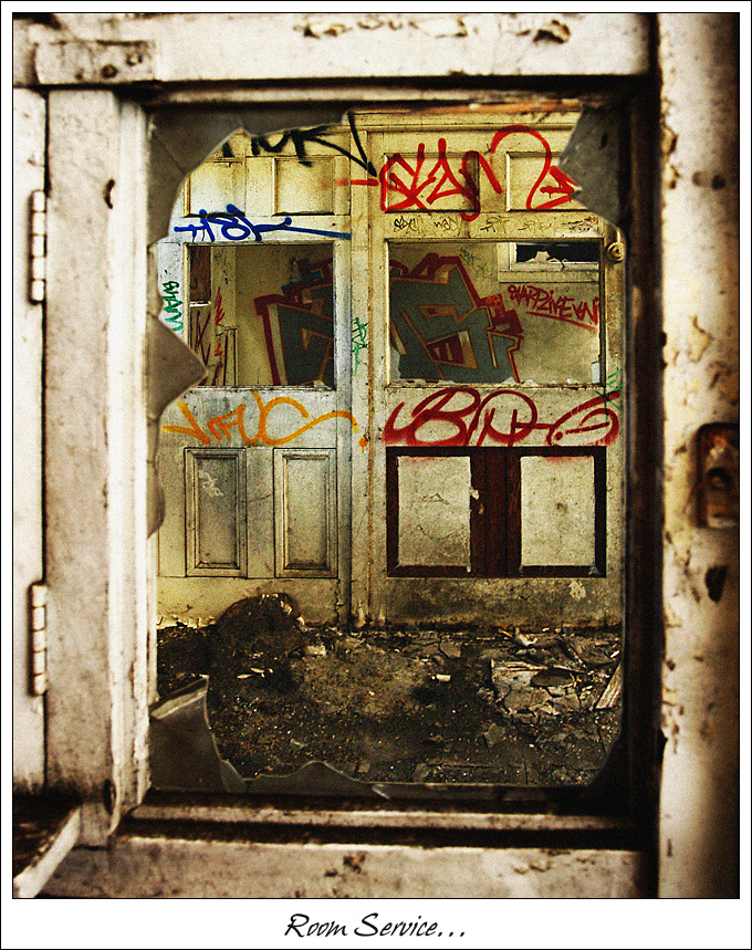
This image is also greatly reduced, from 100mb to 520k for the web, so things start to look quite different.
Thanks for mentioning how it looks to you, I only see it on my screen or when printed, so to me it looks ok, wish we could post and view the originals... :lol: :lol:
And, I am not brave.....more included to say stupid....
Marty

just another point which others may like to contribute to.
I shoot aRGB, process in aRGB, and always save my work in aRGB.
I know I should save a web version in sRGB, but I already have too many versions of each image.....

1. Original from Polaroid camera :wink:
2. Processed file in PSD
3. High Quality JPEG for printing
4. Reduced size JPEG for slideshows
5. Reduced size JPEG for the web

Any comments..???

PostPosted: Fri May 12, 2006 12:04 pm
by stormygirl
Another throught provoking image Marty, and love the treatment you have given it. Well done!

Have you tried the Dragan effect on any of them yet?

PostPosted: Fri May 12, 2006 12:57 pm
by Marty
Hey Jane,
I havent tried the technique you supplied yet.
I will try it though and look at the results.
Cheers
Marty