Page 1 of 1

Silhouettes

PostPosted: Sat May 20, 2006 7:50 pm
by ABG
A few fellow forum members caught up this morning to capture some images of the Opera House at dawn and I was lucky enough to be there. Firstly, let me say what a pleasure it was meeting John (johnd), Trieu, Keith (Firsty) and Craig (Alpha7). I really enjoyed your company and the expertise and experience you shared with me this morning guys.

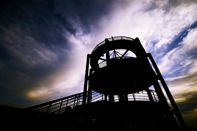
Secondly, a big thank you to Craig who kindly loaned his Sigma 10-20mm lens. I found it difficult to effectively utilise this lens - it really took me some time to get used to just how wide it went! Having said that, it's now high on my 'wanted items' list.

Thirdly, no thanks whatsoever to Keith who now has me lusting after a D200. I arrived at our shoot perfectly happy with my D70. You rotten bastard! :P

Finally, I've posted a couple of images I captured with the Sigma. Please let me know what you think of these images and feel free to be as harsh as you like. If you don't like them, please let me know what it is that doesn't work, or that you don't like. I've got a bloody tough hide and without feedback, I'm not going to improve to the levels that I would really like to.

Image

Image

Cheers

PostPosted: Sat May 20, 2006 7:56 pm
by Michael
They are very nice.

However with the last image I would suggest going to the blue curve in photoshop and playing around with that a bit to make the sky a bit more blue, then go back the the RGB curve and play around with that to level everything up again.

if all goes to plan you should have a bueat blue sky and crisp white clouds behind that whatever it is.

PostPosted: Sat May 20, 2006 7:58 pm
by Alpha_7
Hi Andrew, Thanks again for the lift, it was great to meet you and it was certainly my pleasure to fuel your lust a little by letting you play with the sigma :)

For my #2 is the stronger of the images, clear bold lines against the sky and I like the perspective / depth the shot reacts

#1 Looks a little flat, but to be honest the conditions weren't great for shots like this, perhaps some more PP could bring the shot out a little, possible even cropping out some of the sky at the top could make it stronger ? (just a thought).

I also observed that the shots seem to be oversharpen, halo's are evident in both shots.

PostPosted: Sat May 20, 2006 8:10 pm
by ABG
Thanks Michael. Unfortunately, my knowledge of PS6 isn't good enough to know how to go into the blue curve. Hopefully, I'll learn at the PS forum at Birdy's place in a couple of weeks :)

Craig, re the over sharpening, again I'm too inexperienced with PS to know what I'm doing here. Pretty sure this'll be covered at the forum.

Both images are good, but neither is great. Craig, I hear what you're saying about the conditions not being great, but looking at Keiths screen, I saw some great images popping out at me. Clearly, it's the nut behind the lens that's the biggest difference here. What can I do to either make these better (once I know enough about PS), but more importantly what can I do to improve these when shooting? PS. I'll try cropping out a little sky. Thanks Craig
PPS. Happy for anyboby else to play with either image

PostPosted: Sat May 20, 2006 8:15 pm
by Michael
ABG with your permission I'd like to ava go at that last image using the techniques which I described to you.

is that ok?

PostPosted: Sat May 20, 2006 8:23 pm
by ABG
Absolutely. Maybe you could post simple instructions of what you did for newbies like me, if it's not too time consuming.

PostPosted: Sat May 20, 2006 8:36 pm
by Michael
Okay

Firstly open the image in photoshop

Step: 1 Press ctrl M (keyboard shortcut to curves), then at the top there should be a tab that says RGB click on the arrow next to it and select blue.

Step: 2 Make an S with that curve by clicking on the line and dragging it up or down, you need to do this twice to create the S, you want the sky blue but not too blue so make sure you ballance out either side of the curve by roughly pulling each end the same distance then press ok.

Step: 3 Press ctrl M again this time stay on the RGB curve this time and make an S once again tweaking the S until you get your desired lighting/colour effect.

here is a quick do to just roughly show how a few little tweaks can help dramatise an image (keep in mind its a quick job using a small jpeg file, a much better result can be achieved with a raw file and more time)

Image

PostPosted: Sat May 20, 2006 8:48 pm
by ABG
Wow Michael. That really makes the photo much more dramatic. Thanks for sharing your technique.

I look forward to the day where I can enhance my own images this well...

PostPosted: Sat May 20, 2006 9:00 pm
by PiroStitch
Ditto to what's been said - 2nd pic is far more dramatic than the first. Well spotted :)

PostPosted: Sat May 20, 2006 9:05 pm
by Alex
2nd shot is great, and pping made it even better.

Alex

PostPosted: Sat May 20, 2006 9:21 pm
by ABG
Michael wrote:if all goes to plan you should have a bueat blue sky and crisp white clouds behind that whatever it is.


Oops, forgot to say in my earlier post that it's Sydny Cove Overseas Passenger Terminal. Now there's a name that just rolls off the tongue :P

Thanks for the comments Alex and Piro.

PostPosted: Sat May 20, 2006 9:28 pm
by Bodak
I've had a play with this and gone over the top on the saturation but thought it worthwhile to show the difference with some punch.

Although I have dulled the hot clouds (top left) I still find the sun spot a tad distracting..
I hope I havent broken any rules by doing this .

I like this image.

OperaHouse.jpg" alt="Image" />

PostPosted: Sat May 20, 2006 10:10 pm
by NJ
the added saturation does give it more oomph, but like u said bodak, it is over the top. i think somewhere in between the original and the over the top saturation would look nicer.

PostPosted: Sat May 20, 2006 10:30 pm
by ABG
Thanks Bodak. Your treatment gives the photo more impact, but is a bit overdone for my taste. Did you do this with a hue/saturation layer?

PostPosted: Sun May 21, 2006 6:34 am
by Bodak
ABG wrote:Thanks Bodak. Your treatment gives the photo more impact, but is a bit overdone for my taste. Did you do this with a hue/saturation layer?


In answer to your question I've used selective colour adjustment layer and worked on the red and yellow channels.
The bit where I started to go over the top was with a hue/saturation layer (red and yellow) as well.
If you take my adjusted image and over lay it on yours with opacity of 50% or there a bouts you should get something more to your taste.

PostPosted: Mon May 22, 2006 2:27 pm
by johnd
Hi Andrew,

I like both these images and with the PPing the other guys have done, they both leap off the screen.
Mine are still in my PC somewhere. Hopefully tonight I can get a channce to look at them.

You're right about that D200 of Keiths. Very lusty.

Cheers
John