Cheers,
Owen.
A discussion forum - and more - for users of Digital Single Lens Reflex cameras.
Practicing my composition...Moderators: Greg B, Nnnnsic, Geoff, Glen, gstark, Moderators
Forum rules
Please note that image critiquing is a matter of give and take: if you post images for critique, and you then expect to receive criticism, then it is also reasonable, fair and appropriate that, in return, you post your critique of the images of other members here as a matter of courtesy. So please do offer your critique of the images of others; your opinion is important, and will help everyone here enjoy their visit to far greater extent. Also please note that, unless you state something to the contrary, other members might attempt to repost your image with their own post processing applied. We see this as an acceptable form of critique, but should you prefer that others not modify your work, this is perfectly ok, and you should state this, either within your post, or within your signature. Images posted here should conform with the general forum guidelines. Image sizes should not exceed 950 pixels along the largest side (height or width) and typically no more than four images per post or thread. Please also ensure that you have a meaningful location included in your profile. Please refer to the FAQ for details of what "meaningful" is.
Previous topic • Next topic
5 posts
• Page 1 of 1
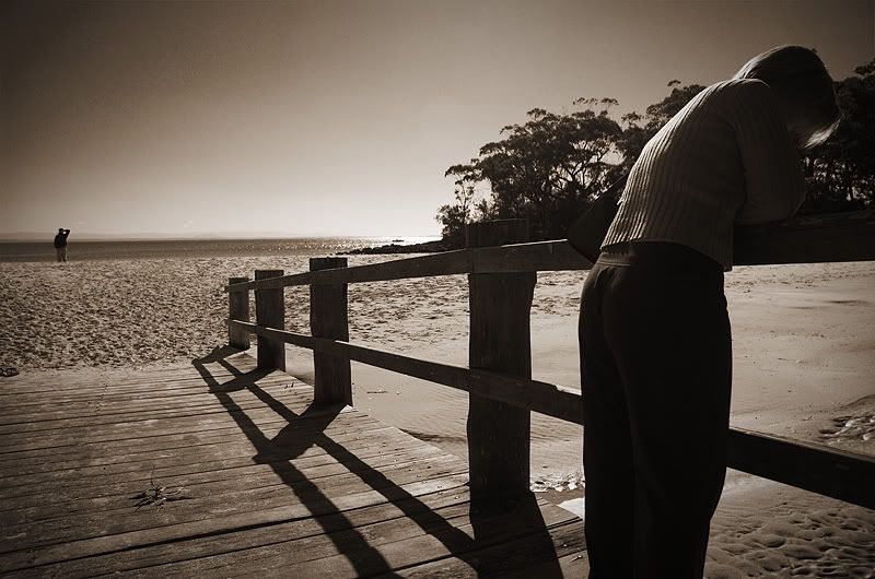
Practicing my composition...
Here's an image I took yesterday focusing on my composition and trying to get it to look right. What do you think?
Cheers, Owen.
i like the composition, its just a bit distracting that half of the person at the right of the image is lit, and half isnt, there is nothing for my eyes to really focus on. but i like how the rail leads the eyes down to the beach where there is another person standing. also love the treatment!
Nathan
D700 | MB-D10 | Nikkor 14-24 | Nikkor 24-70 | Sigma 70-200 | 20 2.8 28 2.8 35 2 50 1.8 | Sigma 105 | SB-800 http://www.flickr.com/nathanjphoto/
The top of the rail is what caught my eye and followed it to the sand / beach where there was nothing, perhaps a more acute angle so both people are on the same line of sight seperated by the top rail?....
Previous topic • Next topic
5 posts
• Page 1 of 1
|


