Page 1 of 1

Pastels and LAB

PostPosted: Thu Jul 06, 2006 9:52 pm
by Bodak
A couple of shots taken at Balnarring yesterday morning.
The first I've kept pastel and the second has been worked in Lab, two different looks..

Image

Image

PostPosted: Thu Jul 06, 2006 10:13 pm
by Slider
Great shots Stephen. :D You'll be signing us all up for Photoshop lesson at the rate your going. :wink:

PostPosted: Thu Jul 06, 2006 11:26 pm
by rokkstar
Number one is excellent - love the pastel tones.

I've not worked in LAB before, other than a b&W conversion, what are the benefits?

PostPosted: Thu Jul 06, 2006 11:33 pm
by big pix
good shots........ but would have like to have seen before and afters in LAB colour.......

PostPosted: Thu Jul 06, 2006 11:39 pm
by Willy wombat
I love those pastels and silky effect on the water. Great SHOT!

PostPosted: Thu Jul 06, 2006 11:48 pm
by Alex
rokkstar wrote:Number one is excellent - love the pastel tones.

I've not worked in LAB before, other than a b&W conversion, what are the benefits?


Matt,

If you get used to it, LAB gives you great control over a lot of things. I now do all my pping in LAB after reading Dan Margulis's book about LAB in PS - recommend buying - a great investment.

Alex

PostPosted: Thu Jul 06, 2006 11:50 pm
by avkomp
good stuff.

this shows me that I need to learn more about the power of lab colour

Steve

PostPosted: Fri Jul 07, 2006 6:32 am
by Bodak
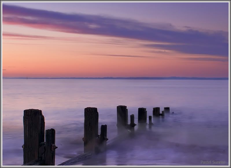
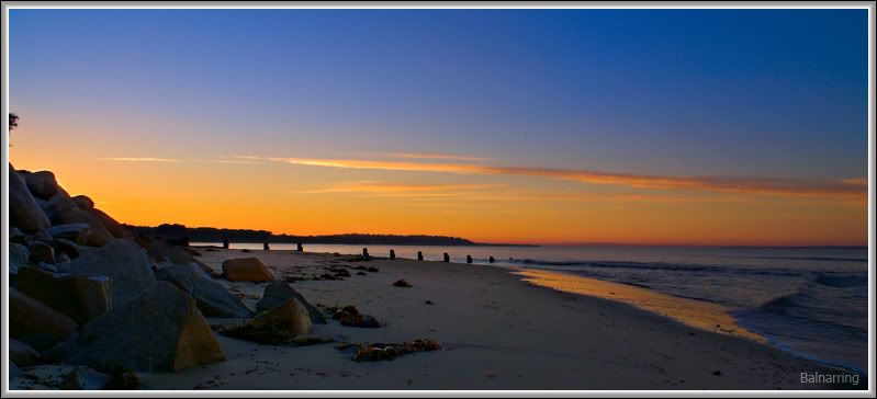
This is the shot straight out of Rawshooter at defaults.
No PP except for crop and resize for the web.

My eye was seeing a lot more than what I ended up taking and the colours were more vibrant than the original but not as much as the PP'd version.

As for the real benefits of Lab, I can't really say as I have only just started to play with Lab this week and don't have the use of any books at this stage.

What I have noticed to this date is that the colours are similar to turning up the vibrance in Rawshooter.

Contrast and sharpening seem less destructive when done in the lightness channel but haven't done test's to confirm or deny this.

Working in Lab mode is a little hard to get a handle on, a book (as suggested
above) would be a very good idea.

Original Version
Image

Thanks for the comments.

PostPosted: Fri Jul 07, 2006 7:13 am
by LostDingo
I prefer the first "Pastel" shot...very peaceful and serene...great colour...excellent shot with good composition...looks well thought out

Paul

PostPosted: Fri Jul 07, 2006 8:08 am
by bindiblue
Great shots. love them both,, well done,

suzanne

PostPosted: Fri Jul 07, 2006 9:33 am
by TonyH
Both are great shots, of the 2, I prefer the second one the rich colours really do appeal to my eye.

PostPosted: Fri Jul 07, 2006 9:34 am
by radar
Stephen,

love the first one, very peaceful and the pastel colours are very nice.

The second one is nice too, but for my taste, a bit too much with LAB, but that's just me.

Great time of day, thanks for sharing.

André

PostPosted: Fri Jul 07, 2006 10:54 am
by beetleboy
Second one's nice but I LOVE the Pastel shot. Has a great feel to it - is that mist or movement of water with a long exposure?

PostPosted: Fri Jul 07, 2006 1:26 pm
by Bodak
beetleboy wrote:Second one's nice but I LOVE the Pastel shot. Has a great feel to it - is that mist or movement of water with a long exposure?


That's movement of water, shot taken at f36 and 2 sec.
The lens was way out past it's best at f8 but what do you do with the sun fast approaching the horizon..

I can thank Slider (Mark) for these images as I started out looking for colours of nature for a weekly theme on Overlander
and like a terrier dog have kept persisting.

Got close this morning along with wet feet and ass.
Won't bore you with today's effort.

Once again, thanks for the positive comments from you all, most encouraging.