A discussion forum - and more - for users of Digital Single Lens Reflex cameras.
Wintery city on a Sunday afternoon - B&WModerators: Greg B, Nnnnsic, Geoff, Glen, gstark, Moderators
Forum rules
Please note that image critiquing is a matter of give and take: if you post images for critique, and you then expect to receive criticism, then it is also reasonable, fair and appropriate that, in return, you post your critique of the images of other members here as a matter of courtesy. So please do offer your critique of the images of others; your opinion is important, and will help everyone here enjoy their visit to far greater extent. Also please note that, unless you state something to the contrary, other members might attempt to repost your image with their own post processing applied. We see this as an acceptable form of critique, but should you prefer that others not modify your work, this is perfectly ok, and you should state this, either within your post, or within your signature. Images posted here should conform with the general forum guidelines. Image sizes should not exceed 950 pixels along the largest side (height or width) and typically no more than four images per post or thread. Please also ensure that you have a meaningful location included in your profile. Please refer to the FAQ for details of what "meaningful" is.
Previous topic • Next topic
9 posts
• Page 1 of 1
Wintery city on a Sunday afternoon - B&W
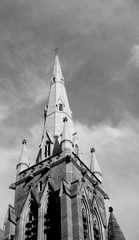
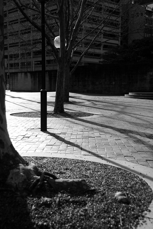
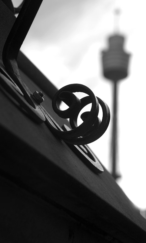
I thought these images evoked a feeling of coldness and a kinda sobering feeling to them. These were taken yesterday afternoon in the city. The 2nd one inparticularly reminds me of how I think of the city on a Sunday rainless, cold day. Critique and comments welcomed:
Geoff
Special Moments Photography Nikon D700, 50mm 1.4, 85mm 1.4, 70-200 2.8VR, SB800 & some simple studio stuff.
Geoff
#3 is the only one here that excites me. It is well composed and has just enough to entice the viewer to linger over the image. #1 I'd like to see in colour and #2 lacks foreground interest. Peter
Disclaimer: I know nothing about anything. *** smugmug galleries: http://www.stubbsy.smugmug.com ***
Thanks Peter.
For some reason the colour version of the cathederal didn't excite me, here it is: 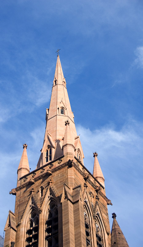 Geoff
Special Moments Photography Nikon D700, 50mm 1.4, 85mm 1.4, 70-200 2.8VR, SB800 & some simple studio stuff.
I think #1 might need a good strong shove with curves with just the sky selected or something to get some more mood or anger in the sky...
Not sure about #2... Just me I think I find #3 an interesting image, the old style foreground subject, with the ultra modern architectural tower in the OOF background... The only thing is that I'd try re-framing to have more separation between the two... Aka Andrew
Geoff, no 3 is great, although I agree Andrew that greater separation between Centrepoint and the in focus object would make it really stand out.
P
Naw - I like the way centrepoint and the scrollwork are connected. If they are more seperated I think that's just what it would be and I would lose the connection some.
D3 | 18-200VR | 50:1.4 | 28:2.8 | 35-70 2.8 | 12-24 f4
picasaweb.google.com/JustinPhotoGallery "We don't know and we don't care"
I don't care much for the first couple here Geoff - sorry! The last one has an appeal to it though - unmistakingly Sydney, but if not for the tower could be anywhere - nice
*** When getting there is half the fun! ***
Geoff
I agree the colour cathedral lacks ooomph too. maybe a stronger B & W conversion? Peter
Disclaimer: I know nothing about anything. *** smugmug galleries: http://www.stubbsy.smugmug.com ***
Previous topic • Next topic
9 posts
• Page 1 of 1
|


