Page 1 of 1
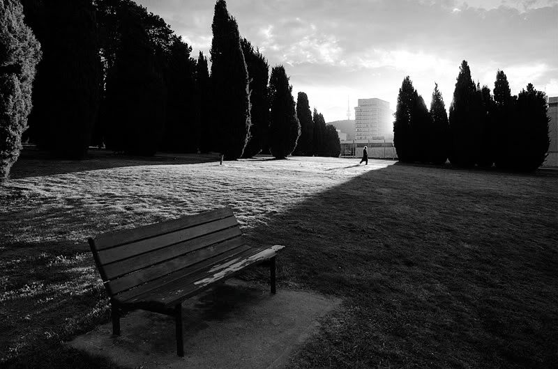
Walking into the light...

Posted:
Wed Aug 30, 2006 7:49 pmby owen
I took this one afternoon down in Canberra. let me know what you think

Cheers,
Owen.
Posted:
Wed Aug 30, 2006 8:35 pmby Kyle
Wow, this really grabs me. Well done
Posted:
Wed Aug 30, 2006 8:41 pmby big pix
great..... the person in the background gives this image a lot of depth..... and the bench makes the image
Posted:
Wed Aug 30, 2006 9:47 pmby Geoff
LOVE it Owen!!
Posted:
Wed Aug 30, 2006 9:50 pmby mudder
I really like your composition in this, I start off at the empty park bench and the lines of the light take me to the person the background, and the shadows keep me on track... This is a very strong image...
Posted:
Wed Aug 30, 2006 10:00 pmby owen
Thanks for the comments gentlemen. I held off on this one for a while because as a colour image it didn't quite have it, but I spent time tonight working on the b&w version.
Cheers,
Owen.
Posted:
Wed Aug 30, 2006 10:33 pmby Willy wombat
Im glad you made an effort to convert it! Great work
Posted:
Thu Aug 31, 2006 12:46 amby asaroha
Great shot. This shot made me appreciate the power of composition in making an image strong.
Posted:
Thu Aug 31, 2006 1:02 amby ado_civon
this works for me...... very powerful light on the top but then it eases off as you take your eyes to the darkness....... incredible (or maybe i've got something wrong with my eyes)
I really like BW shots but the composition makes it even better.
Posted:
Thu Aug 31, 2006 9:17 amby owen
Thanks for the nice comments guys
Posted:
Thu Aug 31, 2006 10:12 amby Glen
Hi Owen, I really like this composition. There is probably a little more shadow detail to be got out if you wanted
Posted:
Thu Aug 31, 2006 2:50 pmby owen
Thanks Glen. Yeah I did increase the contrast and lost some of the shadow detail, but I think if I decreased the contrast now I think it would look too flat.
Thanks though
Cheers,
Owen.
Posted:
Thu Aug 31, 2006 5:55 pmby Mj
Its a beaut... the loss of shadow detail strengthens the composition... more detail and you would lose focus on the primary subject matter.
IMHO as always...

Posted:
Thu Aug 31, 2006 6:11 pmby camrak
Only one word: Beautiful

Posted:
Thu Aug 31, 2006 6:11 pmby PiroStitch
Well spotted! I think the shots does warrant a tighter crop, maybe lose a bit from the top and a bit from the right (the gap after the end of the trees) as there's a bit of a dead space.
Posted:
Thu Aug 31, 2006 7:05 pmby marcotrov
Great composition and lighting Owen. The B&W treatment really suits this image too.
cheers
marco
Posted:
Thu Aug 31, 2006 7:08 pmby Reschsmooth
I think it's a great shot - well done. I agree with Piro in that the right end could have been cropped a bit.
Posted:
Thu Aug 31, 2006 7:20 pmby owen
Thanks guys, I think cropping it might be a good idea. I agree that there is a bit of dead space on the right for that.
Cheers,
Owen.