Thankyou in advance for sharing your thoughts.

A discussion forum - and more - for users of Digital Single Lens Reflex cameras.
Great ocean road trip.Moderators: Greg B, Nnnnsic, Geoff, Glen, gstark, Moderators
Forum rules
Please note that image critiquing is a matter of give and take: if you post images for critique, and you then expect to receive criticism, then it is also reasonable, fair and appropriate that, in return, you post your critique of the images of other members here as a matter of courtesy. So please do offer your critique of the images of others; your opinion is important, and will help everyone here enjoy their visit to far greater extent. Also please note that, unless you state something to the contrary, other members might attempt to repost your image with their own post processing applied. We see this as an acceptable form of critique, but should you prefer that others not modify your work, this is perfectly ok, and you should state this, either within your post, or within your signature. Images posted here should conform with the general forum guidelines. Image sizes should not exceed 950 pixels along the largest side (height or width) and typically no more than four images per post or thread. Please also ensure that you have a meaningful location included in your profile. Please refer to the FAQ for details of what "meaningful" is.
Previous topic • Next topic
20 posts
• Page 1 of 1
Great ocean road trip.
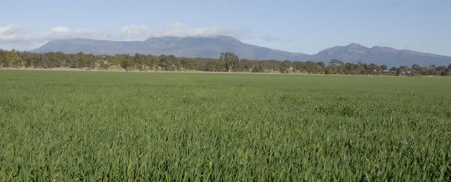
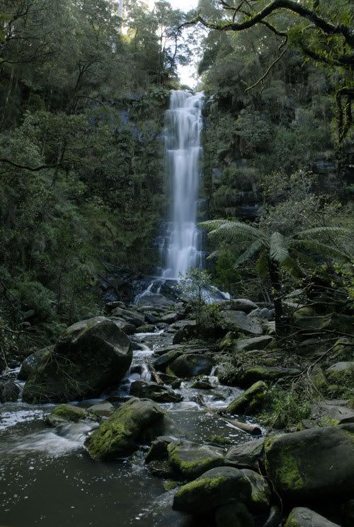
Just started to go through all the pics i took on our recent road trips from Adelaide- Great Ocean rd - Adelaide Trip and though i would post a couple from the first leg of our trip....... Adelaide - Halls Gap - Lorne
Thankyou in advance for sharing your thoughts.
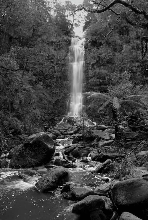
with the last shot of the waterfall, because it is lacking a lot of colour, i would try making it black and white and adding more contrast or playing with shadows/highlights levels. just a thought.
thanks. Nathan
D700 | MB-D10 | Nikkor 14-24 | Nikkor 24-70 | Sigma 70-200 | 20 2.8 28 2.8 35 2 50 1.8 | Sigma 105 | SB-800 http://www.flickr.com/nathanjphoto/
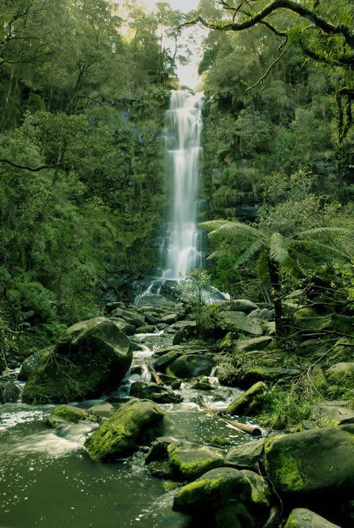
Actually looking at the last picture its a much much better representation of what the colors were actually like, so so green.... much happier with that.... thanks for the advise guys.
i think the b&w did help, but the boosted colour version i think has a bit of a green cast to the whole image, but the colours are much better
Nathan
D700 | MB-D10 | Nikkor 14-24 | Nikkor 24-70 | Sigma 70-200 | 20 2.8 28 2.8 35 2 50 1.8 | Sigma 105 | SB-800 http://www.flickr.com/nathanjphoto/
Actually i though it looked a touch more natural as the original seems to have a blueish tint to it on my monitor...... the water in the pic seems nice and white in the rewored pic
Re: "Waterfall image"
I've reworked your original to give the image more pop and vitality which I think all version so far are lacking. I'll put it up for comparison if you wish. Life is
Stephen
Adam, it is a bit hard to go into everything that I do as I tend to fiddle and fart about until I get what I think is to taste.. Also I am not aware of your expertise with Photoshop CS2. For the colours I have used selective colour and adjusted them to taste, in this case the yellow,green,cyan and blue. On the bright sky I used the shadow/high light filter to drop the sky tone down making sure that this adjustment was on a seperate layer as I need to mask off all areas other than the sky. On a separate layer again I have used brightness and contrast to add light to the foreground and waterfall selectively masking off some of the effect to the left and right middle ground. What I was trying to do was add detail (with light) through the middle of the image and up the waterfall leaving the sides darker to form a tunnel for the eye to follow. Hope this helps a tad, but seeing it done is the real way to understand what I'm trying to explain. Life is
Stephen
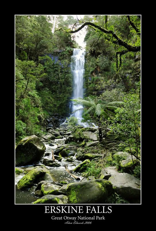
i really like waterfalls
i read through the topic posts and well the final waterfall is a much more improved version of the original shot....... well done. Its not all lost if the original didn't turn out after all..... you've got yourself a nice photo that could be even framed.........
Sheesh I just caught up with this thread - that final version of the waterfall is fantastic, this is probably the best example I've seen of what some skills in photoshop can allow you to do with an image!
Adame - to round this out can you share what you did to get the final result? D3 | 18-200VR | 50:1.4 | 28:2.8 | 35-70 2.8 | 12-24 f4
picasaweb.google.com/JustinPhotoGallery "We don't know and we don't care"
Yep definetly.
OK I reproscessed the RAW file being much more caefull to keep as much highlight and shadow detail in the finall .tiff image as possible. I actually had to reduce the contrast in My Raw software then adjusted the exposure compensation to suit. Took the resulting tiff into CS2 where i adjusted the Color balance, and curves. Also i added a gradient fill layer to remove some of the glareyness from the upper part of the image. Hmm as far as i can remember thats about it, i should really have saved it as a Photoshop document so i could see all the steps that i took I just get lost in what i dooing in photoshop and find at the end of an image i have actually completed about 50 more steps than i can remember. Cheers Adam
Previous topic • Next topic
20 posts
• Page 1 of 1
|