Page 1 of 1
Fun Portrait...

Posted:
Wed Oct 11, 2006 10:23 pmby Bindii
Posted:
Wed Oct 11, 2006 10:40 pmby Geoff
Wow Bindii! The 2nd one in this series really stands out to me - beautiful! Mind sharing your technique/setup for these shots?
Posted:
Wed Oct 11, 2006 10:47 pmby Bindii
Geoff wrote:Wow Bindii! The 2nd one in this series really stands out to me - beautiful! Mind sharing your technique/setup for these shots?
Lol...here goes now I'm to be the laughing stock of the forum...
lay a white sheet on the floor to cover the tiles...turn on overhead spot light....cause I don't have any 'real lights'...open door for natural lights and bounce flash off wall...and shoot...
fix the rest in
PScs2...

(aint curves great!)
Posted:
Thu Oct 12, 2006 12:40 amby sirhc55
Bindii, you may be using non-standard equipment but the results are excellent. The first shot, IMO, is the stand-out. A beautiful pose and the expression, priceless

Posted:
Thu Oct 12, 2006 8:13 amby Aussie Dave
Bindii
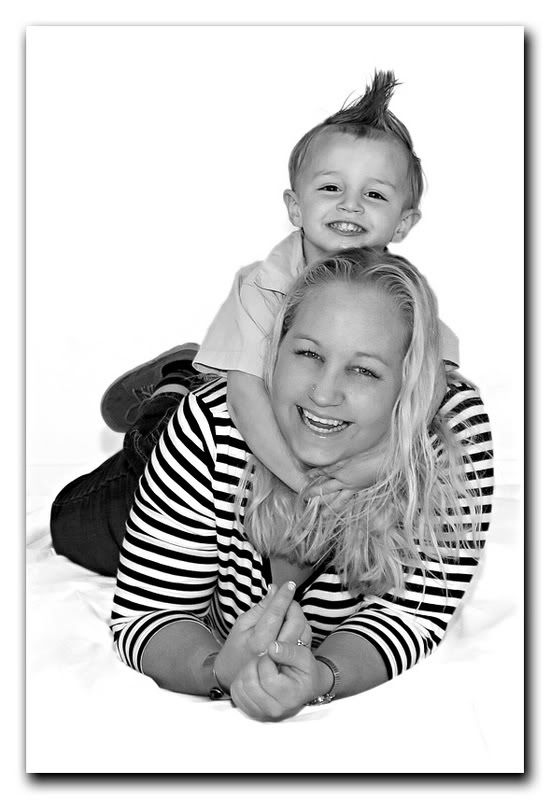
I agree, really nice work. My pick is the last image. A wonderful & fun capture. I'm sure the Mother will
love it !
My only critisism is that, IMO, they seem to be a touch overexposed....or you got a little over-exuberant with the
curves tool

Great series though....you should be proud

Posted:
Thu Oct 12, 2006 8:57 amby PiroStitch
Great stuff
Goes to show you just need to be innovative rather than spend a whole heap on equipment.
My pick is the last one as well.
Posted:
Thu Oct 12, 2006 9:27 amby gstark
Bindi,
The third shot is wonderful, well done.
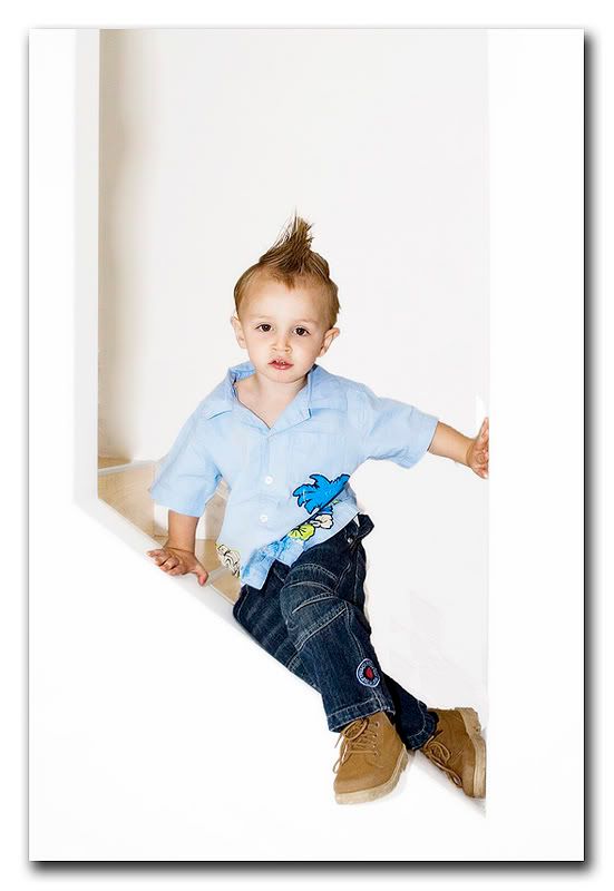
The second shot - it's a shame that you lost the kid's hand at the bottom edge of this. That spoils this otherwise excellent image.
The first one ... hmmmm .... there's something fundamentally wrong here. I'm looking at either side of the subject, and on our right, I'm seeing .... nothing .... yet on our left, I'm seeing some background elements. My feeling is that these background elements should naturally appear on both sides, and the overall background (above the subject's head for instance) gives me no clues as to where the background elements have gone, and thus the image simply doesn't feel right, even though it looks good.
So, what am I missing here?
Posted:
Thu Oct 12, 2006 9:29 amby mic
Really nice stuff,
Well shot & captured.
Mic
Posted:
Thu Oct 12, 2006 12:28 pmby Manta
Some great shots there Bindi, especially given the constraints of your equipment. Shows what can be acheived with minimal gear but a good eye and conceptualisation.
Gary and Dave raise some good points that would be worth exploring. You know I don't normally shoot bipeds or do studio work so I'm not qualified to comment much beyond "I like".
Posted:
Thu Oct 12, 2006 12:47 pmby sirhc55
gstark wrote:
So, what am I missing here?
The shot is oblique so the instance of the left hand side cannot be repeated on the right. The alcove(!) frames the subject beautifully, but keep in mind the subject itself and this is where this shot really shines
Posted:
Thu Oct 12, 2006 1:39 pmby gstark
Chris,
I considered all of that, but it still doesn't strike me as being kosher.
Look at the line along the child's jeans as they track from the buttock, down the right leg, and then continue into the left leg along the ledge of the alcove.
Now look more closely at the area along this line, around the back of the child's knee. There's some sort of a shadow there, and from the colour of it, I'd be willing to suggest that it's the remains of the base (or whatever) that we're seeing on the other side, from where it's been photoshopped out.
I think that this base area was there originally, and that's what I'm "seeing" that should be there, but is not. Thus the image to me seems somewhat unbalanced, and I think that perhaps this area needs to be put back; I'm not sure that it would work without the view that it is the alcove.
Bindi, could you please be so good as to post the original of this image for us?
Posted:
Thu Oct 12, 2006 1:53 pmby sirhc55
Aha - now I see what you mean GS

Posted:
Thu Oct 12, 2006 1:58 pmby phillipb
I think Gary is onto something, there is definetly something there when you bump up the levels.

Posted:
Sat Oct 14, 2006 7:34 pmby Manta
Absolutely! Where did that big black outline come from??!!
Looking back at the shot, I missed that area in the first look but it's pretty obvious that it's not, as Gary says, completely 'kosher' and that there has been some work done (either by a plasterer or by Bindii in
PS). The stairs certainly seem to have disappeared. Perhaps there was a mark on them or the wall?
Posted:
Sat Oct 14, 2006 7:44 pmby Alex
Great portraits. No. 3 is my pick. Nicely executed.
Alex
Posted:
Sat Oct 14, 2006 9:29 pmby asaroha
#2 is my pick, great lightning, great pose, and lovely subject.
I like #1 too until I read gary's post and now I can't get that right bit out of my mind