Page 1 of 1
Yet another wedding

Posted:
Mon Oct 30, 2006 7:59 pmby adame
Guys heres some pics i took at a friends wedding over the weekend would be great for some critique
HERE is also a thread related to this wedding.
Cheers
Adam
Posted:
Mon Oct 30, 2006 8:18 pmby ozimax
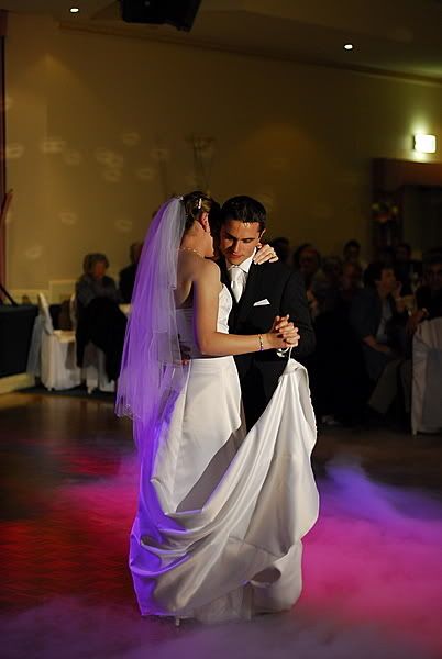
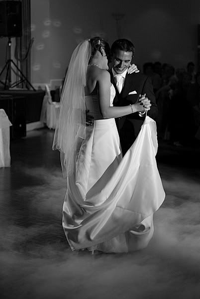
Nice shots Adam, at first glance I thought 2/3 were the same shot but they are different. I like the colour in #2 best but then again I'm not much use when critiquing (?sp) BW images. #2 catched the emotion of the dance well.
Max
Posted:
Mon Oct 30, 2006 8:57 pmby shutterbug
Nice Adam, love image 2

Posted:
Mon Oct 30, 2006 9:00 pmby stubbsy
#2 for me too Adam. #3 wastes those great colours
Posted:
Tue Oct 31, 2006 12:06 amby PiroStitch
#2 is good but either crop it down so you lose the exit sign or use the brush in photoshop and black it out. other than that, love the colours. the first one just lacks a bit in contrast, maybe increase the highlight levels a bit more.
Posted:
Tue Oct 31, 2006 5:38 pmby adame
Thanks for the comments guys.
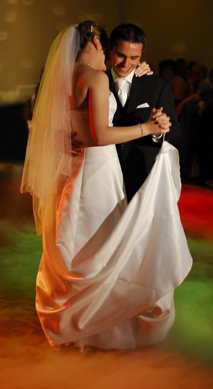
heres another im quite pleased with from the couples first dance
Posted:
Thu Nov 02, 2006 9:46 pmby Yi-P
Great shots!!
Were those all from the 50/1.4?
Posted:
Thu Nov 02, 2006 10:07 pmby Geoff
That last one is a ripper!!
Posted:
Fri Nov 03, 2006 8:25 amby bwhinnen
Geoff wrote:That last one is a ripper!!
Sure is! Makes you wonder just what was being whispered into the groom's ear . . .
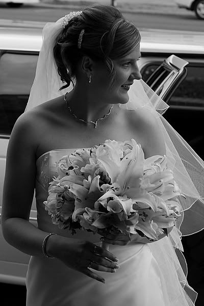
I do like the first one as well, the use of B&W portrays a sense of classical beauty which is emphasised by the side profile to the face and the un-intentional pose. Great capture of a moment in time. Shame about the cars in the top of the frame, if you could clone them out I think it would add to an already great photograph.
Posted:
Fri Nov 03, 2006 10:23 amby the foto fanatic
The tighter crop and the colour makes the last one really great - well done.

Posted:
Fri Nov 03, 2006 2:41 pmby shutterbug
For me the tight crop does not work, since I have already seen the 2nd image. The 2nd images gives the viewer "space" and show the enviroment.
Posted:
Fri Nov 03, 2006 2:50 pmby Alex
I like No.2 a lot!
Great colours
Alex