Page 1 of 1
ca1ais

Posted:
Thu Dec 21, 2006 9:18 pmby NJ
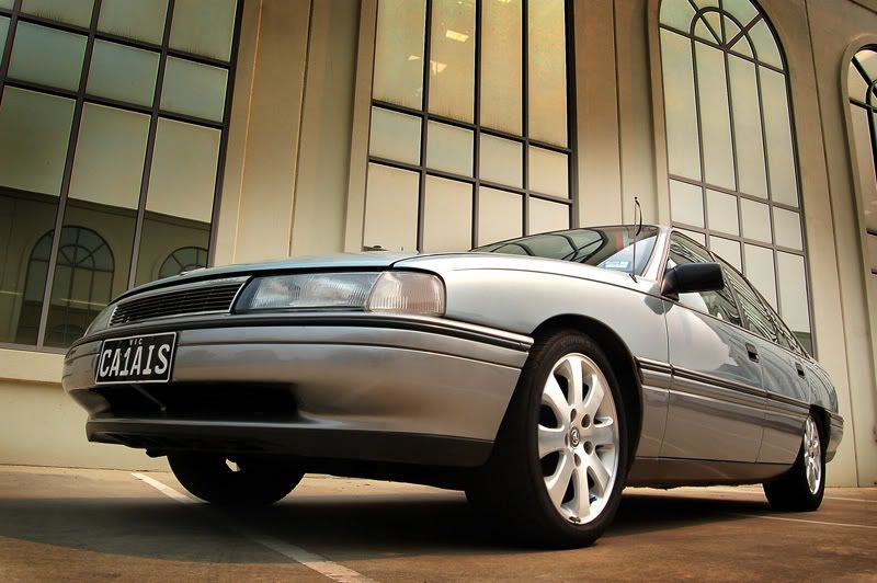
more practise at car photography. please let me know what you think. thanks for looking

more pictures here:
http://s33.photobucket.com/albums/d56/Nathanjacobs/nathans%20calais/
Posted:
Thu Dec 21, 2006 9:26 pmby Oz_Beachside
nice angle. I like the backdrop, and the way your angle of view is virtually under the car.
Perhaps move the P-Plate, and the copper ribbon from the antenna.
Nice exposure.
Posted:
Thu Dec 21, 2006 9:38 pmby sirhc55
I agree, a very nice angle. I would clone out the lights in the middle windows of the building

Posted:
Thu Dec 21, 2006 9:42 pmby NJ
thanks for the suggestions guys. i was thinking the same thing chris but wasnt sure to go ahead with it or not.
thanks again
Posted:
Thu Dec 21, 2006 9:46 pmby stubbsy
Nathan
The quality of your work is really coming along in leaps and bounds. Notwithstanding the valid critiques already made, this is a superb image. You've got a really strong composition, made very good use of an interesting, but not dominating backdrop and used a sublime mix of colours that enhances the viewers enjoyment of the image. Thanks for sharing this.
Posted:
Thu Dec 21, 2006 9:55 pmby NJ
wow thanks stubbsy, that really means a lot to me! its all you guys that make myself push harder to achieve better results! so thanks again.
Posted:
Thu Dec 21, 2006 10:28 pmby the foto fanatic
I think this image is excellent from an artistic viewpoint.
If, however, the objective was to showpoint the car, then I think the angle is too low.
Great exposure level, and I agree about losing the lights.
Posted:
Thu Dec 21, 2006 10:38 pmby Kyle
I find the angle too low, only just though
Apart from that, it's nice and clean, pulled it off well
Posted:
Thu Dec 21, 2006 10:46 pmby NJ
thanks guys, yeah it is more of an artistic view rather than showing the whole car.
Posted:
Thu Dec 21, 2006 10:56 pmby PiroStitch
nice work with the editing as well
top stuff!
Posted:
Thu Dec 21, 2006 11:43 pmby phillipb
I agree with what's been said so far. If I was to pick on something, I would have liked to see a little bit more of the window arches, at least enough not to crop the third one.
But that's really nit-picking.
Posted:
Fri Dec 22, 2006 12:07 amby Glen
Nathan, notwithstanding the minor criticisms already pointed out, that is one great image

Posted:
Fri Dec 22, 2006 12:15 amby NJ
thanks piro, phillip and glen. much appreciated!
phillip, here is one that shows more arches but isnt as strong of an image.
btw nit-picking is good!

Posted:
Fri Dec 22, 2006 9:19 pmby zeddy
the first piture is a ripper it really make the car look appealing,where the second shot well its just a calais
Posted:
Fri Dec 22, 2006 9:28 pmby Matt. K
Perfect background and beautiful light! The secret of good photography! I would be tempted to select the car....invert the selection and slightly desaturate the background and then put a little 'median' blur through it. I would then invert the selection again and give the car a very slight contrast pop using USM 20/40/0 and perhaps very slightly darken the car. I guess the only thing missing is a couple of red roses on the ground front left of the vehicle! Brilliant job!
Posted:
Fri Dec 22, 2006 9:31 pmby marcotrov
Beautifully balanced lighting and setting with great perspective.
cheers
marco
Posted:
Fri Dec 22, 2006 9:40 pmby NJ
thanks guys!
zeddy, thats exactly what i thought!

thanks for the tips matt, feel free to have a play around and post ur result. im not sure i would achieve the same result as u say, but if u were to show me what you have done it might make it easier for me to acheive it