Page 1 of 1

Critique please

PostPosted: Sun Jan 14, 2007 6:58 pm
by owen
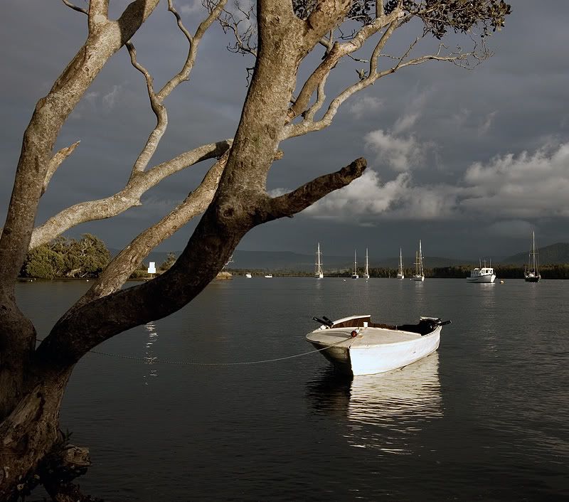
Hi everyone. I was wondering if someone could give me some pointers on ways that this shot could have been improved. I like it, however feel the boats in the background are a bit distracting.

Cheers,
Owen.
Image

PostPosted: Sun Jan 14, 2007 7:08 pm
by sheepie
Hi Owen - I agree that the boats are a little distracting, but I find the navigation sign between the tree branches more so. See what you can do about that.
As for the boats, it would be a fair amount of work to get rid of them, and I don't see them as that much of a distraction. Sometimes you just have to go with what you're given - it's a nice image either way :)

PostPosted: Sun Jan 14, 2007 7:36 pm
by marcotrov
Howdy Owen
I like this shot but i think sheepie is right. The boats are a littls distracting. I feel if you could blend a set of 3-5 bracketted shota you would be able to accommodate the distractions of the blown highlights in the boats and the sign without taking them back too much because i think that part of the strength of the image is the highlights in the boats. It could make a difference in thre overall image :)
cheers
marco

PostPosted: Sun Jan 14, 2007 7:46 pm
by adame
Owen, i dont see the boats as a distraction but as a point of intrest and the tree as a distraction. :roll:

PostPosted: Sun Jan 14, 2007 8:07 pm
by owen
Interesting points guys. I completely missed the navigation sign so thanks for pointing it out. I'm planning on re-taking this at some point so thanks very much for the comments.