A discussion forum - and more - for users of Digital Single Lens Reflex cameras.
SvwartzzzModerators: Greg B, Nnnnsic, Geoff, Glen, gstark, Moderators
Forum rules
Please note that image critiquing is a matter of give and take: if you post images for critique, and you then expect to receive criticism, then it is also reasonable, fair and appropriate that, in return, you post your critique of the images of other members here as a matter of courtesy. So please do offer your critique of the images of others; your opinion is important, and will help everyone here enjoy their visit to far greater extent. Also please note that, unless you state something to the contrary, other members might attempt to repost your image with their own post processing applied. We see this as an acceptable form of critique, but should you prefer that others not modify your work, this is perfectly ok, and you should state this, either within your post, or within your signature. Images posted here should conform with the general forum guidelines. Image sizes should not exceed 950 pixels along the largest side (height or width) and typically no more than four images per post or thread. Please also ensure that you have a meaningful location included in your profile. Please refer to the FAQ for details of what "meaningful" is.
Previous topic • Next topic
5 posts
• Page 1 of 1
Svwartzzz
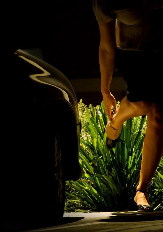
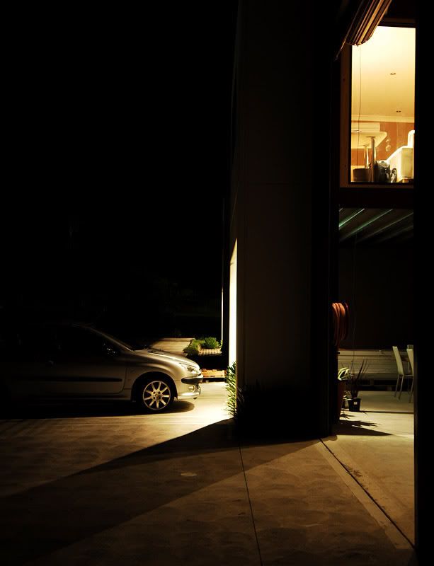
a couple of dark pics outside the studio:
HB
Cinematic!
#1 - immediate impression - CSI Miami... maybe it's just the warm WB and low angle. ( I think I just admitted to actually having watched CSI Miami once #2 I like certain elements of it - the form of the Peugeot is catching, as is the lighting downstairs to highlight the shapes - the curves of the fire reel, the green lines on the roof (roll-a-door maybe). The colour works well too. I keep coming back to one part though, the centre column - seems divisive in the image, but maybe that works in its favour - it creates a lot of little scenes in the one shot.
Both are very interesting as they are so different to your usuall shot, don't have a favourite, but I appreciate you thinking outside the box.
Thanks for the comments.
I know that it isn't my normal "style", but I find it really hard to stick with a particular style for too long. I'm sure that if you look back a couple of year and see your shots, you'll see such a huge change. Perhaps this is why artists are infamous for disowning their own work, negatively looking at older stuff (and sometimes even new stuff!) HB
Previous topic • Next topic
5 posts
• Page 1 of 1
|


