Page 1 of 1
Flinders Island

Posted:
Mon Feb 05, 2007 3:04 pmby NeoN
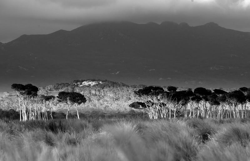
Taken on a recent trip to Fliders Island.I hope you like them. Some P+P.
C+C always welcomed.
NeoN


Posted:
Mon Feb 05, 2007 3:17 pmby Alpha_7
To be very honest with you I don't like the PP on either, both seem way too extreme (Is the word filter still on?) Anyways I think you've pushed them both too far and it destracts from the orginal image.. but thats just me.
Posted:
Mon Feb 05, 2007 3:39 pmby dawesy
I must admit I find the first one a tad overdone as well. It reminds me of an illiustrations more than a photograph, although that may well be the look you're after!!
I'm of two minds on the second. I think it almost works, a kind of eeire quality. However I think the sky spoils the effect. I suspect it's just cloud but after the processing it looks like a dirty smog, which detracrts from the idea of a landscape. I do like the foreground of it though, perhaps a crop just above the hill in the foreground?
Cheers.
Posted:
Tue Feb 06, 2007 10:42 amby NeoN
Thanks
Alpha_7 and
dawesy for your constructive criticism and of course that is the whole idea of submitting images.
Now ,same images different treatment better or.....i thank you in advance for your opinion.
NeoN.

Posted:
Tue Feb 06, 2007 12:04 pmby DaveB
Much better!
1st version of geese was weird: reds were over-done and the whole thing looked like the output from a broken printer. 2nd one feels more normal, although the colours are still obviously manipulated. I think cropping the birds from the left helps.
The 1st version of the grass/trees/mountain/cloud was dramatically oversharpened and as dawesy mentioned, the colour in the cloud just made it look dirty. The 2nd version is much better.
The OOF grass in the foreground detracts a bit though. I used to have that problem until I got a decently-tall tripod...