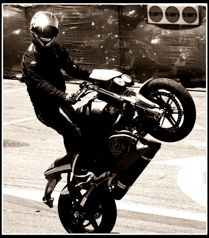
Tried a stark contrast in B&W for this - I kinda like it, but wondered what others thought ??
Posted: Thu Feb 08, 2007 11:40 pm
by Bindii
Ummm...not sure on this one sorry....there is too much detail lost i the darker areas and the highlight on the helmet ir really putting me off..but it looks to be a very glary day so I imagine that it would have been difficult to meter for...good freeze framing though!
Posted: Fri Feb 09, 2007 1:01 pm
by colin_12
The glare on the helmet bugs me too Cc@t.
I like how you have the rider looking right at you.
Regards Colin
Posted: Fri Feb 09, 2007 2:46 pm
by cc@t
This was the original - dont know what I could've done about the helmet glare though ??
Posted: Fri Feb 09, 2007 3:21 pm
by CraigVTR
Colour looks better.
Glare ????
The channel ten sign is distracting also.
Great eye contact, great rider control.