Page 1 of 1

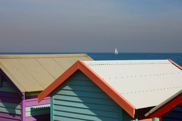
Brighton Beach Boxes

PostPosted: Sat Apr 28, 2007 12:47 pm
by Louie
This is my first ever image post plus one of my first attempts with my new D40. Learning curve starts here!

Image


Cheers, Elena :D

PostPosted: Sat Apr 28, 2007 2:19 pm
by Frankenstein
I like it - lovely use of colours and shapes, and clever positioning of the boat. To my eyes, maybe a bit more contrast would really emphasise the colours, but that's a personal preference. The white roof is probably a bit burnt out, but doesn't detract too much. Well done :)

Frank

PostPosted: Sat Apr 28, 2007 3:53 pm
by Geoff
Welcome Louie! A great first shot. I agree with Frank, a bit more contrast and a slight increase in saturation would make this image pop out some more. Welcome!

PostPosted: Sat Apr 28, 2007 4:15 pm
by Glen
Welcome Louie, I like the composition with the yacht.

PostPosted: Sat Apr 28, 2007 6:22 pm
by Louie
Thanks for the comments, I did saturate it a little bit but photoshop is also something else I am learning at the moment ...

Elena :D

PostPosted: Sat Apr 28, 2007 8:00 pm
by Alex
Love the composition. Nice colours, but I agree, I'd saturate the colours a bit further and play with curves or levels a tad.

Alex