DSLRUsers.com
A discussion forum - and more - for users of Digital Single Lens Reflex cameras.
Is this Overdone?Moderators: Greg B, Nnnnsic, Geoff, Glen, gstark, Moderators
Forum rules
Please note that image critiquing is a matter of give and take: if you post images for critique, and you then expect to receive criticism, then it is also reasonable, fair and appropriate that, in return, you post your critique of the images of other members here as a matter of courtesy. So please do offer your critique of the images of others; your opinion is important, and will help everyone here enjoy their visit to far greater extent. Also please note that, unless you state something to the contrary, other members might attempt to repost your image with their own post processing applied. We see this as an acceptable form of critique, but should you prefer that others not modify your work, this is perfectly ok, and you should state this, either within your post, or within your signature. Images posted here should conform with the general forum guidelines. Image sizes should not exceed 950 pixels along the largest side (height or width) and typically no more than four images per post or thread. Please also ensure that you have a meaningful location included in your profile. Please refer to the FAQ for details of what "meaningful" is.
Previous topic • Next topic
11 posts
• Page 1 of 1
Is this Overdone?
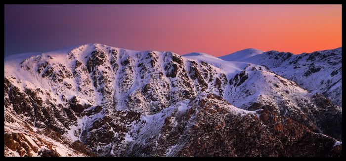
Just finished a fair bit of PP on this image take in the Snowy Mountains last winter. Not sure whtehr or not i've overdone it or not. Would appreciate others opinions.
Seems fine and quite nice to me.
How do you think you've overdone it, if I may be so bold? Producer & Editor @ GadgetGuy.com.au
Contributor for fine magazines such as PC Authority and Popular Science.
Hi MT,
This image looks good to me. Mind if we see the original? That way we may be able to give better judgement on whether or not it's over done Geoff
Special Moments Photography Nikon D700, 50mm 1.4, 85mm 1.4, 70-200 2.8VR, SB800 & some simple studio stuff.
Thanks for the positive feedback.
Heres the photo i started with: 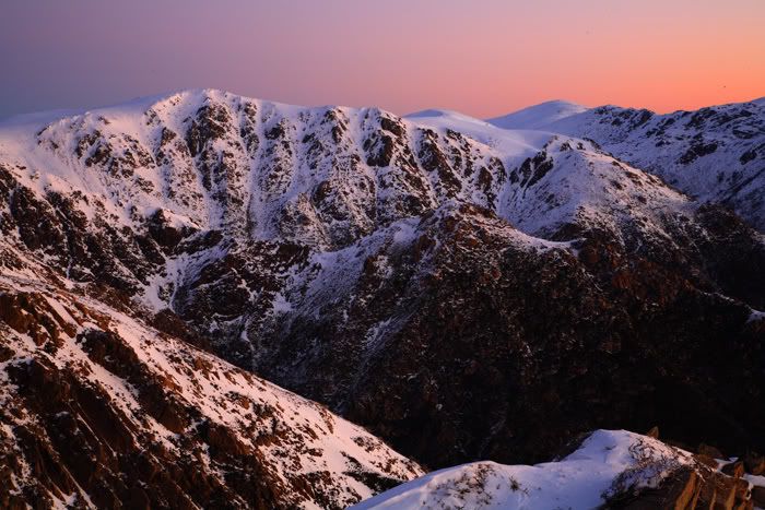
Processing involved blending three different exposures of the same image (original photo was RAW file). One exposure to darken sky a little, another for the midtones and another to bring out some detail in the shadowed lower right of the pic. All photos were merged using layer mask and blurring filter in photoshop. I tweaked the contrast of the sky a little before merging. Once all three exposures were merged i did some overall curves adjustment. I wasn't sure whether or not i oversaturated the sky.
Looks great
Nikon D70
12-24 DX, 18-70 DX, 70-200 VR 20" iMac Intel C2D Aperture 2.1 PS CS3 http://www.jamesrobertphotography.com
I think it is great, but in fact, prefer the uncropped version, as it adds to the size of the landscape. My opinion only
Regards, Patrick
Two or three lights, any lens on a light-tight box are sufficient for the realisation of the most convincing image. Man Ray 1935. Our mug is smug
All good in my eyes - you started with a nice shot to begin with too!
Steve (Nikon D200/D700)
My photography website http://wwphoto.redbubble.com/ My photo blog http://www.redbubble.com/people/wwphoto Please feel free to offer any constructive criticism on my works
Previous topic • Next topic
11 posts
• Page 1 of 1
|


- Mods Database • The team • Delete all board cookies • Reset blocks • All times are UTC + 10 hours [ DST ]

