I'm still learning the whole PP thing and posting process, please let me know any hints you have if this doesn't look right ......
Cheers,
Elena
A discussion forum - and more - for users of Digital Single Lens Reflex cameras.
LanternModerators: Greg B, Nnnnsic, Geoff, Glen, gstark, Moderators
Forum rules
Please note that image critiquing is a matter of give and take: if you post images for critique, and you then expect to receive criticism, then it is also reasonable, fair and appropriate that, in return, you post your critique of the images of other members here as a matter of courtesy. So please do offer your critique of the images of others; your opinion is important, and will help everyone here enjoy their visit to far greater extent. Also please note that, unless you state something to the contrary, other members might attempt to repost your image with their own post processing applied. We see this as an acceptable form of critique, but should you prefer that others not modify your work, this is perfectly ok, and you should state this, either within your post, or within your signature. Images posted here should conform with the general forum guidelines. Image sizes should not exceed 950 pixels along the largest side (height or width) and typically no more than four images per post or thread. Please also ensure that you have a meaningful location included in your profile. Please refer to the FAQ for details of what "meaningful" is.
Previous topic • Next topic
8 posts
• Page 1 of 1
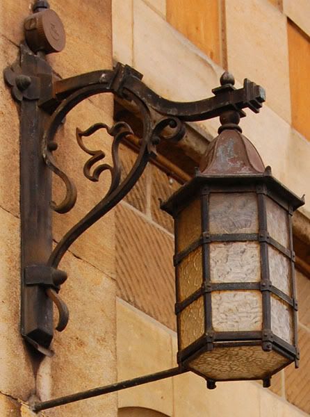
Lantern
Am finally posting another image, long overdue! I have many excuses but no good ones
I'm still learning the whole PP thing and posting process, please let me know any hints you have if this doesn't look right ...... Cheers, Elena
The PP looks great to me. Can't say i'd change anything really.
Would possibly look good in b&w too? Nikon D70
12-24 DX, 18-70 DX, 70-200 VR 20" iMac Intel C2D Aperture 2.1 PS CS3 http://www.jamesrobertphotography.com
nice lantern, its nice when we look up and see a bit of yesterday.
as for feedback on PP, I'd consider rotating the image, CW, about 3 degrees, so the subject (the lantern) is vertical, at the moment, you have the bracket vertical. secondly, perhaps crop from the top down, to remove the 70's contamination of an electrical junction box.
There’s nowt wrong with this pic Elena - let’s see lots more of your pics and PP’ing
Chris
-------------------------------- I started my life with nothing and I’ve still got most of it left
Elena,
Love seeing pics of older bits and pieces. Maybe if you wanted to, darken the edges and background a bit as it will isolate and create more contrast around the lantern, which will make it stand out more. Hassy, Leica, Nikon, iPhone
Come follow the rabbit hole...
For me, the lantern does not stand out enough from the background. I'd be trying a shallower DOF...from the EXIF this is at f 7.1.
B&W or Sepia (well its almost sepia already) could work well, but if you stick to colour I'd give it a little more oomph. This is a very individual thing though and I might have overdone it.. 
Hi guys,
Thanks for the feedback, I appreciate it. Bruce and ATJ, I did wonder about the alignment of the lantern but wasn't sure if I made the lantern vertical the wall might look like it is falling over. And yes, the junction box - the current crop is to remove the cord leading up from it Wayne and Shakey, I like your suggestions about making the lantern stand out more - just need to learn how to darken edges and change the background! Pehpsi, I will try B&W too, see what effect it has. So I will go and play with it more now with all of your suggestions, thanks again! Elena
Previous topic • Next topic
8 posts
• Page 1 of 1
|


