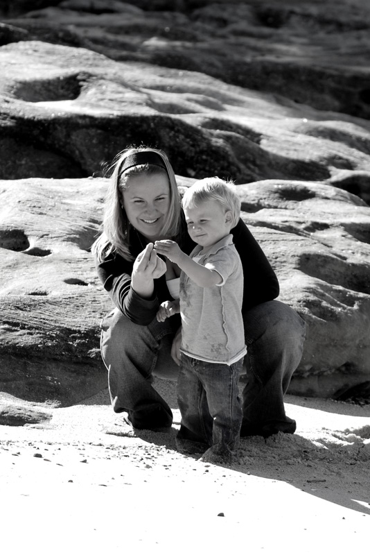
Page 1 of 1

Mother and son

PostPosted: Tue Jul 03, 2007 11:37 pm
by Geoff
One from a recent family shoot that I quite liked. Comments welcomed, a tighter crop perhaps?

Image

PostPosted: Wed Jul 04, 2007 6:36 am
by Steffen
Yes, a tighter crop. The expressions on the faces and the hands are very endearing, but the surrounds don't add much, IMHO.

Cheers
Steffen.

PostPosted: Wed Jul 04, 2007 9:15 am
by ATJ
I agree with Stephen. The background adds nothing to the picture.

PostPosted: Wed Jul 04, 2007 10:50 am
by virgal_tracy
I too agree on the tighter crop.

HAving said that great image and very natural.

PostPosted: Wed Jul 04, 2007 11:24 am
by ozimax
I actually like the background to the subjects, great shot Geoff.

PostPosted: Wed Jul 04, 2007 11:31 am
by Reschsmooth
Geoff, I think the background and foreground add context to what mother and son are doing (looking at something picked up on the beach, presumably) and represents a beautiful shared moment.

I wonder how a colour version would look? (Considering I am a B&W fan) :lol:

PostPosted: Wed Jul 04, 2007 12:02 pm
by Yi-P
IMHO the blown foreground doesn't add too much to the photo, crop tighter :D

PostPosted: Wed Jul 04, 2007 12:04 pm
by Geoff
Thanks for the comments and suggestions peoples - always appreciated.

PostPosted: Wed Jul 04, 2007 12:10 pm
by Geoff
Reschsmooth wrote:I wonder how a colour version would look? (Considering I am a B&W fan) :lol:


Here we are, with a tighter crop too. Personally I much prefer the B&W:
Image

PostPosted: Wed Jul 04, 2007 12:33 pm
by Yi-P
Now that is great looking!! :D

PostPosted: Wed Jul 04, 2007 1:02 pm
by ATJ
I prefer the second image.

PostPosted: Wed Jul 04, 2007 2:45 pm
by virgal_tracy
Love the tighter crop and the colour. I normally prefer B & W but think this second shot is magic.

The background has come to life and there is now highlights within the sand that show up where they didn't in the B & W version.

PostPosted: Wed Jul 04, 2007 3:01 pm
by macka
Geoff, #2 is a winner. Lovely shot. :D

I prefer the colour mainly because this image is already quite contrasty what with the bright sunlight and dark shadows, and the black and white has pushed that a bit too far.

I really like contrasty black and whites as a rule, but for this particular image of mother and son the lowered contrast and the warmth of the colour version are preferable.

Cheers,

PostPosted: Wed Jul 04, 2007 3:15 pm
by sirhc55
Crop is better Geoff but would have liked to see some fill flash to give even more contrast and bring out more detail :)