A discussion forum - and more - for users of Digital Single Lens Reflex cameras.
Graffiti in the parkModerators: Greg B, Nnnnsic, Geoff, Glen, gstark, Moderators
Forum rules
Please note that image critiquing is a matter of give and take: if you post images for critique, and you then expect to receive criticism, then it is also reasonable, fair and appropriate that, in return, you post your critique of the images of other members here as a matter of courtesy. So please do offer your critique of the images of others; your opinion is important, and will help everyone here enjoy their visit to far greater extent. Also please note that, unless you state something to the contrary, other members might attempt to repost your image with their own post processing applied. We see this as an acceptable form of critique, but should you prefer that others not modify your work, this is perfectly ok, and you should state this, either within your post, or within your signature. Images posted here should conform with the general forum guidelines. Image sizes should not exceed 950 pixels along the largest side (height or width) and typically no more than four images per post or thread. Please also ensure that you have a meaningful location included in your profile. Please refer to the FAQ for details of what "meaningful" is.
Previous topic • Next topic
6 posts
• Page 1 of 1
Graffiti in the park
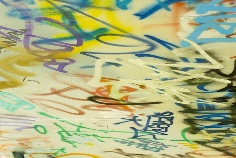
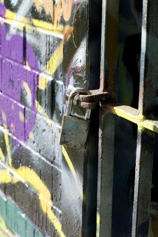
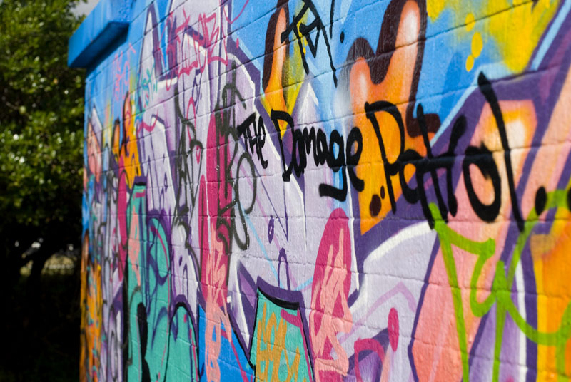
A few from the park today. Minimal PP. Comments welcomed:
Geoff
Special Moments Photography Nikon D700, 50mm 1.4, 85mm 1.4, 70-200 2.8VR, SB800 & some simple studio stuff.
The second one appeals to me for some strange reason... I think its because there is something for me to focus my eye's on..the padlock.. but when I look at the other images my eye's tend to roam all over the place... although they are very well executed and sharp...
The last thing I want to do is hurt you... but it's still on the list...
Hi Geoff.
I like the first pf these It's a different perspective, and for me, it works. g.
Gary Stark Nikon, Canon, Bronica .... stuff The people who want English to be the official language of the United States are uncomfortable with their leaders being fluent in it - US Pres. Bartlet
me too. second one is the killer out of these. i like the focal point. i am not sure if i dislike the first and the third becuase i just dont appriciate the graffiti (tags & poorly executed mural). they are technically very good images. i think theyd work if it was acutally quality graf. does that make any sense? body: nikon d200, d70s, f4s, f601.
lens:nikon 35-70mm f2.8, 70-300mm f4-5.6, 10.5mm f2.8, 20mm f2.8, 28mm f2.8, 50mm f1.8. flash: nikon sb600, sunpak 383 (x1), sunpak 555 (x4), pocketwizard plus II (x4) jamesdwade.com dishonourclothing.com
Nice work Geoff, #1 is my favourite, but I like the interaction with the rusty lock in #2.
But I hate graffiti, not in principle, but it practice. Vandalism, pointless destruction. Greg - - - - D200 etc
Talent hits a target no one else can hit; Genius hits a target no one else can see. - Arthur Schopenhauer
Previous topic • Next topic
6 posts
• Page 1 of 1
|


