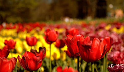
#3 is pretty good IMO. I like the DOF. You could tone down the saturation a touch. In terms of composition, I guess the wilting left lower flower and the partial on the right bottom tends to be a little distracting.
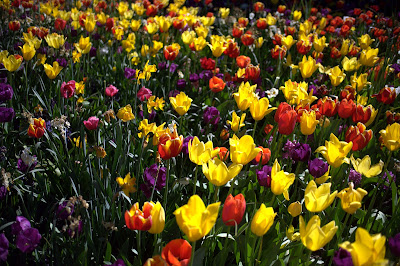
#1 and #2 appear a little dark. I guess it could be personal preference but I prefer the flowers in this setting relatively high key...
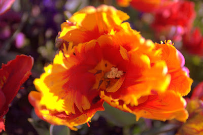
#4 is hard to see the details and hence critique properly. Perhaps a slightly larger picture (800pix or so) would be helpful.
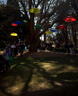
Looks like an interesting event. Would like to see some more pics.

HTH.