
A couple of shots of my granddaughter, 1 with my old camera the other with D200 .
Suzanne
A discussion forum - and more - for users of Digital Single Lens Reflex cameras.
My GranddaughterModerators: Greg B, Nnnnsic, Geoff, Glen, gstark, Moderators
Forum rules
Please note that image critiquing is a matter of give and take: if you post images for critique, and you then expect to receive criticism, then it is also reasonable, fair and appropriate that, in return, you post your critique of the images of other members here as a matter of courtesy. So please do offer your critique of the images of others; your opinion is important, and will help everyone here enjoy their visit to far greater extent. Also please note that, unless you state something to the contrary, other members might attempt to repost your image with their own post processing applied. We see this as an acceptable form of critique, but should you prefer that others not modify your work, this is perfectly ok, and you should state this, either within your post, or within your signature. Images posted here should conform with the general forum guidelines. Image sizes should not exceed 950 pixels along the largest side (height or width) and typically no more than four images per post or thread. Please also ensure that you have a meaningful location included in your profile. Please refer to the FAQ for details of what "meaningful" is.
Previous topic • Next topic
7 posts
• Page 1 of 1
My Granddaughter
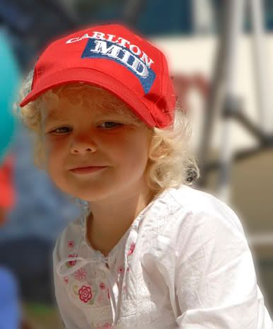
A couple of shots of my granddaughter, 1 with my old camera the other with D200 . Suzanne Nikon D200, 24-120mm VR, 70-300 ED, SB800 flash, Manfrotto tripod,
I like the first, very nice. The second has the red reflection of her hat on her face. Don't know if this could be removed in PS.
Cheers Sheila Sheila Smart
Canon 5D and various Ls Black and White Spider Award 2005 - Photographer of the Year - amateur On-line Gallery here
I like the first also. good light and the had makes a good composition.
as mentioned, the 2nd has a red cast on the face. possibly some fill would have helped, but better to be aware of potential issues such as this and avoid them. you notice also that the whites are quite hot on the shirt. seems to be taken with the sun high and therefore quite strong BTW: seems sharp enough. I guess you have been practicing your techniques after the other thread. Steve check out my image gallery @
http://photography.avkomp.com/gallery3
Thanks Steve and Shelia , these shots where taken before my dramas with the camera,, I am going to put all the setting back to default, and just up the sharpening, see how that goes, did a few practise runs this afternoon, on tripod,
Suzanne Nikon D200, 24-120mm VR, 70-300 ED, SB800 flash, Manfrotto tripod,
Lovely Suzanne. I do agree with teh previous comments that some fill would help to diffuse the red in teh second shot. She's a cutie and I'm sure you'll give your D200 a workout around her.
Cheers
Mark http://www.trekaboutphotography.com He who dies with the most lenses wins...
lovley shots........ like all photography these 2 pix's can be improved
this is what I would do, but as you are the photographer and are happy with the pix's, is what is important......... 1: I find the first pix great but would warm the shot a just little as it looks a little cyan or cold but only in colour 2: this is also good but I find the face just a little dark, the red on the face does not worry me as it is a natural reflection off the hat, and a lot of this will go if the face was a little lighter....... have a play in curves...... Cheers ....bp....
Difference between a good street photographer and a great street photographer.... Removing objects that do not belong... happy for the comments, but .....Please DO NOT edit my image..... http://bigpix.smugmug.com Forever changing
These are great captures, find the first really catching, such a great expression and moment, terrific hat, great pose, like this...
The shadow in the second doesn't worry me... If you want to play in PP, I'd be tempted to sharpen up the eyes a smidge in the first...? Aka Andrew
Previous topic • Next topic
7 posts
• Page 1 of 1
|


