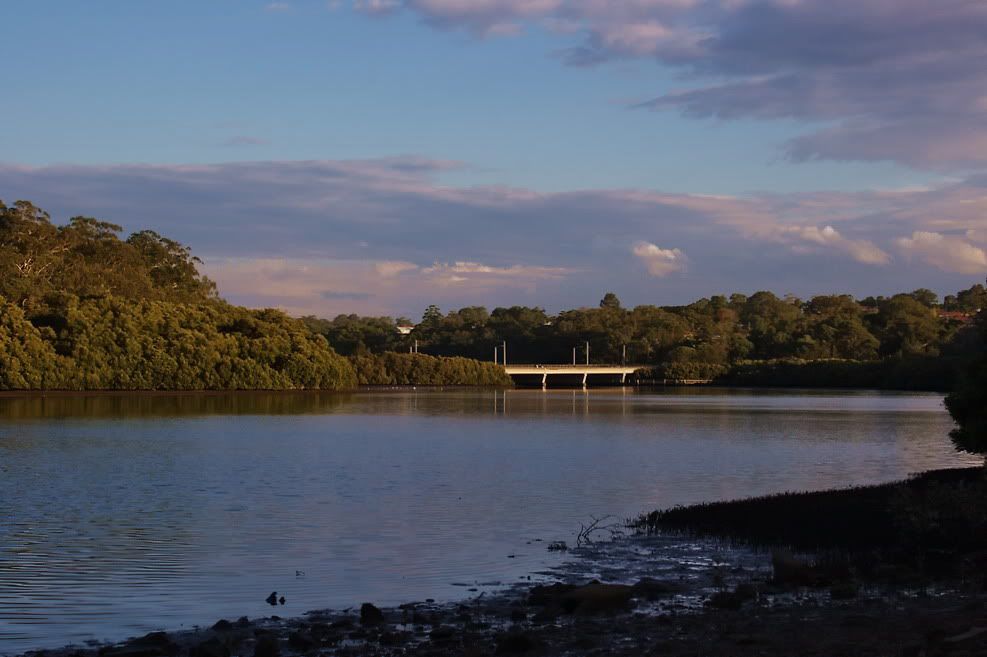
2.
3.
take your pick, or make your own
oh and the kit lense with the 20D isn't THAT bad
A discussion forum - and more - for users of Digital Single Lens Reflex cameras.
a question of saturationModerators: Greg B, Nnnnsic, Geoff, Glen, gstark, Moderators
Forum rules
Please note that image critiquing is a matter of give and take: if you post images for critique, and you then expect to receive criticism, then it is also reasonable, fair and appropriate that, in return, you post your critique of the images of other members here as a matter of courtesy. So please do offer your critique of the images of others; your opinion is important, and will help everyone here enjoy their visit to far greater extent. Also please note that, unless you state something to the contrary, other members might attempt to repost your image with their own post processing applied. We see this as an acceptable form of critique, but should you prefer that others not modify your work, this is perfectly ok, and you should state this, either within your post, or within your signature. Images posted here should conform with the general forum guidelines. Image sizes should not exceed 950 pixels along the largest side (height or width) and typically no more than four images per post or thread. Please also ensure that you have a meaningful location included in your profile. Please refer to the FAQ for details of what "meaningful" is.
Previous topic • Next topic
6 posts
• Page 1 of 1
a question of saturation
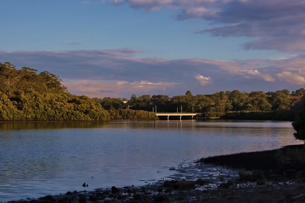
1.
2.
3.
take your pick, or make your own oh and the kit lense with the 20D isn't THAT bad
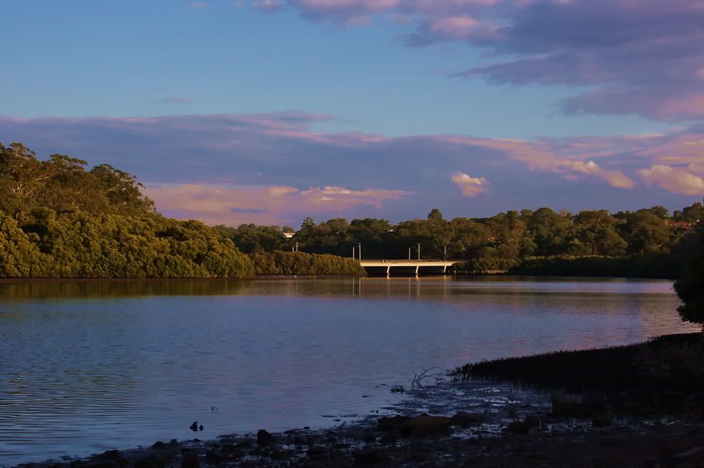
#3 for me
(But I often get told I oversaturate my images Paul http://www.australiandigitalphotography.com
Living in poverty due to my addiction to NIKON... Is there a clinic that can help me?
err i don't really see a difference. is it supposed to be obvious or subtle?
Also can you please reduce the size of the images? If I was using the desktop I wouldn't mind as much as the pic would fit on the screen but at 1024x768 res on the laptop, i can't see the entire pic - hence the increased probability of me not noticing anything with the three versions. Hassy, Leica, Nikon, iPhone
Come follow the rabbit hole...
Kenny,
Pirostich makes a valid point here regarding the image sizes. A couple, really. As a general guide, the maxium size of any side - width or height - should not be greater than 800 pixels. Your images' width is somewhat greater than this, but for one image, or a couple, this wouldn't be a major problem. But in this case you're asking that we compare A with B with C, and with images this large, and even with a fairly large screen, one can only see on and a bit images at any one time, thus making the comparisons you're asking us to do somewhat difficult. So, for this sort of task, it would be far more productive, I think, to use much smaller images, allowing at least two images to be fully seen within the context of the compariosns that you're asking to be done. As it stands now, you've possibly turned off more than a few people from offering comments, simply because of your presentation. g.
Gary Stark Nikon, Canon, Bronica .... stuff The people who want English to be the official language of the United States are uncomfortable with their leaders being fluent in it - US Pres. Bartlet
Previous topic • Next topic
6 posts
• Page 1 of 1
|


