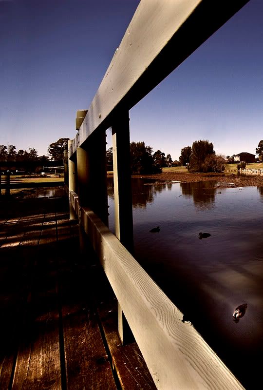
Cropped about 60% so it doesn't realy look like a wideangle.
Your comments appreciated.
A discussion forum - and more - for users of Digital Single Lens Reflex cameras.
Local LakeModerators: Greg B, Nnnnsic, Geoff, Glen, gstark, Moderators
Forum rules
Please note that image critiquing is a matter of give and take: if you post images for critique, and you then expect to receive criticism, then it is also reasonable, fair and appropriate that, in return, you post your critique of the images of other members here as a matter of courtesy. So please do offer your critique of the images of others; your opinion is important, and will help everyone here enjoy their visit to far greater extent. Also please note that, unless you state something to the contrary, other members might attempt to repost your image with their own post processing applied. We see this as an acceptable form of critique, but should you prefer that others not modify your work, this is perfectly ok, and you should state this, either within your post, or within your signature. Images posted here should conform with the general forum guidelines. Image sizes should not exceed 950 pixels along the largest side (height or width) and typically no more than four images per post or thread. Please also ensure that you have a meaningful location included in your profile. Please refer to the FAQ for details of what "meaningful" is.
Previous topic • Next topic
3 posts
• Page 1 of 1
Local Lake
Finally got around to using my new lens - Sigma 10-20.
Cropped about 60% so it doesn't realy look like a wideangle. Your comments appreciated. __________
Phillip **Nikon D7000**
Woah, looks wiiiiiiide to me
Good use of leading lines, although not sure on the WB ? Not sure if it's just me or not, but the bright area in the BR corner with the duck (is it a duck?) seems to catch my eye... Wondering about cropping down the right hand side to *just* remove the bright area in the water there? My eye seems to follow the lines of the railings but bounces back to that bright spot... Not sure if that's you intended though... Just trying to provide feedback, take my ramblings with a grain of salt Aka Andrew
Thanks Andrew, your ramblins are very much appreciated.
Actually you're right on all counts. I played around with the W/B a fair bit because I thought it was too blue to start with so I could have gone a bit off. I thought about the duck as well, the highlight on the face is original so I thought either crop it or enhance it. I decided to lighten the area around the duck . In hindsight maybe better to crop. __________
Phillip **Nikon D7000**
Previous topic • Next topic
3 posts
• Page 1 of 1
|


