

A discussion forum - and more - for users of Digital Single Lens Reflex cameras.
A bit differentModerators: Greg B, Nnnnsic, Geoff, Glen, gstark, Moderators
Forum rules
Please note that image critiquing is a matter of give and take: if you post images for critique, and you then expect to receive criticism, then it is also reasonable, fair and appropriate that, in return, you post your critique of the images of other members here as a matter of courtesy. So please do offer your critique of the images of others; your opinion is important, and will help everyone here enjoy their visit to far greater extent. Also please note that, unless you state something to the contrary, other members might attempt to repost your image with their own post processing applied. We see this as an acceptable form of critique, but should you prefer that others not modify your work, this is perfectly ok, and you should state this, either within your post, or within your signature. Images posted here should conform with the general forum guidelines. Image sizes should not exceed 950 pixels along the largest side (height or width) and typically no more than four images per post or thread. Please also ensure that you have a meaningful location included in your profile. Please refer to the FAQ for details of what "meaningful" is.
Previous topic • Next topic
7 posts
• Page 1 of 1
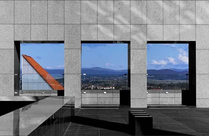
A bit different
These two images are an oddity for me in that they aren't my normal "style" whatever that may be. They are both different yet have similar feel to me. Both shots were taken at New Parliament House in Canberra with my 28-70 f/2.8 lens. The first one was taken in the underground car park, the second from the roof. Let me know what you think even if you think they are junk!. Click an image to see it larger.
Peter
Disclaimer: I know nothing about anything. *** smugmug galleries: http://www.stubbsy.smugmug.com ***
hey peter, i like number one more, number two doesn't do much for me. i think if you cropped just the very top off number one it might look a bit smoother, i like the colours of number 1 too.
thanks. Nathan
D700 | MB-D10 | Nikkor 14-24 | Nikkor 24-70 | Sigma 70-200 | 20 2.8 28 2.8 35 2 50 1.8 | Sigma 105 | SB-800 http://www.flickr.com/nathanjphoto/
I have to take a different view to Nathan, something attracts me to photo #2 in an abstract way. Just mucking around in PS and came up with this:
 President, A.A.A.A.A (Australian Association Against Acronym Abuse)
Canon EOS R6, RF 24-105 F4, RF 70-200 F4, RF 35mm F1.8, RF 16mm F2.8 "And ye shall know the truth, and the truth shall make you free." (John 8:32)
If number two had some other focal point in the third window along (left to right) I think it would have worked better than it did, or as a contrast nothing in the first window. I still like the photo though, it is the opposite of a traditional art gallery, where a photo is framed on the wall rather than the wall being the frame to the landscape. It appeals to me.
Both compositions are very geometric with the shapes on offer. The lighting in the first is very interesting..the shadows adding separation mid-frame between dark and light.
I can't help but feel that the white triangle to the left in the second is too dominating and breaks the general tone of the photo..Having said that, it is a very strong geometric composition with the three squares reminiscent of the slot machines
The first one is great, love it.
The second one, in my opinion is let down by the background, which just does nothing for me.
Previous topic • Next topic
7 posts
• Page 1 of 1
|


