DSLRUsers.com
A discussion forum - and more - for users of Digital Single Lens Reflex cameras.
CraigModerators: Greg B, Nnnnsic, Geoff, Glen, gstark, Moderators
Forum rules
Please note that image critiquing is a matter of give and take: if you post images for critique, and you then expect to receive criticism, then it is also reasonable, fair and appropriate that, in return, you post your critique of the images of other members here as a matter of courtesy. So please do offer your critique of the images of others; your opinion is important, and will help everyone here enjoy their visit to far greater extent. Also please note that, unless you state something to the contrary, other members might attempt to repost your image with their own post processing applied. We see this as an acceptable form of critique, but should you prefer that others not modify your work, this is perfectly ok, and you should state this, either within your post, or within your signature. Images posted here should conform with the general forum guidelines. Image sizes should not exceed 950 pixels along the largest side (height or width) and typically no more than four images per post or thread. Please also ensure that you have a meaningful location included in your profile. Please refer to the FAQ for details of what "meaningful" is.
Previous topic • Next topic
6 posts
• Page 1 of 1
Craig
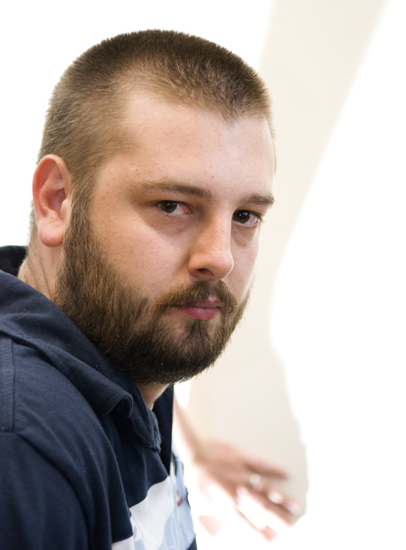
Playing with a few SB800's, the use of Paul's brolly, stand and flash adapter...result # 1 - many more to come. Comments, good bad and ugly welcomed:
Geoff
Special Moments Photography Nikon D700, 50mm 1.4, 85mm 1.4, 70-200 2.8VR, SB800 & some simple studio stuff.
Pity my eyes are so bloodshot, but you could fix that in post.. um I like the funky shadow from my arm on the wall.. I'm sure not everyone will but I like the affect..
How did the snoot ones come out ?
I'm going with ugly I think a little more contrast and shadow, maybe do it in B&W, it just seems to be lacking punch. Nikon D80, MB-D80, Nikon 50mm f/1.8, Nikon 17-55mm f/2.8, SB-800, Sigma 18-200 f/3.5-6.3
Various bits of borrowed/stolen glass/speedlights etc. - zero style or taste. http://harryfisherphotos.smugmug.com
Took me a while to realise that was Craig's arm in the background. For some reason, the perspective gave it a longer focal length look...
I prefer #2 (in the other thread), the composition doesn't look right IMO - needs to be shifted a little left, towards more of Craig's back.
Goeff
It's a good pose but technically it doesn't 'pop'. I too like the background treatment. The shadows around the eyes? Is that an effect you were after? Regards
Matt. K
Previous topic • Next topic
6 posts
• Page 1 of 1
|


- Mods Database • The team • Delete all board cookies • Reset blocks • All times are UTC + 10 hours [ DST ]

