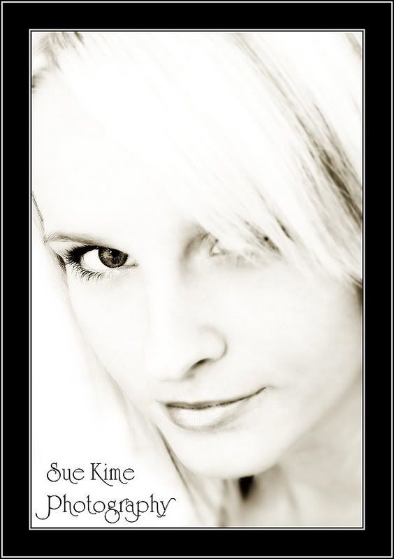
anyways enough whining from me...I did a portfolio for a lass that aims to be a model a few weeks ago....she wanted 'something different'..which is exactly what she got...
what do you think?
A discussion forum - and more - for users of Digital Single Lens Reflex cameras.
I've been so slack...Moderators: Greg B, Nnnnsic, Geoff, Glen, gstark, Moderators
Forum rules
Please note that image critiquing is a matter of give and take: if you post images for critique, and you then expect to receive criticism, then it is also reasonable, fair and appropriate that, in return, you post your critique of the images of other members here as a matter of courtesy. So please do offer your critique of the images of others; your opinion is important, and will help everyone here enjoy their visit to far greater extent. Also please note that, unless you state something to the contrary, other members might attempt to repost your image with their own post processing applied. We see this as an acceptable form of critique, but should you prefer that others not modify your work, this is perfectly ok, and you should state this, either within your post, or within your signature. Images posted here should conform with the general forum guidelines. Image sizes should not exceed 950 pixels along the largest side (height or width) and typically no more than four images per post or thread. Please also ensure that you have a meaningful location included in your profile. Please refer to the FAQ for details of what "meaningful" is.
Previous topic • Next topic
7 posts
• Page 1 of 1
I've been so slack...
not posting anywhere much these days due to an internet problem....as in I moved house and have been unable to obtain any sort of broadband at my new place...which I might add is in the heart of suburbia...something to do with a lack of ports...or so they tell me...
anyways enough whining from me...I did a portfolio for a lass that aims to be a model a few weeks ago....she wanted 'something different'..which is exactly what she got... what do you think?
The last thing I want to do is hurt you... but it's still on the list...
WOW, I like them in the order Posted!
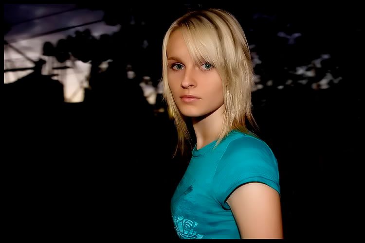
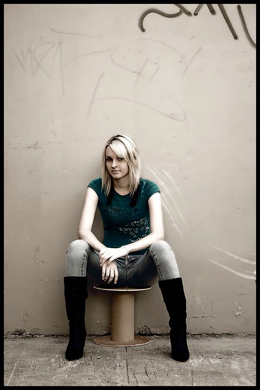
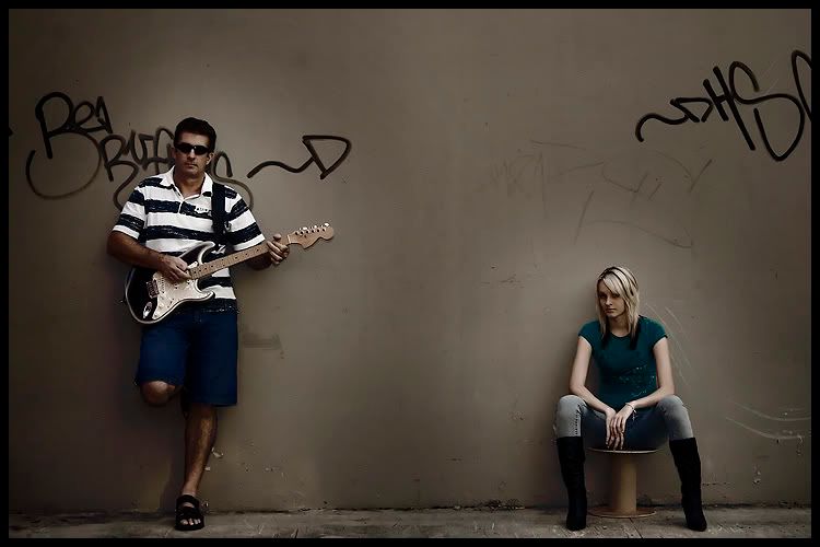
#1 Awesome, just Love it. #2 Excellent, really like it too #3 Not sure the negative space works for me.. but still a good shot #4 Not a fan of the processing the (halo ish) around the people but still stylish
The first is good, just not my cup of tea, well executed though!
Really like the second, the tones look great. This is my favourite of all of them. In the third she seems to be too bright, I like the idea but I think you may have gone a little overboard on her arms... I would have liked to have seen something more on the wall above her though, perhaps some more graffiti? And the fourth I like the treatment (the halo around the two) I just find the emptiness between them a little disconcerting, hard to explain... I think like the second if there was more on the walls this would work a little better for me, or the two were a little closer, or taken from an angle and having the guitarist OOF... (sorry just thinking aloud as I do from time). Nice work though
Bindii,
they were worth the wait. She will be very pleased with these. Like Craig, I love the first one. Also really like #3, it would make for a nice magazine cover, just have the headlines at the top. The lighting in the second is great, my little niggle on it is that I find the upper left a bit busy. I would have preferred the foliage to extend there as well. Cheers, André Photography, as a powerful medium of expression and communications, offers an infinite variety of perception, interpretation and execution. Ansel Adams
(misc Nikon stuff)
Wow... she's very attractive.
#1 and #2 are great and really show her off well. #3 and #4 don't do much for me as I don't really understand what you are trying to show. She still looks attractive, though. Edit: I agree with André. #3 would work very well as a magazine cover with room down the sides for the contents.
four very nice shots
just few things to think about on the first one it looks like you have added the shadow line in the middle of her lips as you can see separate spots maybe you could use a very small brush with the blur tool to blend these together to give a smoother line just my opinion but it looks like you have gone a little to far with neatimage on the skin in the second one as it is starting to look a bit plastic and fake I agree with bwhinnen about the bright arms but they only need to come back about a 1/3 of the way back to the face tones (which are fantastic and a lot more natural than in #2) or you would ruin the effect you are going for by the look of the girl she should do well as a model and she should be very pleased with your photos
Previous topic • Next topic
7 posts
• Page 1 of 1
|


