DSLRUsers.com
A discussion forum - and more - for users of Digital Single Lens Reflex cameras.
Mother and sonModerators: Greg B, Nnnnsic, Geoff, Glen, gstark, Moderators
Forum rules
Please note that image critiquing is a matter of give and take: if you post images for critique, and you then expect to receive criticism, then it is also reasonable, fair and appropriate that, in return, you post your critique of the images of other members here as a matter of courtesy. So please do offer your critique of the images of others; your opinion is important, and will help everyone here enjoy their visit to far greater extent. Also please note that, unless you state something to the contrary, other members might attempt to repost your image with their own post processing applied. We see this as an acceptable form of critique, but should you prefer that others not modify your work, this is perfectly ok, and you should state this, either within your post, or within your signature. Images posted here should conform with the general forum guidelines. Image sizes should not exceed 950 pixels along the largest side (height or width) and typically no more than four images per post or thread. Please also ensure that you have a meaningful location included in your profile. Please refer to the FAQ for details of what "meaningful" is.
Previous topic • Next topic
14 posts
• Page 1 of 1
Mother and son
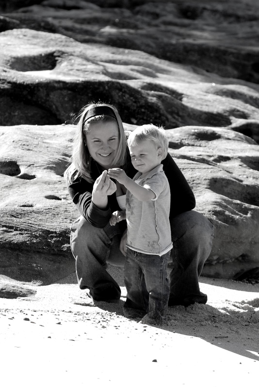
One from a recent family shoot that I quite liked. Comments welcomed, a tighter crop perhaps?
Geoff
Special Moments Photography Nikon D700, 50mm 1.4, 85mm 1.4, 70-200 2.8VR, SB800 & some simple studio stuff.
Yes, a tighter crop. The expressions on the faces and the hands are very endearing, but the surrounds don't add much, IMHO.
Cheers Steffen. lust for comfort suffocates the soul
I too agree on the tighter crop.
HAving said that great image and very natural.
I actually like the background to the subjects, great shot Geoff.
President, A.A.A.A.A (Australian Association Against Acronym Abuse)
Canon EOS R6, RF 24-105 F4, RF 70-200 F4, RF 35mm F1.8, RF 16mm F2.8 "And ye shall know the truth, and the truth shall make you free." (John 8:32)
Geoff, I think the background and foreground add context to what mother and son are doing (looking at something picked up on the beach, presumably) and represents a beautiful shared moment.
I wonder how a colour version would look? (Considering I am a B&W fan) Regards, Patrick
Two or three lights, any lens on a light-tight box are sufficient for the realisation of the most convincing image. Man Ray 1935. Our mug is smug
Thanks for the comments and suggestions peoples - always appreciated.
Geoff
Special Moments Photography Nikon D700, 50mm 1.4, 85mm 1.4, 70-200 2.8VR, SB800 & some simple studio stuff.
Here we are, with a tighter crop too. Personally I much prefer the B&W: 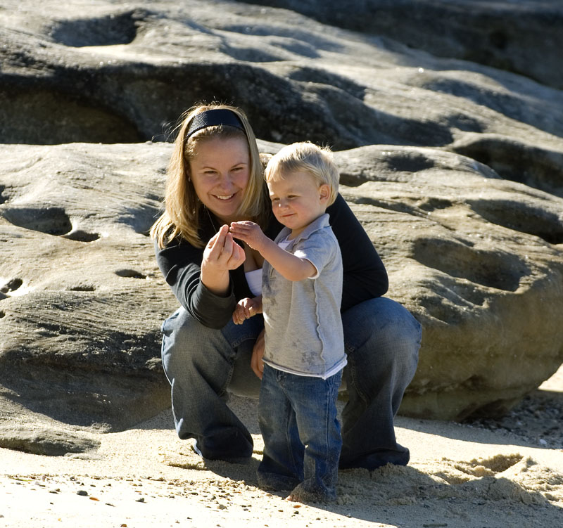 Geoff
Special Moments Photography Nikon D700, 50mm 1.4, 85mm 1.4, 70-200 2.8VR, SB800 & some simple studio stuff.
Love the tighter crop and the colour. I normally prefer B & W but think this second shot is magic.
The background has come to life and there is now highlights within the sand that show up where they didn't in the B & W version.
Geoff, #2 is a winner. Lovely shot.
I prefer the colour mainly because this image is already quite contrasty what with the bright sunlight and dark shadows, and the black and white has pushed that a bit too far. I really like contrasty black and whites as a rule, but for this particular image of mother and son the lowered contrast and the warmth of the colour version are preferable. Cheers, Cheers,
macka a.k.a. Kris
Crop is better Geoff but would have liked to see some fill flash to give even more contrast and bring out more detail
Chris
-------------------------------- I started my life with nothing and I’ve still got most of it left
Previous topic • Next topic
14 posts
• Page 1 of 1
|


- Mods Database • The team • Delete all board cookies • Reset blocks • All times are UTC + 10 hours [ DST ]

