|
Got a thin skin? Then look elsewhere. Post a link to an image that you've made, and invite others to offer their critiques. Honesty is encouraged, but please be positive in your constructive criticism. Flaming and just plain nastiness will not be tolerated. Please note that this is not an area for you to showcase your images, nor is this a place for you to show-off where you have been. This is an area for you to post images so that you may share with us a technique that you have mastered, or are trying to master. Typically, no more than about four images should be posted in any one post or thread, and the maximum size of any side of any image should not exceed 950 px.
Moderators: Greg B, Nnnnsic, Geoff, Glen, gstark, Moderators
Forum rules
Please note that image critiquing is a matter of give and take: if you post images for critique, and you then expect to receive criticism, then it is also reasonable, fair and appropriate that, in return, you post your critique of the images of other members here as a matter of courtesy. So please do offer your critique of the images of others; your opinion is important, and will help everyone here enjoy their visit to far greater extent.
Also please note that, unless you state something to the contrary, other members might attempt to repost your image with their own post processing applied. We see this as an acceptable form of critique, but should you prefer that others not modify your work, this is perfectly ok, and you should state this, either within your post, or within your signature.
Images posted here should conform with the general forum guidelines. Image sizes should not exceed 950 pixels along the largest side (height or width) and typically no more than four images per post or thread.
Please also ensure that you have a meaningful location included in your profile. Please refer to the FAQ for details of what "meaningful" is.
 by ATJ on Sun Aug 09, 2009 11:21 am by ATJ on Sun Aug 09, 2009 11:21 am
-

ATJ
- Senior Member
-
- Posts: 3982
- Joined: Fri Feb 18, 2005 10:44 am
- Location: Blue Mountains, NSW
-
by Mr Darcy on Sun Aug 09, 2009 2:27 pm
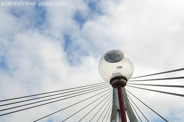
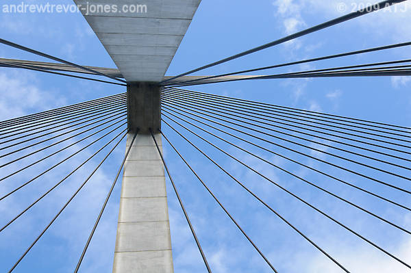
Of these #1 works for me, and possibly #2. The others look like you've attempted to capture the symmetry and missed. I have one similar to you #4 which I feel works better. I will post it in a day or two. Don't have time to do it at the moment.
Greg
It's easy to be good... when there is nothing else to do
-

Mr Darcy
- Senior Member
-
- Posts: 3414
- Joined: Thu Oct 26, 2006 11:35 pm
- Location: The somewhat singed and blackened Blue Mountains
by CraigVTR on Sun Aug 09, 2009 3:52 pm
Andrew
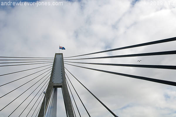
I agree with Greg but think there is too much unused sky at the top of the first two images. I like the positioning of the light and the flag in #1, well spotted.
Craig
Lifes journey is not to arrive at our grave in a well preserved body but, rather to skid in sideways, totally worn out, shouting, "Wow what a ride."
D70s, D300, 70-300ED, 18-70 Kit Lens, Nikkor 105 Micro. Manfrotto 190Prob Ball head. SB800 x 2.
-

CraigVTR
- Senior Member
-
- Posts: 1243
- Joined: Fri Feb 03, 2006 6:09 pm
- Location: Montville, Sunshine Coast, Queensland
-
by ATJ on Sun Aug 09, 2009 4:52 pm
Thanks for the comments. I guess I just don't have an eye for these sorts of photographs. I thought the 4th was the strongest of the lot. Seems I was wrong. I was not trying to capture any symmetry at all in any of the shots. Quite the contrary, I was going after asymmetry and leading lines.
-
ATJ
- Senior Member
-
- Posts: 3982
- Joined: Fri Feb 18, 2005 10:44 am
- Location: Blue Mountains, NSW
-
by biggerry on Sun Aug 09, 2009 5:30 pm
capture the symmetry and missed.
trying to capture any symmetry
symmetry was hard to capture since the walkway is never in the middle, the only really good spot for that, in my opinion, is in the middle of the road, which has it's difficulties.... the final image i think is the strongest and appeals to me, the placement of the pylon and the leading lines works, the only thing i find as an issue is teh colour of teh sky, this however could be my end, it seems alittle too 'light blue' maybe a little darker with contrast on the clouds would suit?
-

biggerry
- Senior Member
-
- Posts: 5930
- Joined: Tue May 13, 2008 12:40 am
- Location: Under the flight path, Newtown, Sydney
-
by aim54x on Sun Aug 09, 2009 6:23 pm
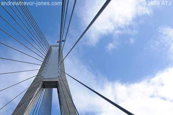
I have to be different on this one. #3 nails it for me. The colours and composition just work for me. I have to say that #1 and #4 do little for me with the light and and the concrete arms doing little to improve the image in my opinon.
Great to see pics from the walk.
Cameron Nikon F/Nikon 1 | Hasselblad V/XPAN| Leica M/LTM |Sony α/FE/E/Maxxum/M42Wishlist Nikkor 24/85 f/1.4| Fuji Natura BlackScout-Images | Flickr | 365Project
-

aim54x
- Senior Member
-
- Posts: 7305
- Joined: Fri Feb 01, 2008 10:13 pm
- Location: Penshurst, Sydney
-
by Mr Darcy on Sun Aug 09, 2009 11:04 pm
ATJ wrote:I was going after asymmetry and leading lines.
Well I guess you achieved it. The photos still don't work for me though. Greg
It's easy to be good... when there is nothing else to do
-
Mr Darcy
- Senior Member
-
- Posts: 3414
- Joined: Thu Oct 26, 2006 11:35 pm
- Location: The somewhat singed and blackened Blue Mountains
by stubbsy on Sun Aug 16, 2009 12:30 pm
ANdrew. I agree with Cameron. #3 is the one 
-

stubbsy
- Moderator
-
- Posts: 10748
- Joined: Wed Dec 08, 2004 7:44 pm
- Location: Newcastle NSW - D700
-
Return to Image Reviews and Critiques
|