|
Got a thin skin? Then look elsewhere. Post a link to an image that you've made, and invite others to offer their critiques. Honesty is encouraged, but please be positive in your constructive criticism. Flaming and just plain nastiness will not be tolerated. Please note that this is not an area for you to showcase your images, nor is this a place for you to show-off where you have been. This is an area for you to post images so that you may share with us a technique that you have mastered, or are trying to master. Typically, no more than about four images should be posted in any one post or thread, and the maximum size of any side of any image should not exceed 950 px.
Moderators: Greg B, Nnnnsic, Geoff, Glen, gstark, Moderators
Forum rules
Please note that image critiquing is a matter of give and take: if you post images for critique, and you then expect to receive criticism, then it is also reasonable, fair and appropriate that, in return, you post your critique of the images of other members here as a matter of courtesy. So please do offer your critique of the images of others; your opinion is important, and will help everyone here enjoy their visit to far greater extent.
Also please note that, unless you state something to the contrary, other members might attempt to repost your image with their own post processing applied. We see this as an acceptable form of critique, but should you prefer that others not modify your work, this is perfectly ok, and you should state this, either within your post, or within your signature.
Images posted here should conform with the general forum guidelines. Image sizes should not exceed 950 pixels along the largest side (height or width) and typically no more than four images per post or thread.
Please also ensure that you have a meaningful location included in your profile. Please refer to the FAQ for details of what "meaningful" is.
 by Willy wombat on Fri Jun 18, 2010 1:21 pm by Willy wombat on Fri Jun 18, 2010 1:21 pm
-

Willy wombat
- Senior Member
-
- Posts: 2284
- Joined: Mon Jun 20, 2005 10:47 pm
- Location: Bentleigh, VIC Australia
by Alpha_7 on Fri Jun 18, 2010 2:43 pm
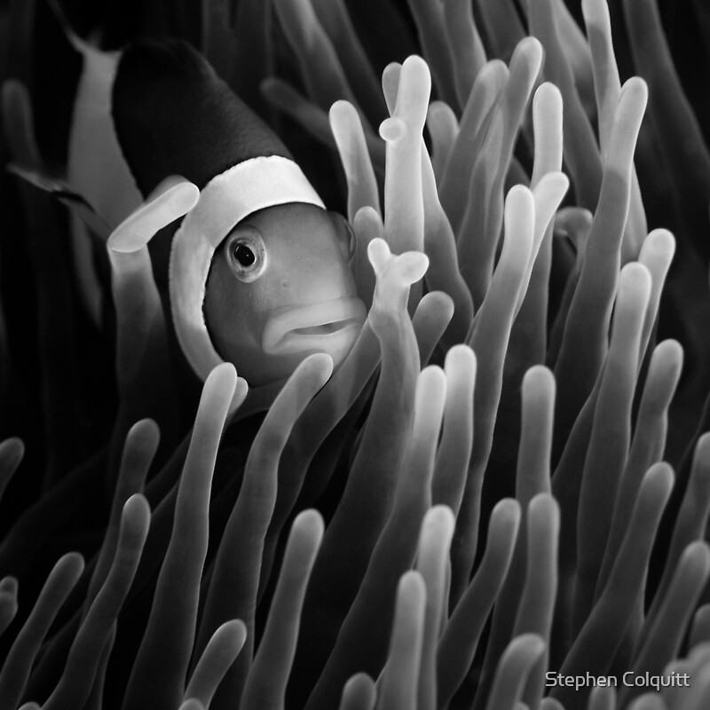
Wow Steve, these are really great. I bet your happy with the results. I'd hard picked to chose a favourite, but I think #1 has a special appeal to me and I like the black and white processing you've done (what does the colour version look like?).
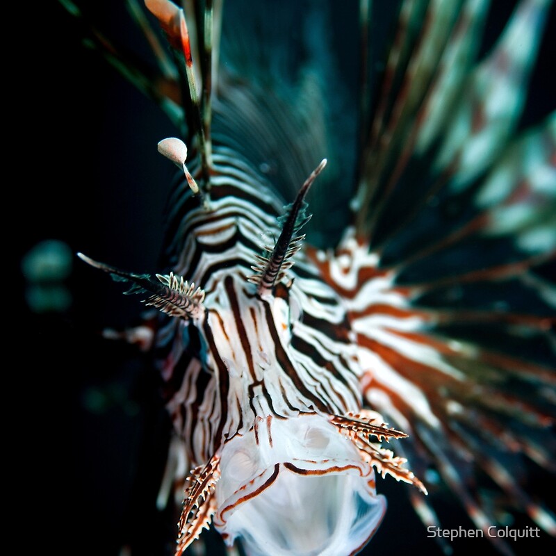
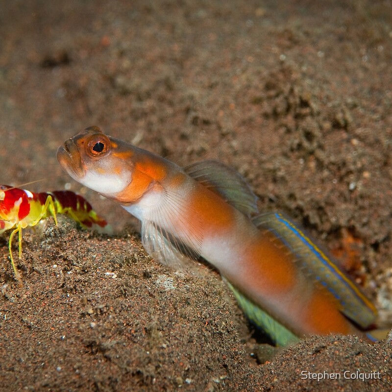
Image wise, I think the last has the least amount of impact, but it does have I guess some humour in capturing a moment the two together, kind looking guilty.
-

Alpha_7
- Senior Member
-
- Posts: 7259
- Joined: Sun Aug 14, 2005 6:19 pm
- Location: Mortdale - Sydney - Nikon D700, x-D200, Leica, G9
-
by biggerry on Fri Jun 18, 2010 2:51 pm
I love that third one, great dof and composition, really jumps out at me and has a 3d feel to it. Perfectly cropped also (or framed) the inclusion of the lines of the fins etc really make go 'wow'. I also like the first, but I reckon its a crime to remove teh colour from this shot.  The last image is nice and could definitely work with a tighter crop as well. Watermark is a bit off putting smack bang in teh middle. Maybe go larger and more transparent? The final linked image is also a winner in my mind, its amazing that is underwater 
-

biggerry
- Senior Member
-
- Posts: 5930
- Joined: Tue May 13, 2008 12:40 am
- Location: Under the flight path, Newtown, Sydney
-
by Manta on Fri Jun 18, 2010 5:22 pm
Gadzooks - what brilliant shots Steve!
Third one is awesome but I find the first one the most powerful, due to the B&W treatment. Clown fish are rarely portrayed that way and you've done a stellar job on the conversion.
Fantastic work, super sharp and crystal clear!
-

Manta
- Former Outstanding Member Of The Year
-
- Posts: 3815
- Joined: Tue Nov 30, 2004 10:49 pm
- Location: Hamilton Qld
-
by aim54x on Sat Jun 19, 2010 2:09 am
WOW, this is a great set, and I really struggle to pick a favourite.
#1 works really well as a black and white, but I also want to see the colour.
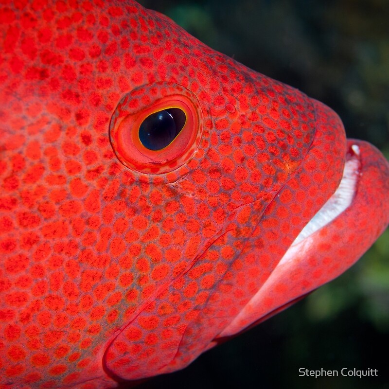
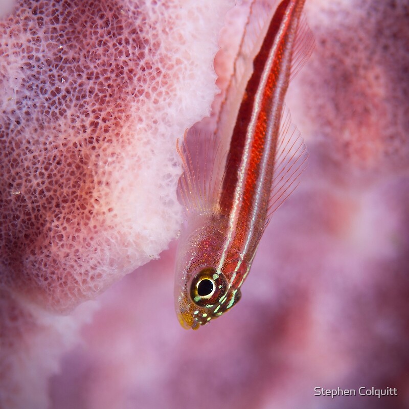
#2 is probably the weak link for me, there is less here than the others
#3 is great, it has depth and dynamic
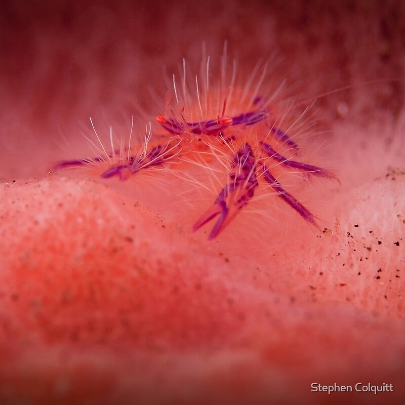
#4 is very interesting, with the prawn and the fish, just begging to caption comically
Cameron Nikon F/Nikon 1 | Hasselblad V/XPAN| Leica M/LTM |Sony α/FE/E/Maxxum/M42Wishlist Nikkor 24/85 f/1.4| Fuji Natura BlackScout-Images | Flickr | 365Project
-

aim54x
- Senior Member
-
- Posts: 7305
- Joined: Fri Feb 01, 2008 10:13 pm
- Location: Penshurst, Sydney
-
by Willy wombat on Mon Jun 21, 2010 5:34 pm
Alpha_7 wrote:Wow Steve, these are really great. I bet your happy with the results. I'd hard picked to chose a favourite, but I think #1 has a special appeal to me and I like the black and white processing you've done (what does the colour version look like?).
Image wise, I think the last has the least amount of impact, but it does have I guess some humour in capturing a moment the two together, kind looking guilty.
Hi Craig - Yes I very happy with these. Shame I sat on them for so long. Its nice to go back over old shots to see what you missed on the first pass. The last shot is more a behavioural image than an artistic piece. These two critters actually havean interesting symbiotic relationship where the shrimp digs the holes but cant see well, and the fish lives with the shrimp in the holes (getting a free place to live) and in turn keeps a look out for danger whilst the shrimp is digging. Its quite cool to watch but difficult to get close to the action because a diver is often perceived as a danger and they scurry back down into the hole. biggerry wrote:I love that third one, great dof and composition, really jumps out at me and has a 3d feel to it. Perfectly cropped also (or framed) the inclusion of the lines of the fins etc really make go 'wow'. I also like the first, but I reckon its a crime to remove teh colour from this shot. The last image is nice and could definitely work with a tighter crop as well. Watermark is a bit off putting smack bang in teh middle. Maybe go larger and more transparent? The final linked image is also a winner in my mind, its amazing that is underwater
Sorry about the watermark. Its an automatically generated thing. The presentation of #1 is quite unique. I was very lucky to have my camera pointed at the fish when it opened its mouth up to have a yawn. I have darkened the peripherals a bit to try to accentuate the lines. Its come up quite nicely, even though there is not strong eye contact with the subject. Poor old nemo looked ok in colour but I just wanted to present this in a slightly different way. I was going for more of an art print look for this one. Thanks for checking out all of the images I posted too!! Manta wrote:Gadzooks - what brilliant shots Steve!
Third one is awesome but I find the first one the most powerful, due to the B&W treatment. Clown fish are rarely portrayed that way and you've done a stellar job on the conversion.
Fantastic work, super sharp and crystal clear!
Thanks very much for the feedback! aim54x wrote:WOW, this is a great set, and I really struggle to pick a favourite.
#1 works really well as a black and white, but I also want to see the colour.
#2 is probably the weak link for me, there is less here than the others
#3 is great, it has depth and dynamic
#4 is very interesting, with the prawn and the fish, just begging to caption comically
Thanks for the critique #2 was a hard one because ti is a little dull. Nothing amazing is happening here I agree. Only included for those people who are easily swayed by colour!! Cheers guys Steve
-
Willy wombat
- Senior Member
-
- Posts: 2284
- Joined: Mon Jun 20, 2005 10:47 pm
- Location: Bentleigh, VIC Australia
by surenj on Mon Jun 21, 2010 11:54 pm
Kudos for taking this sort of winning shots UNDERWATER!!  #1 #3 are absolutely brilliant. The last two linked images are also absolute winners. Great color and composition. IS this with a 105mm? How much light is there for you to spot these? What sort of strobes do you use?? I do hope you get these published though. Would be such a waste to keep on your drive!!
-

surenj
- Senior Member
-
- Posts: 7197
- Joined: Fri Sep 15, 2006 8:21 pm
- Location: Artarmon NSW
by Willy wombat on Tue Jun 22, 2010 11:18 am
surenj wrote:Kudos for taking this sort of winning shots UNDERWATER!! #1 #3 are absolutely brilliant. The last two linked images are also absolute winners. Great color and composition. IS this with a 105mm? How much light is there for you to spot these? What sort of strobes do you use?? I do hope you get these published though. Would be such a waste to keep on your drive!!
Hey Suren Yes with the 105mm macro lens. Its very useful lens for underwater images. I use two strobes with my underwater rig - Sea and Sea YS110s I hope that someone decides to publish them too!!! And it would be even better if I could get paid for them!!
-
Willy wombat
- Senior Member
-
- Posts: 2284
- Joined: Mon Jun 20, 2005 10:47 pm
- Location: Bentleigh, VIC Australia
by bigsarg7 on Tue Jun 22, 2010 3:02 pm
wow,
# 1 and #3 are my favourites, number 1 is an image i would expect to see published, it to me has all the quality to make it into a magazine or something. i love the fact #1 is black and white, its classy and I fell in love with it the moment i saw it....a lot of extremely good shots! well done!
2 x Fuji xt1,vg-xt1 grip, Fujinon xf 18-55mm 2.8-4, Fujinon xf 14mm, Fujinon 56mm 1.2.
-

bigsarg7
- Senior Member
-
- Posts: 667
- Joined: Tue Oct 21, 2008 2:11 pm
- Location: Goulburn Valley (Victoria, Australia)
by ATJ on Thu Jun 24, 2010 4:54 pm
Well done, Steve. #4 is my favourite just because of its uniqueness. I have seen many shrimp gobies and even photographed them. I have seen a few snapping shrimp with gobies but never been able to get close enough to get a shot before the shrimp disappears down the burrow. Add to that the fantastic colours of both shrimp and goby, this is a winner in my books.  #1 I'd prefer to see in colour. OK, so I don't like black and white much, but I think its a crime to lose the beautiful colours of the anemonefish and the subtle colours of the anemone tentacles. #2 would be better if you were slightly lower - so you were level with the fish - and slight further forward. Or even better if the cod was heading towards you. #3 is great although could probably do with a tad more depth of field as the eyes look a little soft. Overall, great job and you must be stoked.
-

ATJ
- Senior Member
-
- Posts: 3982
- Joined: Fri Feb 18, 2005 10:44 am
- Location: Blue Mountains, NSW
-
Return to Image Reviews and Critiques
|
