I was bored this afternoon so thought I would create a desktop background to go along with my website.
Here is what I got:
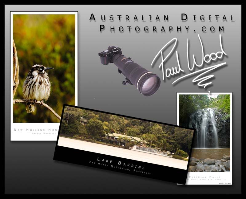
What do you guys think? Any suggestions to make it more appealing/better?
Thanks
Paul
A discussion forum - and more - for users of Digital Single Lens Reflex cameras.
Playing Around In PSCS... Desktop BackgroundModerators: Greg B, Nnnnsic, Geoff, Glen, gstark, Moderators
Forum rules
Please note that image critiquing is a matter of give and take: if you post images for critique, and you then expect to receive criticism, then it is also reasonable, fair and appropriate that, in return, you post your critique of the images of other members here as a matter of courtesy. So please do offer your critique of the images of others; your opinion is important, and will help everyone here enjoy their visit to far greater extent. Also please note that, unless you state something to the contrary, other members might attempt to repost your image with their own post processing applied. We see this as an acceptable form of critique, but should you prefer that others not modify your work, this is perfectly ok, and you should state this, either within your post, or within your signature. Images posted here should conform with the general forum guidelines. Image sizes should not exceed 950 pixels along the largest side (height or width) and typically no more than four images per post or thread. Please also ensure that you have a meaningful location included in your profile. Please refer to the FAQ for details of what "meaningful" is.
Previous topic • Next topic
20 posts
• Page 1 of 1
Playing Around In PSCS... Desktop Background
Hi there,
I was bored this afternoon so thought I would create a desktop background to go along with my website. Here is what I got:
What do you guys think? Any suggestions to make it more appealing/better? Thanks Paul http://www.australiandigitalphotography.com
Living in poverty due to my addiction to NIKON... Is there a clinic that can help me?
Tried moving the Lake Barrine image but couldn't get it to look quite right....
So I added some text: 
Better/worse/other? Paul http://www.australiandigitalphotography.com
Living in poverty due to my addiction to NIKON... Is there a clinic that can help me?
That improves an already very good layout
"The good thing about meditation is that it makes doing nothing respectable"
D3 - http://www.oneputtphotographics.com
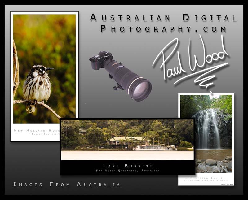
Very nice Paul but I would make just one small suggestion - bring the right hand pic over the centre pic (exactly the same position)
Chris
-------------------------------- I started my life with nothing and I’ve still got most of it left
Like this?
Not sure that I like this one. 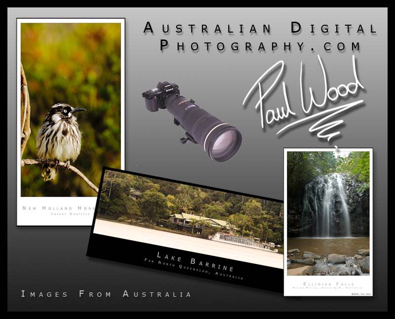
Paul http://www.australiandigitalphotography.com
Living in poverty due to my addiction to NIKON... Is there a clinic that can help me?
Glad you like it. If you're serious then I could give it a go for you. (not tonight though). I must warn you though that I have no idea where this bit of creativity came from and I don't know if I could do it again. I'm limited to only one creative thing per year (it's hard-wired into my brain that way) and.... well it's a long way until next year Paul http://www.australiandigitalphotography.com
Living in poverty due to my addiction to NIKON... Is there a clinic that can help me?
Paul, great work i think it looks fantastic and you have done a great job and i too like Rob wish we could be this creative when bored.
Cheers John BBJ D3,D2x,D70,18-70 kit lens,Sigma 70-200mm F2.8EX HSM,Nikon AF-I 300m F2.8, TC20E 2X
80-400VR,SB800,Vosonic X Drive,VP6210 40 http://www.oz-images.com
just to see what it looks like i wouldn't mind seeing the lake barrine image straight and over the top of the other two images but making sure the light patch across the lake barrine image does not match up with the light sections on the other two images.
probably won't be as good as the tilted version but good to compare. Shane
Life's too short to be sad ! http://bigred4x4.blogspot.com/2008/01/welcome.html http://bigred.redbubble.com
You don't ask much do you? lol kidding
Paul http://www.australiandigitalphotography.com
Living in poverty due to my addiction to NIKON... Is there a clinic that can help me?
Paul
really nice work on your desktop wallpaper. My preference is for the last version, with Lake Barrine straight. I feel the angle detracts from the picture and does not do the image justice. A couple more suggestions (which are only my preference and you do not need to try them out) are: Make the bird photo smaller, perhaps the same size as the waterfall image, and have the Lake Barrine image run underneath the bird and along the bottom, with equal spacing between the borders of the 3 images (to add symmetry). I feel the images would be stronger as seperate units on the screen as opposed to layered, as you currently have them displayed. Reduce the size of the signature & instead of having a lone camera with HUGE lens, perhaps include a photo of yourself taking a photo (or setup ready to take a photo - you may need help with this These are just a couple of thoughts that popped into my head whilst viewing your images. I'm not saying they're better, just something to think about. If you agree & want to try it out, or it sparks further ideas....so be it Dave
Nikon D7000 | 18-105 VR Lens | Nikon 50 1.8G | Sigma 70-300 APO II Super Macro | Tokina 11-16 AT-X | Nikon SB-800 | Lowepro Mini Trekker AWII Photography = Compromise
I agree with you on the photo of me and being more personal.... however I would have to borrow another camera off a friend for that... Can't do that right now.
Next time I'm around someone else with a digital camera I will definately give that a go. Thanks for all your suggestions so far. Keep them comming if you have more. Paul http://www.australiandigitalphotography.com
Living in poverty due to my addiction to NIKON... Is there a clinic that can help me?
is this the sort of personal image your looking to put on there ?
 Shane
Life's too short to be sad ! http://bigred4x4.blogspot.com/2008/01/welcome.html http://bigred.redbubble.com
I liked no 2 best, normally I like things in straight lines, but not this time. I think the Lake Barrine shot on the diagonal and in front of the other two works best for me.
I also pefer the wording "Images of Australia" rather than "Images From Australia", I've given some thought as to why I prefer "of" to "from" but I can't think of a reason, I just do. Bob in Bull Creek
Bob in Bull Creek - I'm with you.
Paul - fantastic work !!!!! If that's what you do when you are bored, I'd love to see what you can do when you put your mind to it!!!!!!!! Well done Rel Dodging and burning are steps to take care of mistakes God made in establishing tonal relationships! -Ansel Adams
http://www.redbubble.com/people/blacknstormy
Paul,
I think your very nice montage would make a good front page for a portfolio or such, but I wouldn't use it as a background. I like my backgrounds unobtrusive, low-contrast. I also like them colour-neutral and mid-tone if I'm looking at photographs on the same screen. Cheers Steffen.
Previous topic • Next topic
20 posts
• Page 1 of 1
|


