|
Got a thin skin? Then look elsewhere. Post a link to an image that you've made, and invite others to offer their critiques. Honesty is encouraged, but please be positive in your constructive criticism. Flaming and just plain nastiness will not be tolerated. Please note that this is not an area for you to showcase your images, nor is this a place for you to show-off where you have been. This is an area for you to post images so that you may share with us a technique that you have mastered, or are trying to master. Typically, no more than about four images should be posted in any one post or thread, and the maximum size of any side of any image should not exceed 950 px.
Moderators: Greg B, Nnnnsic, Geoff, Glen, gstark, Moderators
Forum rules
Please note that image critiquing is a matter of give and take: if you post images for critique, and you then expect to receive criticism, then it is also reasonable, fair and appropriate that, in return, you post your critique of the images of other members here as a matter of courtesy. So please do offer your critique of the images of others; your opinion is important, and will help everyone here enjoy their visit to far greater extent.
Also please note that, unless you state something to the contrary, other members might attempt to repost your image with their own post processing applied. We see this as an acceptable form of critique, but should you prefer that others not modify your work, this is perfectly ok, and you should state this, either within your post, or within your signature.
Images posted here should conform with the general forum guidelines. Image sizes should not exceed 950 pixels along the largest side (height or width) and typically no more than four images per post or thread.
Please also ensure that you have a meaningful location included in your profile. Please refer to the FAQ for details of what "meaningful" is.
 by Michael on Sun May 07, 2006 9:07 pm by Michael on Sun May 07, 2006 9:07 pm
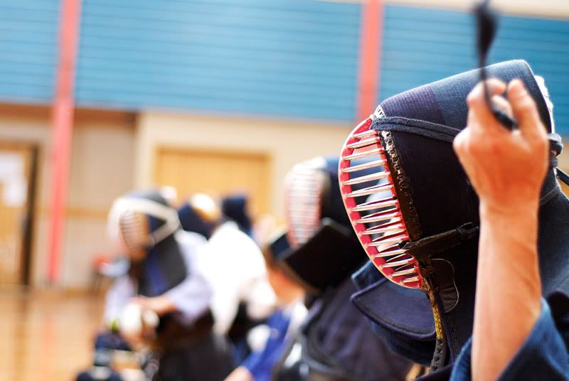
I stumbled across the toowoomba kendo club on my travels today, it turns out the japanese teacher from my old school runs the club as he's japanese, anyhow I liked the colour pic but I thought I could add to it.
I vignetted the lighting to minimise distractions, burned in a few features on the main subject and dodged a few things as well.

larger version
http://static.flickr.com/49/142321982_5606f6350b_o.jpg
comments and critique appreciated as always
EDIT: The edited photo is now in this post FYI Last edited by Michael on Mon May 08, 2006 9:57 am, edited 1 time in total.
Are we there yet?
-

Michael
- Senior Member
-
- Posts: 685
- Joined: Wed Sep 07, 2005 8:48 pm
- Location: Toowoomba QLD
-
by PiroStitch on Sun May 07, 2006 9:10 pm
Nice one Michael  Can you post one w/out the vignetting? The vignetting feels a bit fake
-

PiroStitch
- Senior Member
-
- Posts: 4669
- Joined: Sat Mar 05, 2005 1:08 am
- Location: Hong Kong
-
by Michael on Sun May 07, 2006 9:13 pm
I can post the unedited version.....
 Last edited by Michael on Sun May 07, 2006 9:15 pm, edited 1 time in total.
Are we there yet?
-
Michael
- Senior Member
-
- Posts: 685
- Joined: Wed Sep 07, 2005 8:48 pm
- Location: Toowoomba QLD
-
by Manta on Sun May 07, 2006 9:14 pm
Cool costumes - maybe Kendo can be my next Hobby of the Month. (Have to figure out a way to play sax through the mask)
I like the shot Michael but, like Piro, would perfer to see it sans vignette.
-

Manta
- Former Outstanding Member Of The Year
-
- Posts: 3815
- Joined: Tue Nov 30, 2004 10:49 pm
- Location: Hamilton Qld
-
by PiroStitch on Sun May 07, 2006 9:34 pm
I like the composition Michael. My only other suggestion would be to reduce the brightness or if you shot with Raw, reduce the exp comp. The uniform in the background is a tad distracting
-
PiroStitch
- Senior Member
-
- Posts: 4669
- Joined: Sat Mar 05, 2005 1:08 am
- Location: Hong Kong
-
by Michael on Sun May 07, 2006 9:54 pm
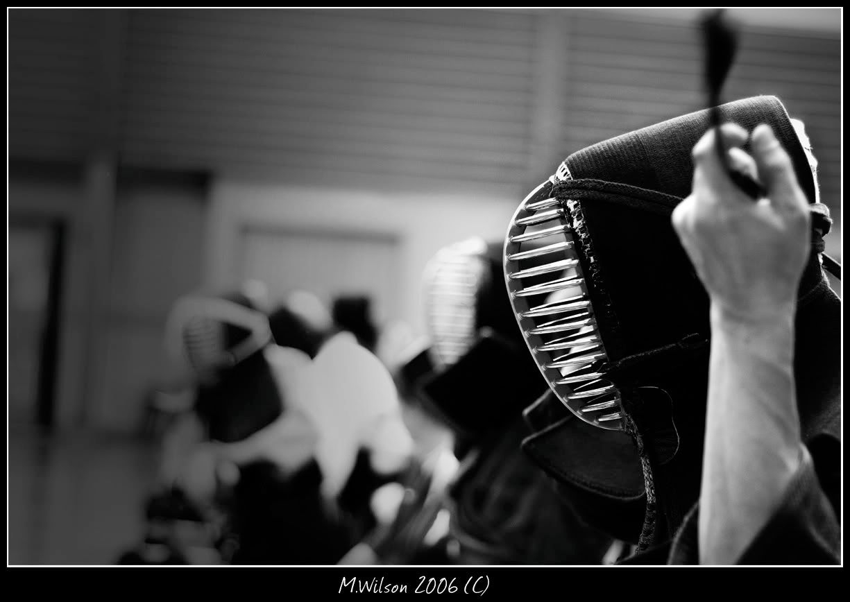
I'll have a go at that piro, I wasn't happy with the colour version mainly because its a dodgy PCYC at least with the BW version you can imagin it's a dojo.
Are we there yet?
-
Michael
- Senior Member
-
- Posts: 685
- Joined: Wed Sep 07, 2005 8:48 pm
- Location: Toowoomba QLD
-
by Slider on Sun May 07, 2006 10:05 pm
Very nice Michael. I think the b&w version has been done well and enhances the original. 
-

Slider
- Senior Member
-
- Posts: 1767
- Joined: Sun Jul 10, 2005 8:17 pm
- Location: Pumicestone Passage, S.E. Qld
-
by Willy wombat on Sun May 07, 2006 11:02 pm
If the move from light to dark in the B&W was a little more graduated then this might help but I quite like it how it is. Nice costume BTW - was he just tightening his face guard? Shame you dont have the staff in the shot
-

Willy wombat
- Senior Member
-
- Posts: 2284
- Joined: Mon Jun 20, 2005 10:47 pm
- Location: Bentleigh, VIC Australia
by xerubus on Sun May 07, 2006 11:08 pm
i really like the black and white michael.. nicely done and interesting subject.
perhaps add some more burning so that it leads up to the front of the mask (and darkening the far left a tad more) and some slight burning above the mask?
cheers
-

xerubus
- Senior Member
-
- Posts: 2740
- Joined: Fri Oct 22, 2004 3:33 pm
- Location: Nth Brisbane
-
by Michael on Sun May 07, 2006 11:14 pm
Willy wombat wrote:If the move from light to dark in the B&W was a little more graduated then this might help but I quite like it how it is. Nice costume BTW - was he just tightening his face guard? Shame you dont have the staff in the shot
They were removing thier masks for the end of the class. thier staffs were next to them.
Is this any better?
http://img.photobucket.com/albums/v730/ ... endoBW.jpgAre we there yet?
-
Michael
- Senior Member
-
- Posts: 685
- Joined: Wed Sep 07, 2005 8:48 pm
- Location: Toowoomba QLD
-
by ABG on Mon May 08, 2006 9:36 am
Yep. I really like what you've done with this photo in PP. Your skills are really shining through here.
Andrew
-

ABG
- Senior Member
-
- Posts: 689
- Joined: Mon Nov 14, 2005 1:53 pm
- Location: Oatley, Sydney
-
by xerubus on Mon May 08, 2006 9:41 am
much better Michael...
cheers
-
xerubus
- Senior Member
-
- Posts: 2740
- Joined: Fri Oct 22, 2004 3:33 pm
- Location: Nth Brisbane
-
by Oneputt on Mon May 08, 2006 9:43 am
Without a doubt, for me the B&W version is best. It is a very strong image.
-

Oneputt
- Senior Member
-
- Posts: 3174
- Joined: Tue Jan 04, 2005 3:58 pm
- Location: Stuck in traffic Maroochydore.
-
by Michael on Mon May 08, 2006 9:52 am
Thanks everyone I used a 50% neutral grey overlay layer, with a soft edged brush set white and 15% opacity to dodge the vignette to make it blend in with everything a little more plus I dodged the metal bits on the helmet.
Once again thanks for the tips it's helped me refine the image to how I feel to be its full or near ful potential.
Michael
EDIT: I just put the image that was in the photobucket link into my original post just so people know.
Are we there yet?
-
Michael
- Senior Member
-
- Posts: 685
- Joined: Wed Sep 07, 2005 8:48 pm
- Location: Toowoomba QLD
-
by Sheila Smart on Mon May 08, 2006 10:23 am
For someone like me who loves mono, I prefer the coloured version. Great DOF and interesting subject matter. Well done.
Cheeres
Sheila
Sheila Smart
Canon 5D and various Ls
Black and White Spider Award 2005 - Photographer of the Year - amateur
On-line Gallery here
-
Sheila Smart
- Member
-
- Posts: 477
- Joined: Sun Jan 15, 2006 10:20 am
- Location: Avalon Beach, NSW
-
by Alpha_7 on Mon May 08, 2006 10:46 am
Michael I really like the revised B&W version you've done well to refine the shot into something powerful, that for me has a real dramatic impact.
-

Alpha_7
- Senior Member
-
- Posts: 7259
- Joined: Sun Aug 14, 2005 6:19 pm
- Location: Mortdale - Sydney - Nikon D700, x-D200, Leica, G9
-
by Michael on Mon May 08, 2006 11:08 am
Thanks alpha Are we there yet?
-
Michael
- Senior Member
-
- Posts: 685
- Joined: Wed Sep 07, 2005 8:48 pm
- Location: Toowoomba QLD
-
Return to Image Reviews and Critiques
|
