DSLRUsers.com
A discussion forum - and more - for users of Digital Single Lens Reflex cameras.
ParklandsModerators: Greg B, Nnnnsic, Geoff, Glen, gstark, Moderators
Forum rules
Please note that image critiquing is a matter of give and take: if you post images for critique, and you then expect to receive criticism, then it is also reasonable, fair and appropriate that, in return, you post your critique of the images of other members here as a matter of courtesy. So please do offer your critique of the images of others; your opinion is important, and will help everyone here enjoy their visit to far greater extent. Also please note that, unless you state something to the contrary, other members might attempt to repost your image with their own post processing applied. We see this as an acceptable form of critique, but should you prefer that others not modify your work, this is perfectly ok, and you should state this, either within your post, or within your signature. Images posted here should conform with the general forum guidelines. Image sizes should not exceed 950 pixels along the largest side (height or width) and typically no more than four images per post or thread. Please also ensure that you have a meaningful location included in your profile. Please refer to the FAQ for details of what "meaningful" is.
Previous topic • Next topic
6 posts
• Page 1 of 1
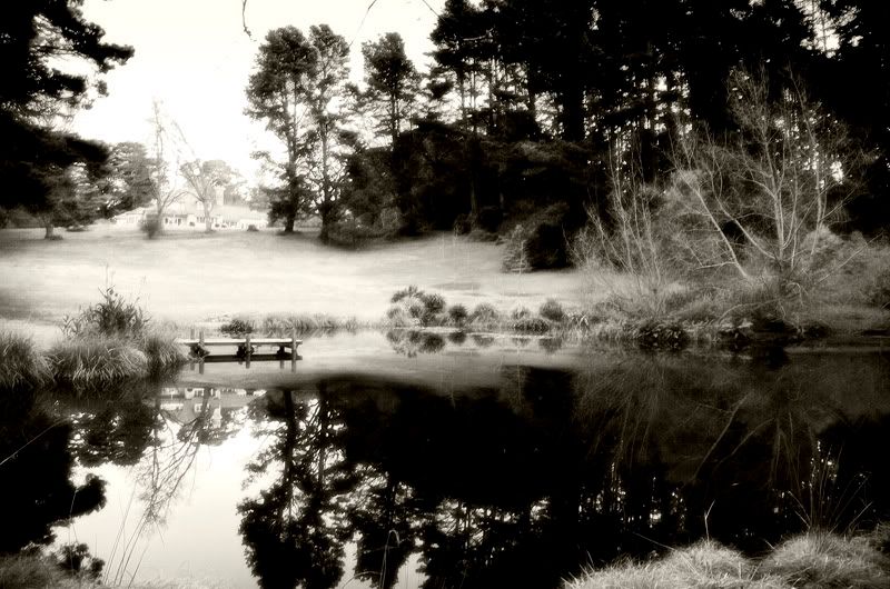
There are aspects that I like and dislike in this shot Phillip.
The highlights are blown out in the top left and the there are some distracting sticks/branches that could go. But Ii like the treatment and the misty appearance near the jetty. Perhaps a pano crop could be an option? Steve (Nikon D200/D700)
My photography website http://wwphoto.redbubble.com/ My photo blog http://www.redbubble.com/people/wwphoto Please feel free to offer any constructive criticism on my works
hi
uuhmm.... it just does not make sense, reflection on the water of the house. try a diferent angle?... maybe sunrise? that small jetty has a lot of potential. the all area has a lot of great angles. christian check my website>> http://www.6701.sunpixs.com
I quite like this. Firstly, the tones. Then, the blown-out light above the house provides a mysterious centre of interest. I find myself looking into the reflection trying to find out what's there above the house...
I would clone out those three twigs sticking in from the top. They look like scratches on an old photograph. Cheers Steffeen. lust for comfort suffocates the soul
Once agin Phillip, you have another nice one. Good contrast and really crisp. Like the others suggested, I would knock out the twigs at the top. The sky is very hot, but it doesn't trouble me greatly. The house at the rear needs to be normal density to match the reflection and not appear too weak.
I still think it is great though. Well done Col
Previous topic • Next topic
6 posts
• Page 1 of 1
|


- Mods Database • The team • Delete all board cookies • Reset blocks • All times are UTC + 10 hours [ DST ]

