|
Got a thin skin? Then look elsewhere. Post a link to an image that you've made, and invite others to offer their critiques. Honesty is encouraged, but please be positive in your constructive criticism. Flaming and just plain nastiness will not be tolerated. Please note that this is not an area for you to showcase your images, nor is this a place for you to show-off where you have been. This is an area for you to post images so that you may share with us a technique that you have mastered, or are trying to master. Typically, no more than about four images should be posted in any one post or thread, and the maximum size of any side of any image should not exceed 950 px.
Moderators: Greg B, Nnnnsic, Geoff, Glen, gstark, Moderators
Forum rules
Please note that image critiquing is a matter of give and take: if you post images for critique, and you then expect to receive criticism, then it is also reasonable, fair and appropriate that, in return, you post your critique of the images of other members here as a matter of courtesy. So please do offer your critique of the images of others; your opinion is important, and will help everyone here enjoy their visit to far greater extent.
Also please note that, unless you state something to the contrary, other members might attempt to repost your image with their own post processing applied. We see this as an acceptable form of critique, but should you prefer that others not modify your work, this is perfectly ok, and you should state this, either within your post, or within your signature.
Images posted here should conform with the general forum guidelines. Image sizes should not exceed 950 pixels along the largest side (height or width) and typically no more than four images per post or thread.
Please also ensure that you have a meaningful location included in your profile. Please refer to the FAQ for details of what "meaningful" is.
 by Alex on Wed Nov 08, 2006 8:08 pm by Alex on Wed Nov 08, 2006 8:08 pm
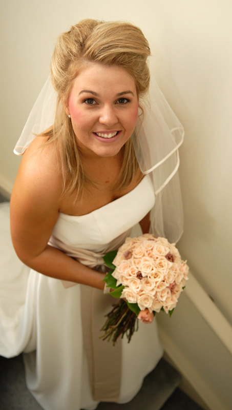
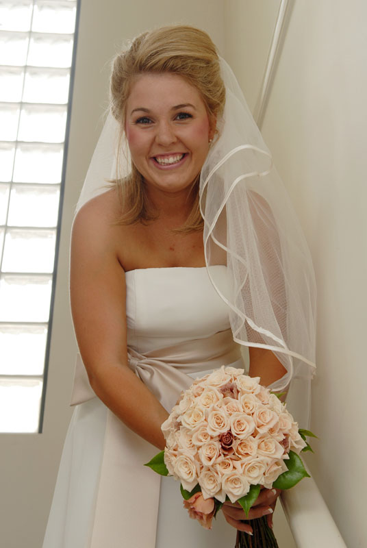
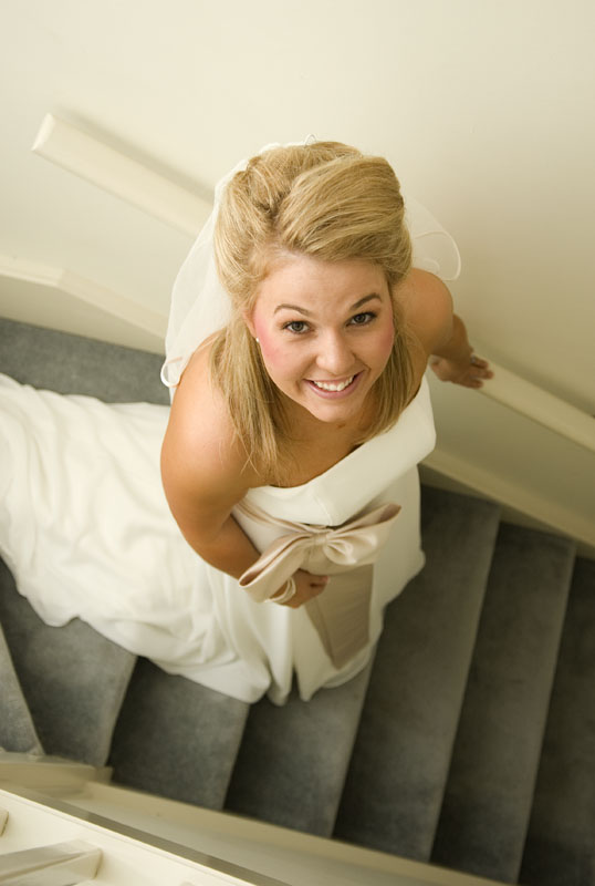
Great stuff, Geoff! The last one is the winner, in my opinion - the exposure and WB are spot on, the composition is also very good. I think No. 1 has WB a bit too warm and slightly underexposed.
Alex
-

Alex
- Senior Member
-
- Posts: 3465
- Joined: Thu Feb 24, 2005 6:14 pm
- Location: Melbourne - Nikon
-
by Geoff on Wed Nov 08, 2006 8:18 pm
Thanks Alex. I haven't teaked these images to their full potential as yet, but see what you mean about the WB in #1.
-

Geoff
- Moderator
-
- Posts: 7791
- Joined: Sat Aug 07, 2004 12:08 am
- Location: Freshwater - Northern Beaches, Sydney.
-
by Matt. K on Wed Nov 08, 2006 10:49 pm
Geoff
Here's a little action I created and use a fair bit on females...you probably know and use this but just in case you don't...
IN PHOTOSHOP...control + J to copy the image...FILTER/OTHER/HIGHPASS and dial in a fair bit, about 30. Experiment with the amount. IMAGE/ADJUSTMENTS/INVERSE and then BLUR/GAUSIAN...about 3 and finally in the layers pallete...change the blend mode to soft light and dial down the opacity to suit. Don't overdo it. You can rub through the top layer with a 50% erasor to bring back detail in the eyes, lips jewelry etc.
This makes brides glow. I don't do this to every pic...only those that will suit the procedure. I think some of your shots might glow with the treatment.
Nice images! Regards
Matt. K
-

Matt. K
- Former Outstanding Member Of The Year and KM
-
- Posts: 9981
- Joined: Mon Sep 06, 2004 7:12 pm
- Location: North Nowra
by shutterbug on Thu Nov 09, 2006 12:53 pm
Hi Geoff, overall I prefer one.
I think the images are abit tight 
-

shutterbug
- Senior Member
-
- Posts: 1853
- Joined: Fri Jan 07, 2005 11:32 am
- Location: A Pub in Sydney / Bankstown
Return to Image Reviews and Critiques
|