What do you think? (despite the pole of the pier... i think that's from the diffused glow I used early in the processing.)

edit: updated whole post pretty much. revised version of the shot
A discussion forum - and more - for users of Digital Single Lens Reflex cameras.
Lightning off the pierModerators: Greg B, Nnnnsic, Geoff, Glen, gstark, Moderators
Forum rules
Please note that image critiquing is a matter of give and take: if you post images for critique, and you then expect to receive criticism, then it is also reasonable, fair and appropriate that, in return, you post your critique of the images of other members here as a matter of courtesy. So please do offer your critique of the images of others; your opinion is important, and will help everyone here enjoy their visit to far greater extent. Also please note that, unless you state something to the contrary, other members might attempt to repost your image with their own post processing applied. We see this as an acceptable form of critique, but should you prefer that others not modify your work, this is perfectly ok, and you should state this, either within your post, or within your signature. Images posted here should conform with the general forum guidelines. Image sizes should not exceed 950 pixels along the largest side (height or width) and typically no more than four images per post or thread. Please also ensure that you have a meaningful location included in your profile. Please refer to the FAQ for details of what "meaningful" is.
Previous topic • Next topic
17 posts
• Page 1 of 1
Lightning off the pier
Took this pier shot yesterday, and added the lightning from another shot.
What do you think? (despite the pole of the pier... i think that's from the diffused glow I used early in the processing.)
edit: updated whole post pretty much. revised version of the shot Last edited by owen on Mon Mar 05, 2007 2:45 pm, edited 2 times in total.
Owen - shall I just say I'm not up for chosing POTW this week, but if I was.....
Wow...I like this shot VERY much mate. Nicely done. Can we see the colour version too? Geoff
Special Moments Photography Nikon D700, 50mm 1.4, 85mm 1.4, 70-200 2.8VR, SB800 & some simple studio stuff.
That's fantastic Owen. I would never have known the lightning was added. It looks like it is meant to be there.
Steve.
|D700| D2H | F5 | 70-200VR | 85 1.4 | 50 1.4 | 28-70 | 10.5 | 12-24 | SB800 | Website-> http://www.stevekilburn.com Leeds United for promotion in 2014 - Hurrah!!!
if you hadnt told us that you added the lightning, i wouldnt have known! well done, its an excellent image!
Nathan
D700 | MB-D10 | Nikkor 14-24 | Nikkor 24-70 | Sigma 70-200 | 20 2.8 28 2.8 35 2 50 1.8 | Sigma 105 | SB-800 http://www.flickr.com/nathanjphoto/
This is awesome!!!!! Definitely worth the effort you put in and more. Love it.
My only nitpick is the slight dark haloing of the closest railing/barrier. Possibly from the PPing?
Thats a pretty surreal image there. Ever thought of applying a gradient map and see what funky images will spring out of it?
Hi Owen - as others have already said, you've done a great job of merging these two images. Well done
Have you considered cropping the foreground out though? I know you probably have an image in mind with the foreground rocks, but to me I think it would be stronger with just the pier coming out from the side, in a pano-style crop (cut off just above the rocks). Maybe it's just my preference for pano shapes? *** When getting there is half the fun! ***
The lightning was taken from this image:
http://dslrusers.com/viewtopic.php?t=24475&highlight= and the original of the pier shot is this: 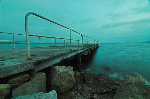
Basically I did the following things to create the image. Convert it all to B&W using the desaturate tool. (Always try to create a new layer for each step.) Lasso the lightning and feather by 50 pixels, then paste into other image. Matching colours with the two images is very difficult, so from here on in everything was done in black and white. To match the clouds around the lightning with the rest of the sky, I played with the levels and curves until I got a very low contrast sky, and you could barely see the lightning. Then merged all visible layers, duplicated that layer and increased the contrast of it to enhance the lightning as well as darken the sky. Add a layer mask and do a straight gradient to blend the sky into the foreground. Then fiddled with contrast of foreground layer to get it to match the mood of the sky. Added a vignette by creating new blank layer dragging oval marquee around the image, inversing, feathing by 250, then filling with black and reducing opacity to about 60 or 70. As I mentioned, somewhere along the line early in the piece I did a diffuse glow on the image, which stuffed up the pole on the pier. Sheepie: that pano is a good idea, and just did a quick preview and it works... thanks for the idea
Owen,
I realy like this image, the dark allmost forboding effect works very well. I am envious of your abilitty to add the lightning I have no idea how this is done. My ability to process shots is very limited. I have one question, please do not take this as a critisism of your photos or processing ability, its just something I have noticed in some other images that have been photo shopped. I am guessing that it has to do with merging two images, the colour of sky above and below the middle rail of the safety rail on the far side of the pier is different except in the gap between the two sections of the rail. It just seemed to jump out at me and caught my eye, it doesn't show up in the original of the pier thats what got me wondering. Anyway its still a great photo. Cheers Rick.
Hey Rick. Thanks for the comments mate. The difference in colours, or tones, is probably due to the way I played with the contrast. You've also reminded me that I 'burned' in some of the sky in order to blend the lightning in properly. I'd say any inconsistancy is due to that.
Previous topic • Next topic
17 posts
• Page 1 of 1
|


