I know this will be an ask at this res but hey ......nothing ventured.......
Regards Colin

A discussion forum - and more - for users of Digital Single Lens Reflex cameras.
March FlyModerators: Greg B, Nnnnsic, Geoff, Glen, gstark, Moderators
Forum rules
Please note that image critiquing is a matter of give and take: if you post images for critique, and you then expect to receive criticism, then it is also reasonable, fair and appropriate that, in return, you post your critique of the images of other members here as a matter of courtesy. So please do offer your critique of the images of others; your opinion is important, and will help everyone here enjoy their visit to far greater extent. Also please note that, unless you state something to the contrary, other members might attempt to repost your image with their own post processing applied. We see this as an acceptable form of critique, but should you prefer that others not modify your work, this is perfectly ok, and you should state this, either within your post, or within your signature. Images posted here should conform with the general forum guidelines. Image sizes should not exceed 950 pixels along the largest side (height or width) and typically no more than four images per post or thread. Please also ensure that you have a meaningful location included in your profile. Please refer to the FAQ for details of what "meaningful" is.
Previous topic • Next topic
10 posts
• Page 1 of 1
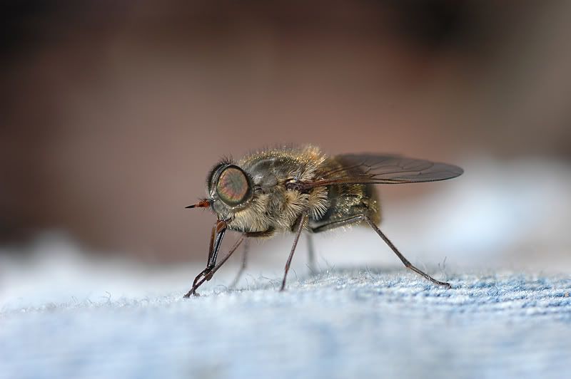
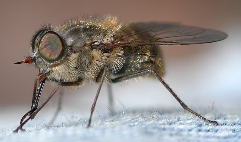
March Fly
I would like opinion on which of these images is best as I am trying to get a work flow organised for my macro work.
I know this will be an ask at this res but hey ......nothing ventured....... Regards Colin
#1 seems to be a bit soft
#2 looks sharper, and would be my preference of the 2 #3 looks good as well. More detail in the blown up version. I think this might be the best one. More subject in the frame and less background. My 2c worth. Russell
Nikon D700 // 50 1.4 // 70-200 2.8 VRII // 24-120 f4// Tamron 90 // SB-800 // 70-300G I'm on Redbubble too ... http://www.redbubble.com/people/rflower If you can make one of my photos look better and you have the inclination ... please do so.
Colin,
All three are great. When compared to the other two, the first is a little soft - although would have been fine on its own. The detail on the third one is incredible. Seeing the spike on the head, it is no wonder they bloody hurt.
Are these different crops of the same image? If so, I'd pick #3 but leave a bit more room to the left and top. The close-up works well for me. Just don't make it look so caged in. I like the colour in the eye. Maybe that can be, ehem, enhanced a bit in PP?
Cheers Steffen. lust for comfort suffocates the soul
#3 is cropped too tight IMO. It needs more room on the left.
#2 is my favourite composition-wise and overall, but I'd add a "WOW!!" to #3 for the amount of detail in the shot!
Pentax istDS+K10D. Pentax 50mm f1.4, Sigma 10-20mm, Tamron 90mm f2.8 macro, Kit Lenses. http://www.redbubble.com/people/berndt2
Thankyou all for the constructive comments.
All are from the same capture. #1 and #2 are the whole image that was sharpened at differnt stages of size manipultion, and you seem to agree with what I thought. #3 is a crop from the centre that has been resized. Once again thanks, Regards Colin
Previous topic • Next topic
10 posts
• Page 1 of 1
|


